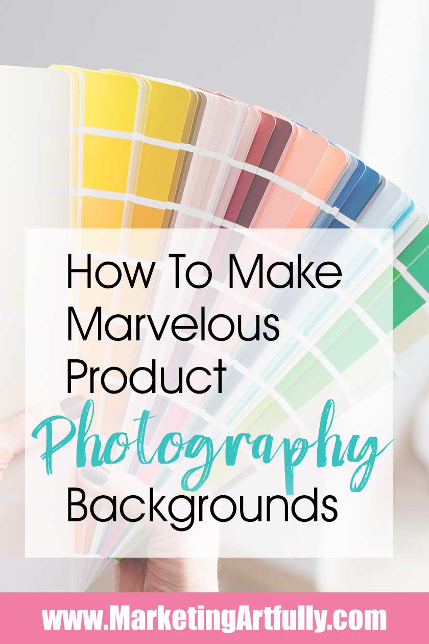
Just the other day I was writing a post about How To Take Super Amazing Product Photography With Your iPhone, and I got to thinking about the backgrounds of my pictures.
If we are working in layers to make our pictures look pretty then the background of our product photography are a super important step to get right!
please note :: I often recommend resources, some I receive an affiliate commission for at no additional cost to you, these all help to keep this site free for you!
Standard Background Colors - Black and White
To get started, let's talk about the two plain jane but effective background colors, black and white.
Light and bright or dark and dramatic?
There is no greater contrast that you can get other than choosing pure black or pure white and there are reasons to pick each one.
White - For some reason I feel like everyone thinks that white is a super easy background color to use. While it does capture that "light and bright" feeling, as a background color I find it to be a little flat and hard to use.
Pros For Using White Backgrounds
- It is universally thought to be a very bright, clean look
- It will rarely clash with what you are taking a picture of (more about this later)
- It really makes colorful things "pop" off the page!
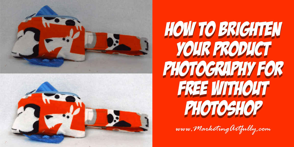
Additional Resource: How To Brighten Your Product Photography For Free With GIMP
Cons For Using White
- It is almost impossible to get it perfect in the camera (it is usually too gray or too blue)
- All the shadows show up
- It gets icky bits on it easily that you have to photoshop out
Black - I tend to like black much better than white if I am trying to simply show the function of an item.
Pros For Using Black
- It is much easier to photograph as there are no shadows to deal with
- There is high contrast with many objects
- It is much more forgiving and you can make sure that the colors in your piece are perfect rather than trying to change things so the background looks right
Cons For Using Black
- If your item is dark it will not show up as well
- On sites like Instagram and Pinterest it has been shown that white backgrounds get more likes and shares
Contrast With The Item You Are Photographing
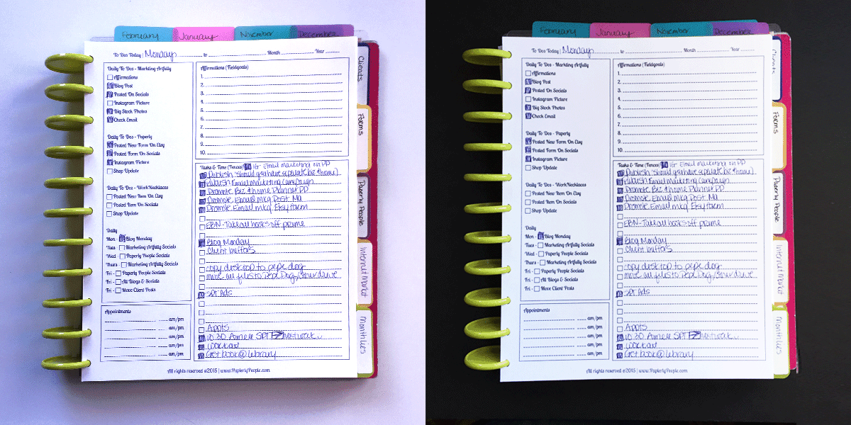
This is pretty stark and not photos I would use in my marketing, but I think that it shows pretty clearly that the item you are photographing really does matter when you are picking a background color. Using the white notebook on the white background is a super big problem as the whites are not the same color so when I made the workbook page look right, the background became a funny color.
Photographing the white page against the dark background definitely made my workbook jump off the page and getting the white page white was a much easier proposition.
If you are photographing dark objects, black may not be your best option and if you are doing white on white, just know that there could be a bunch of editing involved to get both the item and the background to look white-white.
There are "workarounds you can do if you want to do white on white backgrounds! For example, you can put something behind the white paper to add a little bit of interest!


Contrast With Other Items For Sale or Posted
As you can see in the picture above, there is super high contrast with the white page of my blog site when you use a black background. But that is when we are comparing apples to apples. Now let's look at them in some real life environments and see what happens!
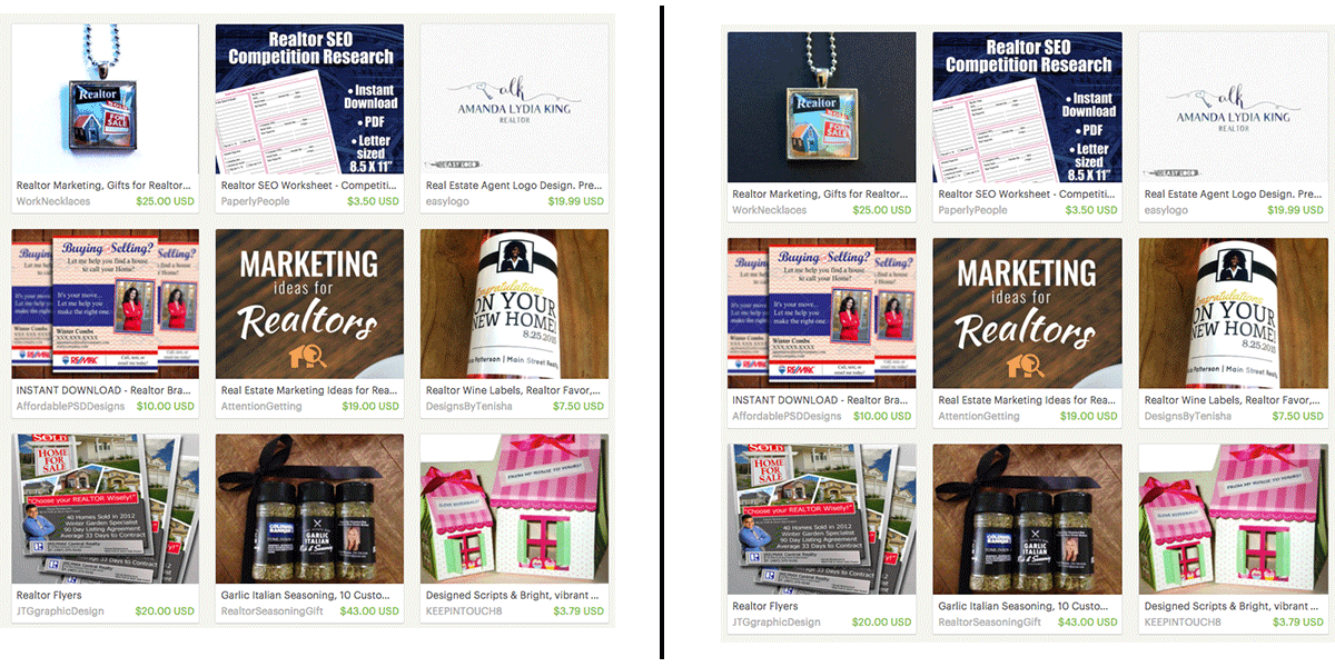
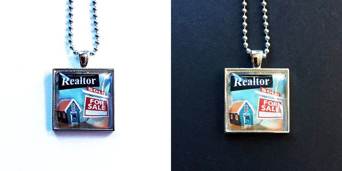
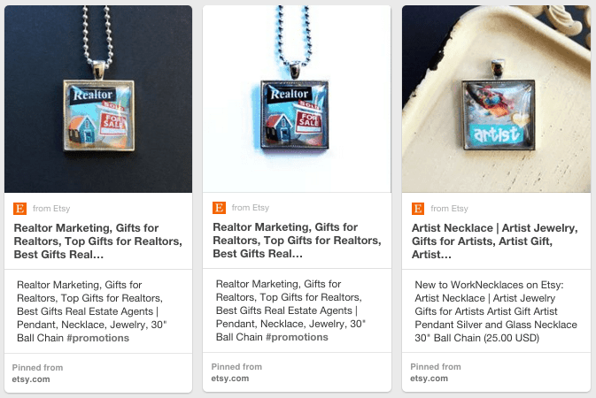
Now we can see how they contrast with other items for sale on Etsy. I personally feel like the two white items (my necklace and whatever that logo thing is) are totally eclipsed by the other brighter things on this page.
The black one stands out more on this page because it is one of the darkest elements on the page (along with one of my other products - the realtor SEO sheet...I hate when I mess up my own experiments!)
Now let's look at the listings on Pinterest, these are three different looks and I still think that the black jumps out the most (although I am not sure it would sell the most).
Black and White Wrapup
Having done this exercise, I am thinking that mostly I like black pictures and darker backgrounds, but that is just me! I like dark websites and rooms and furniture too. If you are the kind of person who likes light and bright, go with that!
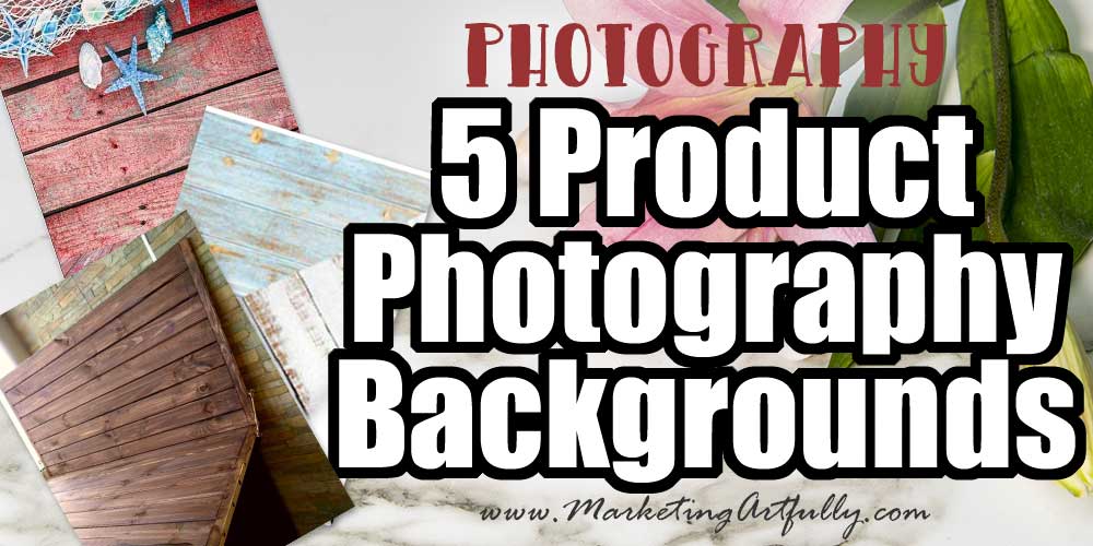
Patterned and Interesting Backgrounds
Okay, now let's get a bit more interesting! I love using pattered backgrounds for my pictures. I have a ton of scrapbook paper that I can just swap in and out. These colorful patterns make for great product photos on the fly and also are super for sharing "different" pictures on social media. By taking a whole series of shots on different backgrounds you can post more frequently without fatiguing your audience.
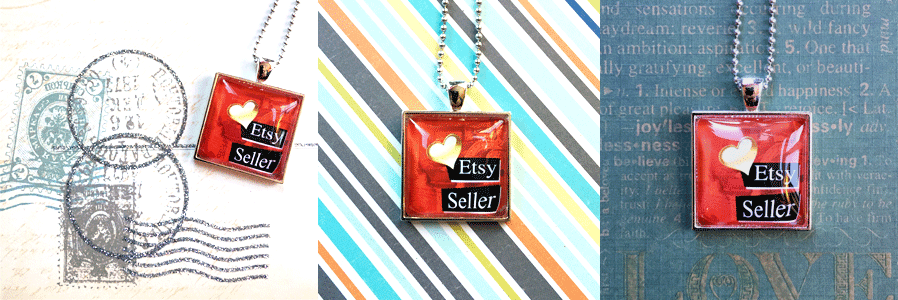
As you can see, each of these backgrounds looks very different, but all are fun and eye-catching. Taking and editing these pictures was a matter of minutes and while I might not use them all for my listings, I did think that the one with the mailing bits was cute for Etsy Sellers!
Additional Resource: Easy Tweaks For Your Lifestyle Product Photography
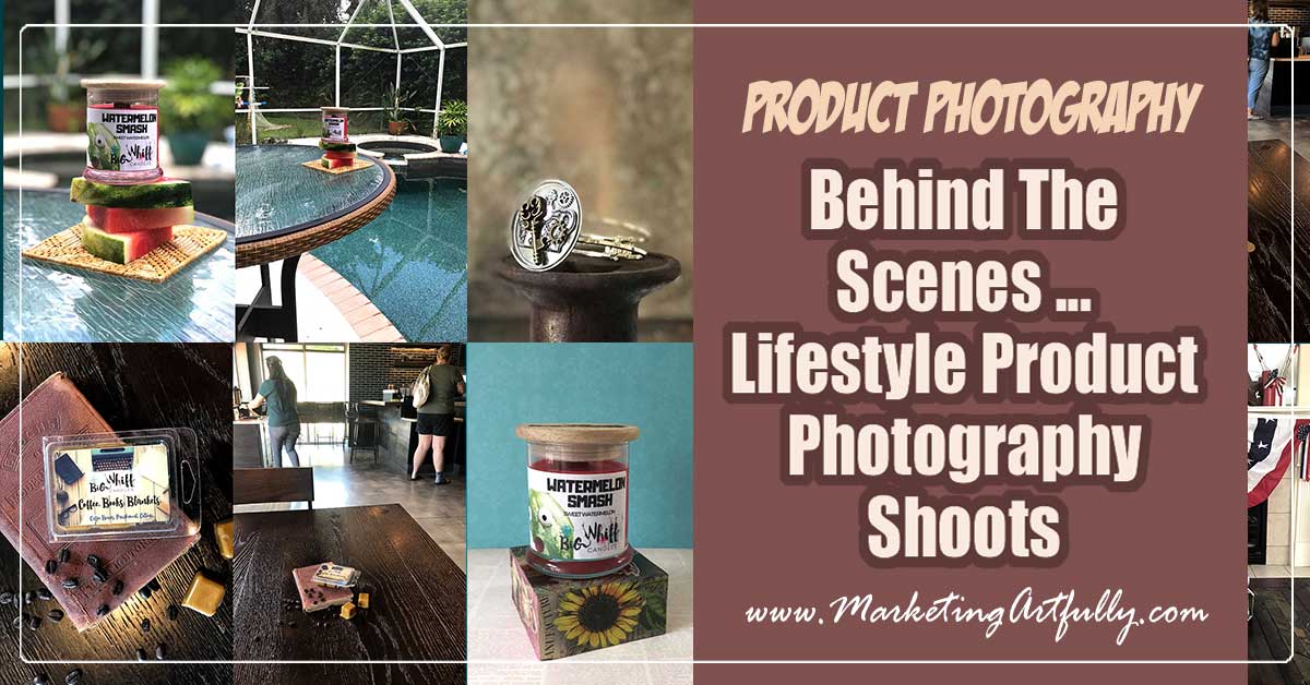
Candid Backgrounds
Those are all nice and all, but sometimes you want to get something a little more fancy! Using candid backgrounds from your environment can really make for some stunning product photography. Here are a few that I have done lately.
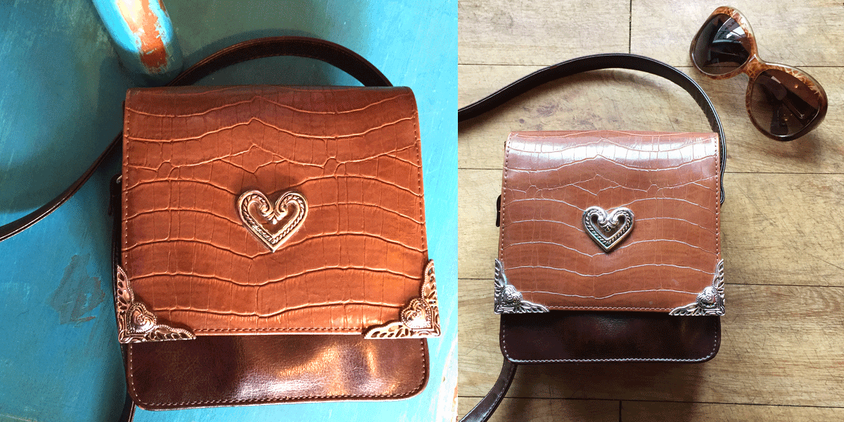
photos taken at the Pink Purse and Your Sports Hub
This is a great example of how you can have different looks to share! The one on the left (turquoise background) was taken on a little shelf thingy and the one on the right (brown) was taken on the weathered floor by the front door of the business. It was super easy to pop the bag into two different areas to take really different pictures.
The one on the right will probably appeal to the kind of buyer that would want this purse, a little more rustic and weathered!
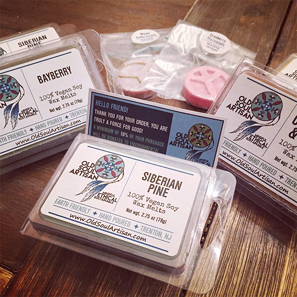
This one was taken on my kitchen table. I had gotten some soy wax melts from Old Soul Artisan and thought it would be fun to take a quick product shot!
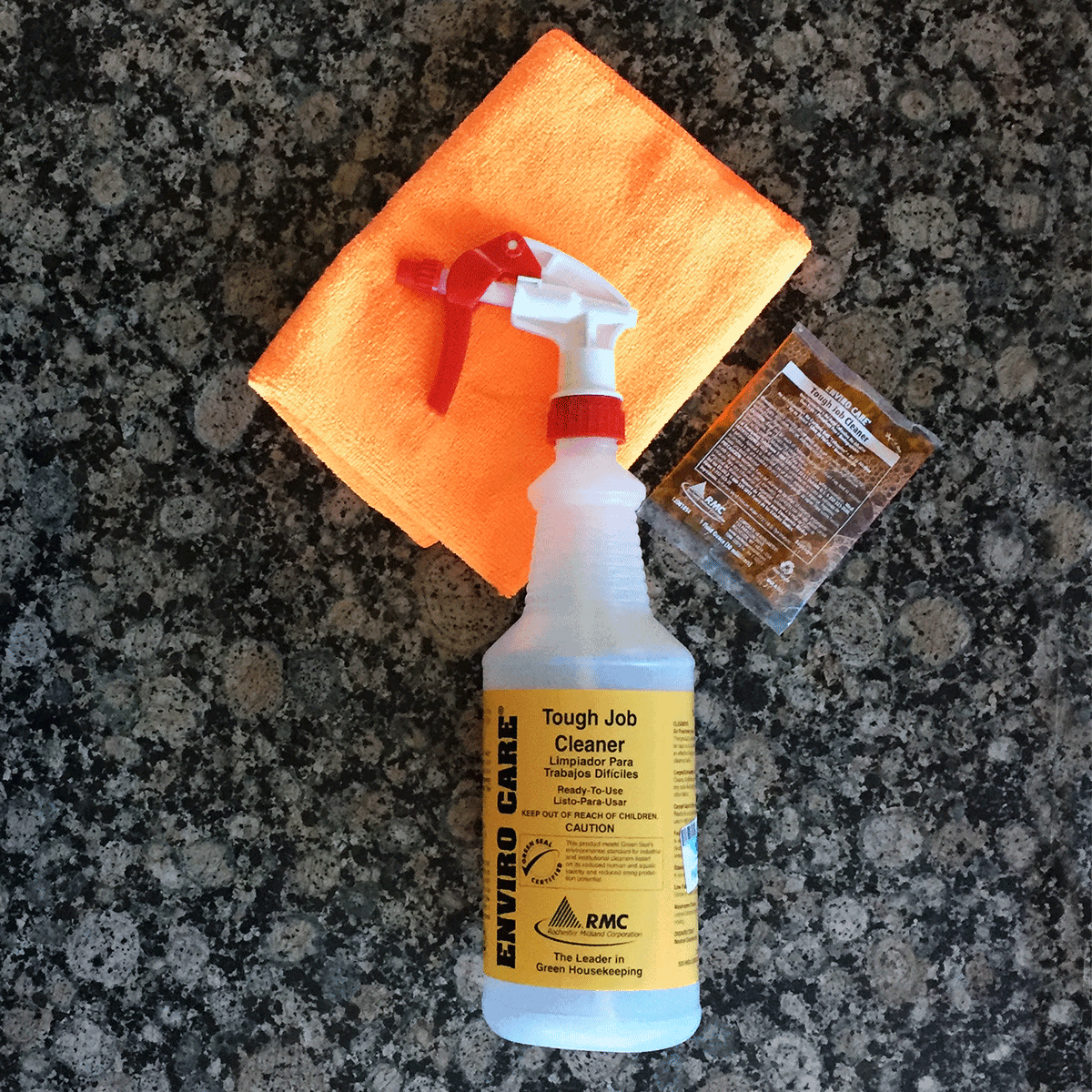
It can seem like you have to have super fun or fancy products to have cute photos, but this cleaning kit from Green Cleaning Products LLC is about as un-sexy as it can get! Even a towel, packet and spray bottle look much cuter when they are on my granite kitchen counter!
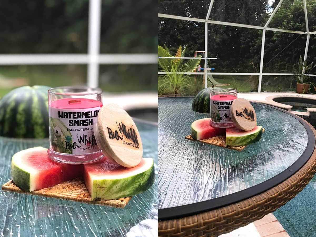
Another fun thing to do is go out in the wild and take "on location" shots! These pics from Big Whiff Candles show how you can make something "plain" look fun and exciting!
Additional Resource: How to Create Gorgeous Lifestyle Photography
Backgrounds For Product Photography Wrapup
As you can tell we are ambling toward the last layer of product photography, the styling. That will be last post in this series (if you haven't read the first post, How To Take Super Amazing Product Photography With Your iPhone yet, check it out!)
But if you think about your product photography in layers, the background layer is really import and worth-while to take a bit of time on!