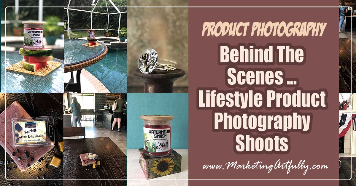
As an Etsy, Ebay or Shopify store owner, you need to take basic boring pictures for your listings. But you also need to take lifestyle photos to share on your social media accounts!
Today is super fun! I will show you behind the scenes of some of the products I have taken pictures of with my iPhone so that you can see how to set up a shot that will result in a cool lifestyle product photo!
What Is Lifestyle Product Photography?
Etsy sent out an email a wee bit ago that showed the kinds of products that did well on their Instagram account.

As you can see from the pictures, almost all of these are "styled" in some way to look more like what they would in someone's home or life. That is what we mean by a lifestyle picture!
Some of these sellers achieved it by grouping multiples together, but many showed their product "in real life" so the buyer could get an idea of how it would look once they bought it.
For Pinterest, Instagram and even Facebook, straight product shots on a white background stick out like a sore thumb (and not in a good way).
People on social media are not looking for something to buy, they are looking for ways to make their life better and if you can show how their life will be better after they buy your product. Think "aspirational living" when you are taking your pictures.

Why Mobile (or iPhone) Pictures
I KNOW, my pictures would be better, clearer, more perfect with a DSLR camera, but I just can't bring myself to use one. Between having to make sure there is a card, figuring out how to stick it in my computer, and dealing with "raw" files (what the hell are raw files?) I just gave up.
But luckily for me cell phone cameras got better! YAY!
And my phone has a great little feature called "Portrait" mode that blurs out the background of the shot. I also can take really good high quality "plain" pictures of my fancy styling too.
Seriously, if your phone is halfway decent and you do a half way decent job of styling your pictures will be GOOD ENOUGH for posting on social media!
There are statistics out there that say people are looking at them for as little as two seconds... two seconds!
I don't have to have perfect pictures to sell my stuff, I just have to have pictures cute enough that they look at them for a wee bit and then go and buy or save them for later.
Additional Resource : How To Take Super Amazing Product Photography With Your iPhone
Behind The Scenes of My Lifestyle Photography Shoots
I have to admit that calling what I do a "shoot" like the real photographers seems funny, but that is what they are! I set up a shot and then try and get some fun pictures out of it.
They don't always work... but sometimes magic happens!
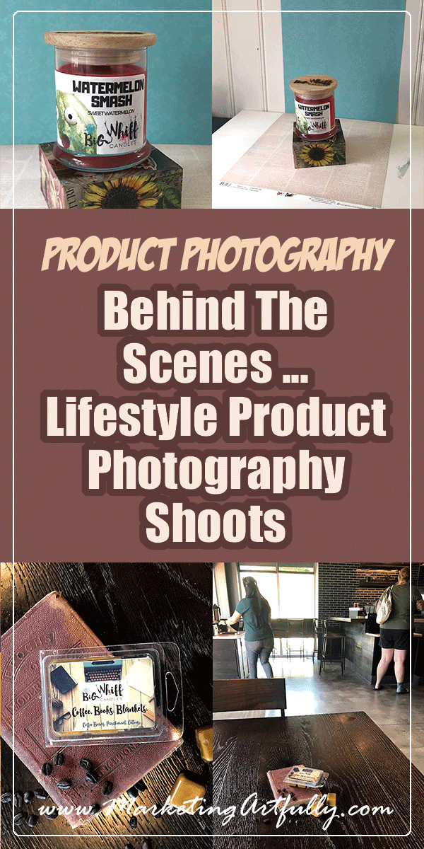
Starting Super Basic - Scrapbook Paper Background
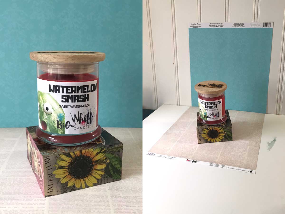
product source Big Whiff Candles
I wanted to start with something super simple using just my regular camera and some cheap props. I made that wood block the candle is sitting on with Mod Podge and tissue paper and the base and background are simply 12X12 sheets of scrapbook paper.
As you can see, just adding a wee bit of a contrast in the back between the plain blue paper and the words on the bottom makes a really interesting picture.
In this one I tried the words on the top first, but then the candle didn't pop off the page!
Notice that there is nothing super "sexy" or hard about this setup. You could buy all different kinds of scrapbook paper and have all different kinds of color combinations to make your products pop!
Starbucks As My Photo Studio
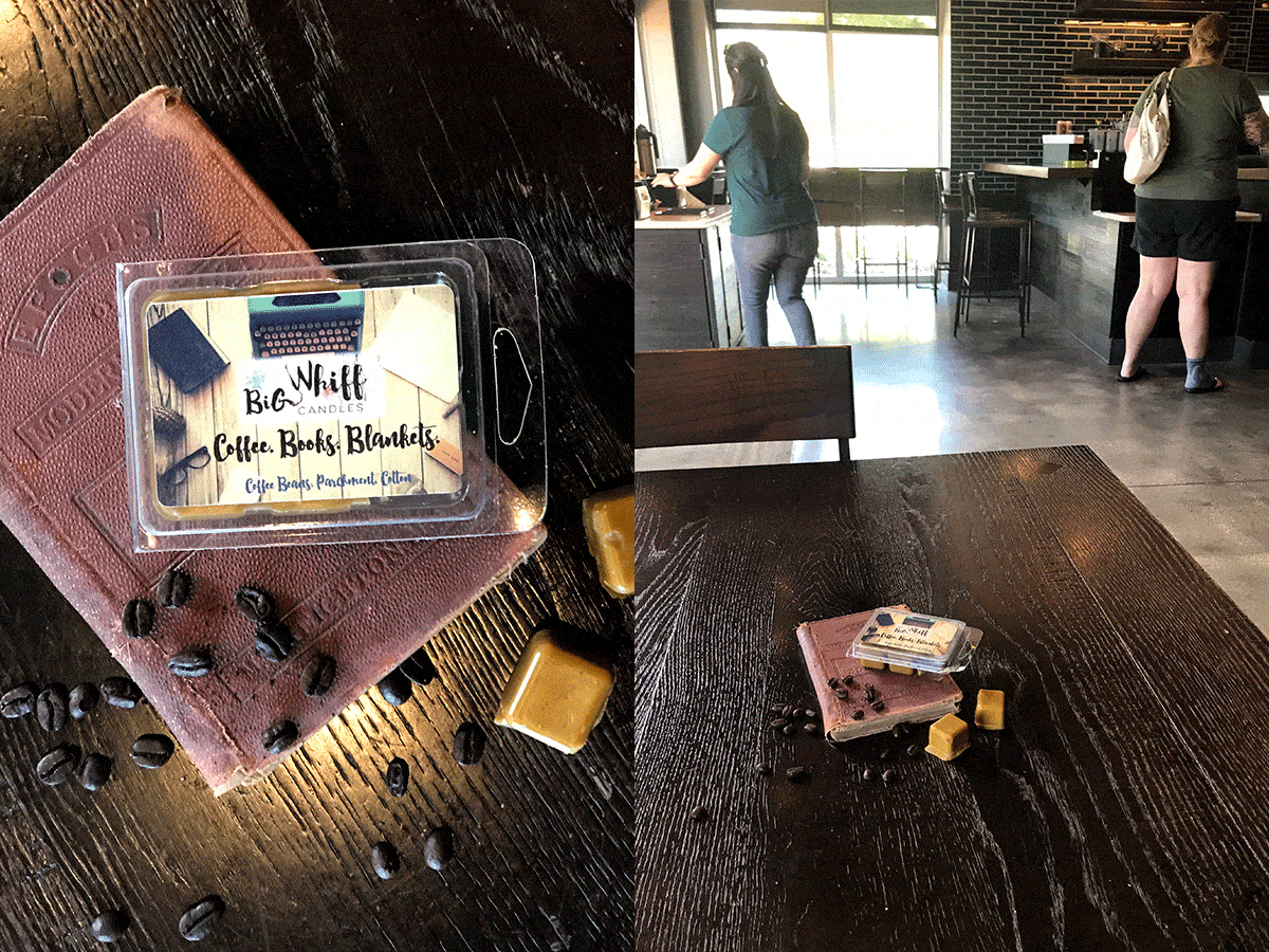
product source Big Whiff Candles
This one was super fun! Because the title of the product was "coffee, books and blankets" I could pull out my trusty coffee beans to add some texture to the shot.
As you can see, I love the lighting in Starbucks for these dark and moody shots! That said, I had to change tables like 3 times to get the light shining down on the books and beans in just the right way.
The first shot I took I hadn't pulled out the yellow wax melts and it didn't look nearly as cool (but I would still post it another time because we always need more shots for social media!)
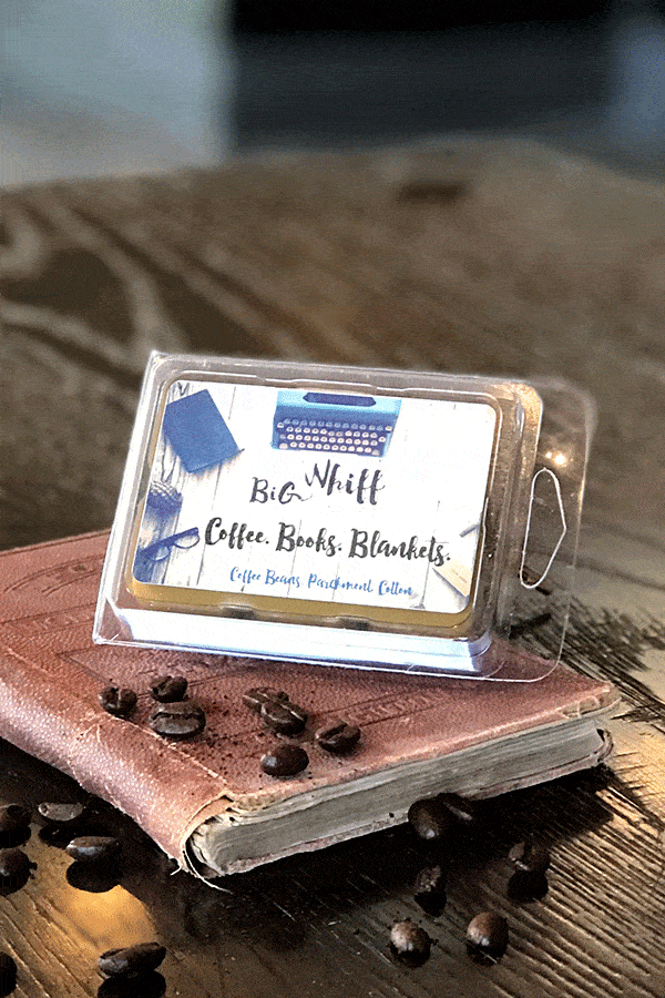
Starbucks As My Photo Studio #2
While I was all set up and making a ruckus anyways, I thought, why not do one of my vintage products that could look cool in this dark and moody lighting?
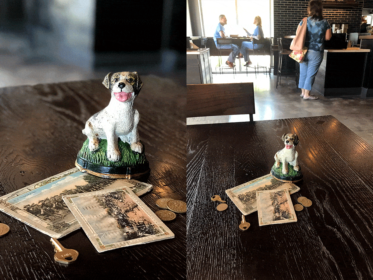
product source So Glamorously Vintage
I love how this little paperweight/doorstop looks in this lighting!
Now, I showed this to my actual photographer husband and he said he didn't think that the "stuff" around (the keys, coins & postcards) matched a dog statue.
But that is okay! I am not trying to make a picture worthy of Horse and Hound magazine... I am taking a picture that conveys a "vintage" feeling and again... they only look at it for 2 seconds!
In Home Product Photography - Match The Customer

product source Kabiu Boutique
As soon as I saw this steampunk bracelet I knew that I wanted to photograph it with a "grungy" look. The person who will buy this probably doesn't want to see it looking all "light and bright" or "cute and fun", they probably want cool, dark and brooding!
I made this photo with a lot of "negative space" at the top so they would have room to put some words above it for Pinterest.
I did use the Portrait mode pretty heavily on this one and it has a weird reflection-y thing on the left side that you probably didn't notice.
Please, please, please, if you don't learn anything else from this post, understand that your pictures don't have to be "perfect" to be striking. I could have spent hours trying to turn it just the right way so the light didn't catch it and throw that glow on it, but I bet you didn't even notice it in the first place!
Beachy and Bright Lifestyle Product Photography
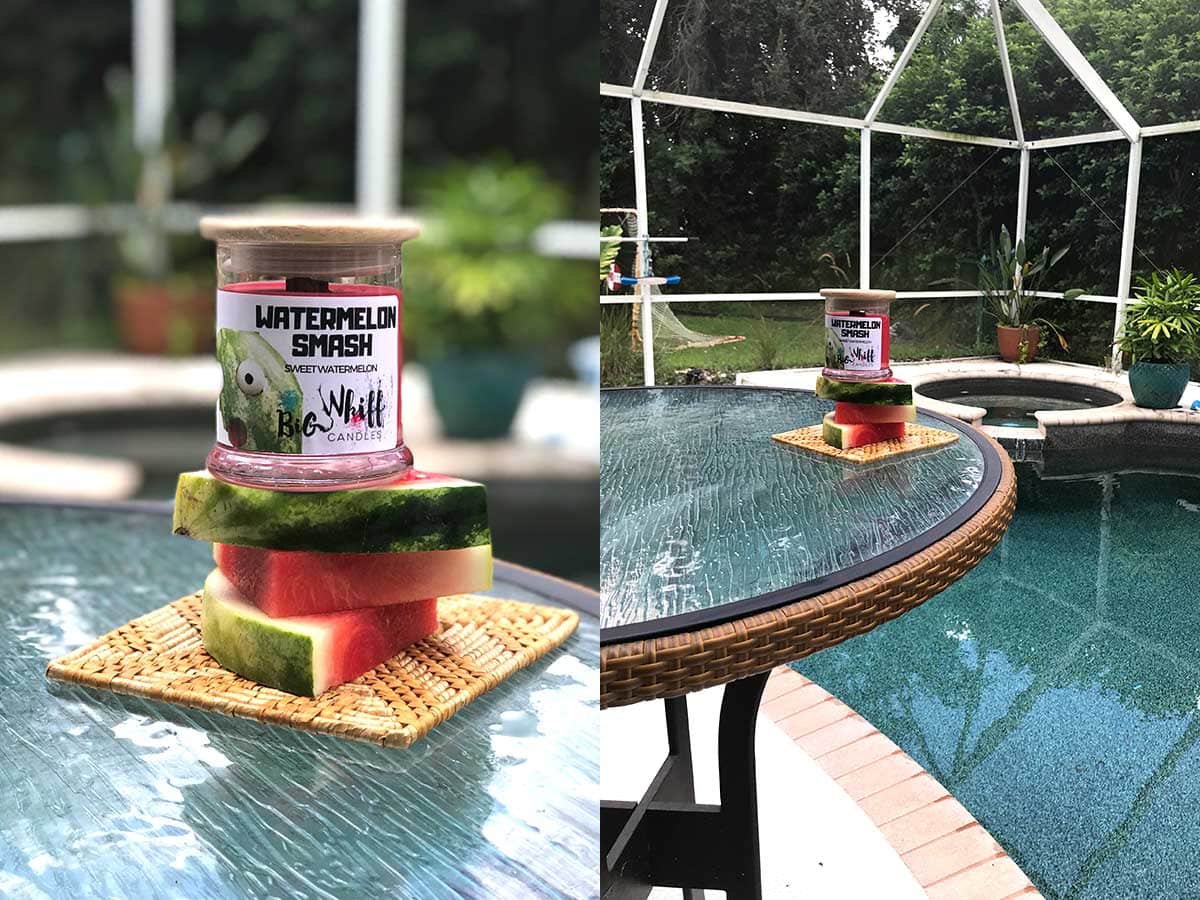
product source Big Whiff Candles
Alright then, enough of the dark and broody pictures, I thought it would be fun to go out on my back patio and take some fancy shots!
The cool thing about this picture is that I used the watermelon slices exactly the same way that I used the blocks above. They elevate the candle so you can tell it is the star of the show.
This is a super colorful shot and you probably think it is wicked cool. I see the pool basketball hoop in the background that my kids left out.
Seriously, if you are taking these kinds of fun pictures for your products, you have to stop thinking that everything is wrong and just know that no one is critiquing it but you!
Lifestyle Product Photography FAQs
What kind of phone do you use?
I use an iPhone 7 Plus (you can get them refurbished from Apple on Amazon.) The thing that makes it cool is the ability to take "Portrait Pictures" which blurs the backgrounds. I know that there are a bunch of the Android cameras which do the same thing now too!
Don't people get mad when you take pictures in public places?
No! I am super polite and ask first. The Starbucks people are always happy to have me and anywhere else I go I just ask if would be okay to take pictures before I whip all my stuff out!
How did you get good at taking lifestyle pictures?
Take lots of pictures! So first you have to take a lot of the same subject to get a few that look good. Instead of trying to take one perfect picture, take lots of different angles. Second, the more pictures I took overall the better at it I became. At first your pictures won't be that good but over time you will get better and better at taking pictures and styling your shots.
I did take a class on Creative Live called Craft Photography Fundimentals and that really helped me get started seeing to style my pictures. (#promo)
What if your pictures are horrible?
Much like when I see pictures of myself, when I look at my product photography pictures I often see all the flaws. Just ignore that and take a quick peek to see if it looks cool and don't obsess about all the details!
