Tips and ideas for how to pair fonts for your brand! Includes examples and info about why certain font combinations work well together. Beyond just serifs and san serifs, more about how fonts work to represent your business and branding.
please note :: I often recommend resources, some I receive an affiliate commission for at no additional cost to you! check out my policies here
A Little About Choosing Fonts
Ok, so, if you saw the post of how to pick a font type for your brand, you know all about characteristics, font categories and so on. If not, please go back and brush up!
All of the fonts used in this post are from this HUGE font bundle from Creative Market!
The first thing you need to do is to choose the font that best fits what your brand is trying to convey. That will help you in pairing them.
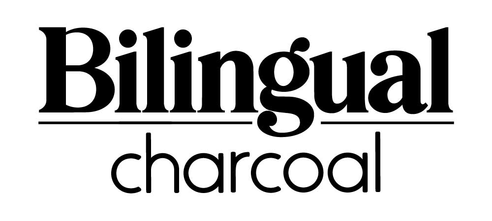
For instance, start with a bold serif header and then choose a more nondescript sans-serif sub-header for an accessible and dependable feel that’s both modern and traditional.
But wait, there’s more… (always more!) Do you want to choose contrasting fonts (like the example above) or related fonts?
Related or Complementary Fonts
Related, or complementary fonts can be a great choice. One font can give a feeling of more depth when paired with another, similar one.
An easy way to do this is to use fonts from the same family. Since the typefaces were made to work together, it’s usually a safe bet.
Just look for a font family that has a larger range of options such as font size, weight (such as light, regular, and bold), and case (upper, lower, small caps).
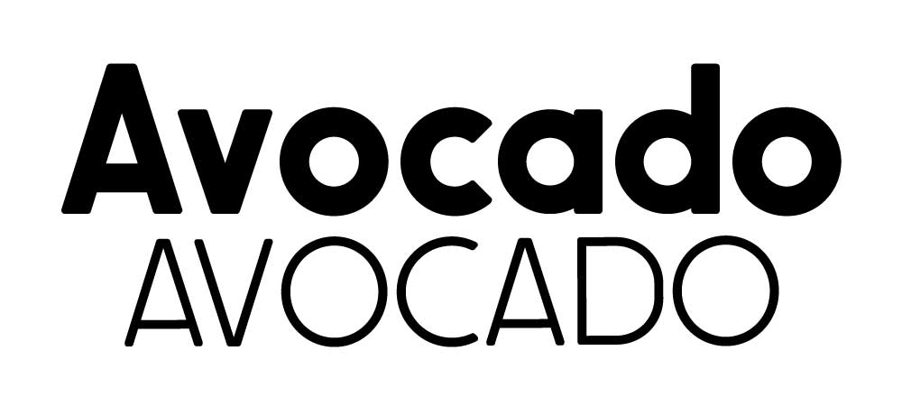
Don’t, however, pair fonts that are too similar! If you do, it can mess up the hierarchy you want to establish (more on that below). Here’s an easy way to see if you’ve chosen two fonts that are too similar.
Type the same word in each font side by side on your screen. Now sit back a little and squint. If the fonts look basically the same, try different choices.
Contrasting Fonts
Another idea may be to use contrasting fonts. It’s not a weird as it sounds.
Go back to your list of adjectives from the linked article above and see what happens. You’ll find, probably, that there are a few different feelings you want to convey.
If you make intricate, artistic crocheted blankets, for example, you may want to convey a feeling that’s traditional, but artsy. You can do that by mixing serif fonts with sans serif fonts or sans serif fonts and script or decorative fonts.
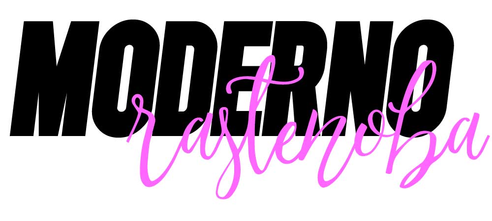
Remember, too, that contrast can be created with differences in style, size, weight, spacing, and color, among others.
For instance, pairing a bold, chunky font with a tall, thin one, whether in the same font family or different ones, works well because the differences create specific functions for each font, allowing them to represent different pieces of information.
Contrast doesn’t mean conflict. Go for harmony, not just different.
Visual Hierarchy of Fonts
Now, onto visual hierarchy. This is basically letting your reader know how information is separated or grouped.
Think about a magazine article. There is usually a bold headline with smaller sub-headlines, a smaller body text and captions. The hierarchy combine fonts so that they visually separate the different elements and levels of information.
When you think about hierarchy, think about what you want the reader to notice first, then second, etc. Decide what information is most important (i.e. noticed first) and what is less important (i.e. noticed after the most important). Make sense?
Clarity of Fonts
Also, and this is also really important, make sure your font choices not only work well together but are legible and readable and limit how many you use.
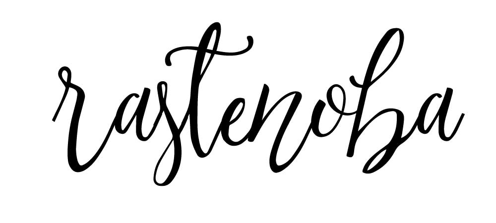
For example, this is a good one for a fancy logo font... but it is not that legible...
You want people to be able to read your message and not be overwhelmed or turned off by too much busy-ness in your choices.
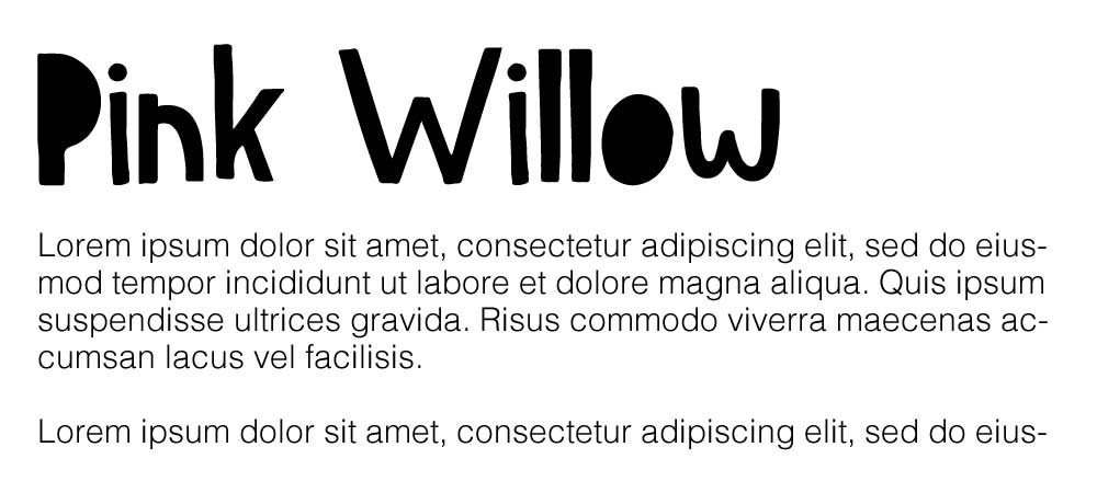
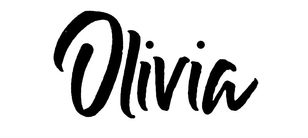
This is a script font too, but it is much more legible for reading!
There may be some types of brands that call for more complicated font combinations (think vintage or Victorian) and that’s ok. Just make sure the general look is balanced and not cluttered or jarring.
Pairing Font Wrapup
Depending on what you are trying to do with your font pairs (logo, brochure, website, free or paid download) will determine what kinds of fonts you want to pick to go together.
A super creative brand could use two wild and crazy fonts, a bank needs to use two plain and solid fonts.
Mostly it is a combination of what your customer expects and what you like to use!