Tips and ideas for how to pick fonts for your company branding, new products or even Pinterest pins. Learning how to find the perfect font can make all your graphic design better, even if you are working on a DIY design project!

please note :: I often recommend resources, some I receive an affiliate commission for at no additional cost to you! check out my policies here
Branding. It’s incredibly important. But don’t think that because you picked out the perfect name, tagline and graphic logo for your brand that you’re finished.
Oh no, quite the contrary. The branding nightmare continues. Now you need to choose a font to carry through your marketing: website, email, marketing pieces.
It’s not just color choice that prompts the perfect emotional response. Think about the last time you used Comic Sans, Papyrus, Curlz MT for a sign or in an email. People hate it!
However there are others that are much more appealing. So let’s take a few minutes and think about what this process entails.
The perfect font for your brand should be unique and unforgettable, legible, work across platforms and communicate the personality of your brand. Easy peasy!
Font Characteristics
First, what characteristics do you want to convey about your brand?
There are a ton out there, so think for a minute and then right down the first few adjectives that come to mind when thinking about what you want people to feel about your brand.
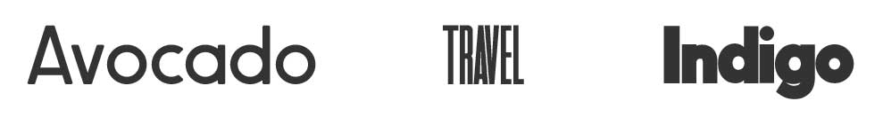
Choose words that you want your target audience to think when they see your brand. If you’re selling a service, do you want them to think “trustworthy” or “reliable”.
Here are a couple of logos that have "trustworthy" fonts!

If you have an Etsy store for your craft, should they think “playful”, “artsy” or “beautiful”?

See where I’m going with this? Know what you want people to think and feel before jumping into fonts. Once you have that down, the choice is a bit easier to make whether you pick a sans serif or serif typefaces.
Font Categories
Ok, so now that you know what characteristics to look for, there are a number of categories of fonts to start your search. Each one conveys a different message.
1. Serif fonts
These are the oldest font style (as in way back to the 1400’s) are named for their little “feet” or serifs, at the top and bottom of the letters. These fonts are classic, traditional and trustworthy, and convey authority, reliability, confidence, and respectability.
The most popular of these is Times New Roman which many newspapers were printed in because it copied the old fashioned typewriter styles.
There’s a subset of serif fonts called slab serif. They are thick and blocky and are usually used for headlines. They’re a bit more bold or rugged.
2. Sans Serif fonts, or “no feet”
Are fonts without the serifs at the top and bottom. They give a clean, minimal or modern feel. They didn’t show up until the 1800’s and are more popular today on websites because they’re easier to read on screens, no matter their resolution.
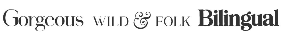
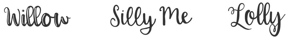
3. Script fonts
Are fonts that look like handwriting, including cursive casual scripts. They convey elegance, creativity, femininity, informality and sociability. They are unique and distinctive. They also tend to be trendy, which can be an issue.
Trends come and go! So use these sparingly, especially in the body of your written items because they can be hard to read. That said, they’re a fun choice if you want to be seen as playful, informal, approachable, or artistic.
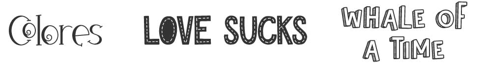
4. Novelty or decorative fonts
These are quirky and bold. They convey fun and are eye catching. They are also distinctive and dramatic. These very stylized fonts are diverse and include unique shapes, forms, or proportions. Use them very sparingly for some of the same reasons as script fonts – readability and trendiness.
Readability
One of your next considerations is readability. Legibility as addressed above in the character of the font is important, but also think about how letters and numbers are going to look.
Think about the capital letter I, the lowercase L and the number 1. Type them together and see how easy or difficult it is to tell them apart. You don’t want a letter L to be confused with a 1 or I, or vice-versa!
Should You Use Licensed Fonts or Free Fonts?
This is important people! Choose a licensed font and use it without the license at your own peril! The companies who own them take their intellectual property, their fonts, very seriously.
If you’re low budget (i.e. just getting started) consider Google Fonts, Font Squirrel or Font Library. These are open-source, free font libraries.
The downside to these is they offer a limited selection. It may be hard to find font families with a range of different font weights and styles (like light, regular, semibold, bold, and more).
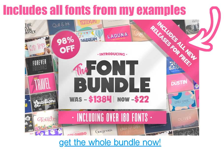
I suggest getting a "font bundle" like the one I used to make this post! It is $22 and contains A LOT OF FONTS you can use without worrying!
How To Pick Your Font Types Wrapup
There you have it! Whether you pick a geometric sans serif or go with more formal scripts, your type styles can help your brand convey the feeling of your company!
I am super proud of you for reading all the way through this! I KNOW it can feel a little overwhelming when you start, but once you know what is going on with fonts you can make a great choice that will serve your business well!
Additional Resource :: How to pair different fonts!