Today I am going to be talking about "flat lay" photography. This is where you put the item(s) to be photographed on a flat surface and shoot directly down at them. I am super interested in Flay Lay for my GlamorouslyVintage Instagram where I post food photography pics.
These are 10 super awesome flat lay photography shots that I found which have a varying number of likes but all of which are visually stunning!
Some things that really matter when you are shooting these types of product photography shots are:
Lighting - you really can use the light to create highlights and shadows in your picture! Some of these are bright and flooded with light and some use the shadows to create depth in the picture.

Color - you can either use a complimentary color to your item to create drama or use a highly contrasting background color (or even white) to make your time pop.
Contrast - with all design the picture will always pop if there is contrast. Some of the items seem to "pop" off the page, this is because they are in high contrast to the background or the items around them!
For each picture I am going to talk a little bit about why I picked it and what I think makes it a great shot.
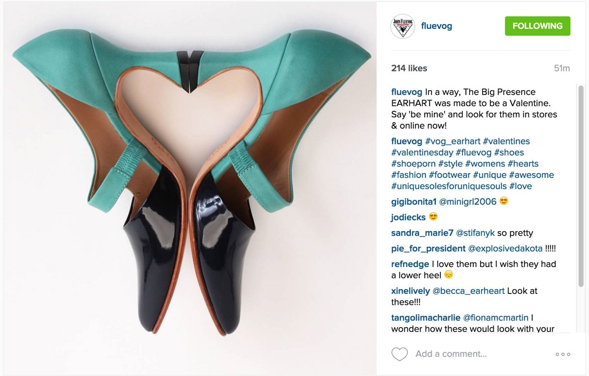
photo credit fluevog


Why It Works
Okay, let's just get this out of the way quickly, fluevog makes a snazzy pair of shoes. Their Instagram stream is full of cute and colorful footwear but this shot stood out for me as they posted it right around Valentines Day. The heart that soles made was a really eye catching feature, over and above the beauty of the shoes.
That said, this shot is super high contrast with the black and teal popping off of a plain white background. I know it seems like shooting on a white background would be easiest, but to get the colors right AND the white to look white really is one of the hardest things to do!
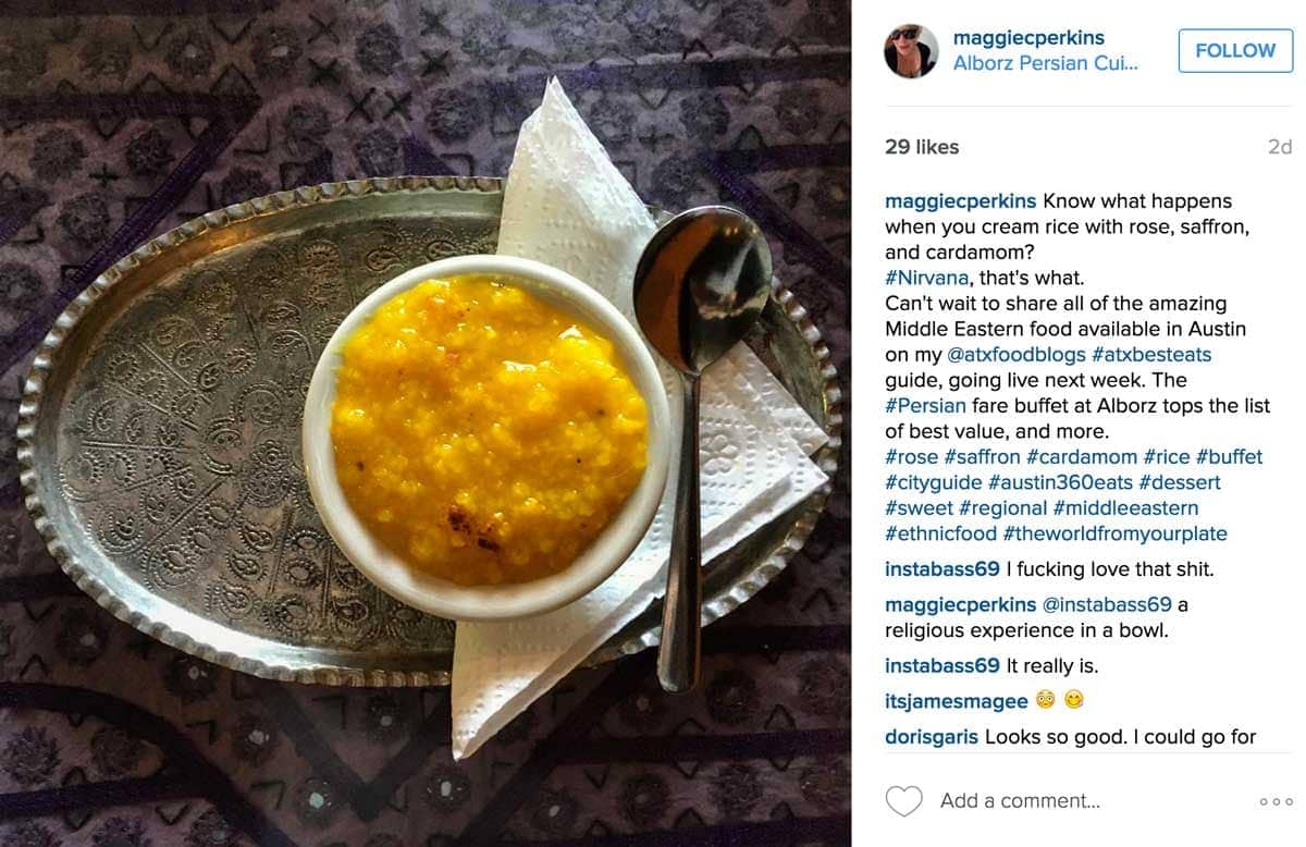
photo credit maggiecperkins
Why It Works
This shot is awesome in a bunch of different ways. First off, this represents Middle Eastern food perfectly. The tray and background texture immediately made me think of Middle East or Indian cooking. Then there is a simple symmetry to this. the tray in the middle, the bowl in the middle of the tray, the napkin in the middle of the bowl. That is super pleasing to the eye. Last but not least, the saffron rice jumps off the photo because of the contrast with the metal tray and the dark background.
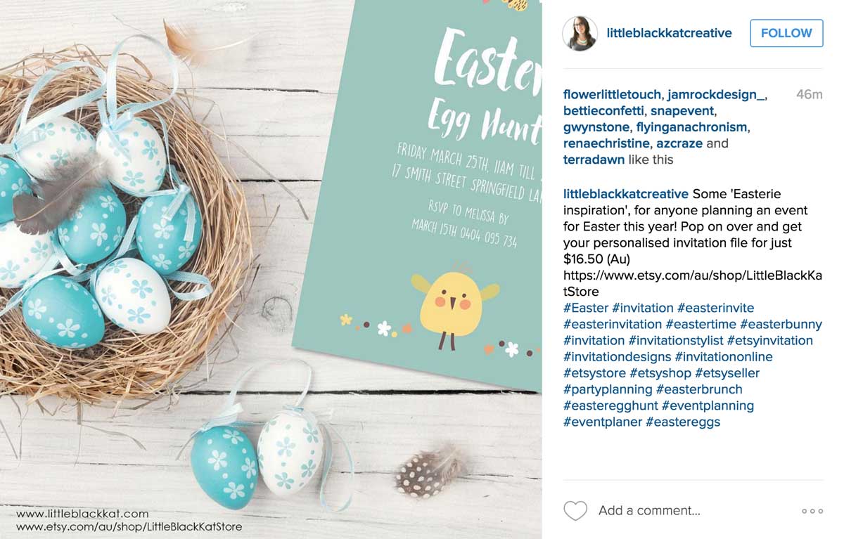
photo credit littleblackkatcreative
Why It Works
This is a super, well put together shot. First off, the product she is selling is an Easter invitation file and you can immediately tell from this shot that it has something to do with Easter and eggs. Next is the fairly neutral background (white boards, tan nest and blue and white eggs) that allow the little yellow chick to be the focal point of this shot. With all the eggs it could be easy to miss that she is selling a digital file party invitation, but that really does become where the eye goes with the green card and bright yellow bird.
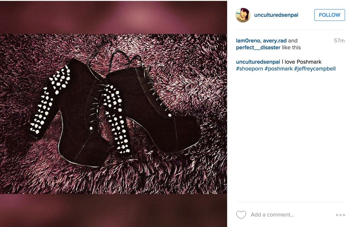
photo credit unculturedsenpai
Why It Works
This is a really low contrast shot. The shoes could tend to fade into the background but because there is texture plus light and dark places in the "furry" background that doesn't happen. Instead the shoes are definitely the star of this show and the silver rivets are popping off the page. "Dark Photography" is a rage right now and this shot definitely is a great example of that trend.
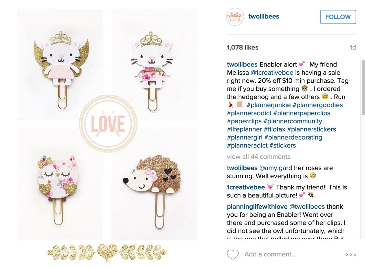
photo credit twolilbees - original poster 1creativebee
Why It Works
First off, this is a little unfair because who wouldn't find tiny hedgehogs with bows adorable, but I digress. This is actually 4 photos that are very slightly melded together with a white grid behind them and the "love" medallion in the middle. That may have been to make slight variations in the "white" backgrounds less noticeable and it works. Even the white on white items are clearly visible and you truly get a "gold sparkle" vibe from these cute little paperclips.
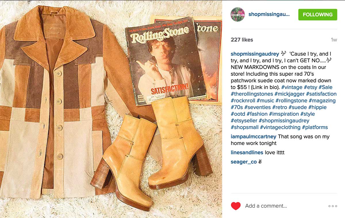
photo credit shopmissingaudrey
Why It Works
This shop has their flat lay photography NAILED. They are selling vintage clothes and each photo is a study in years gone by from the slight yellowish cast of the pictures to the vintage Rolling Stone magazine that they use in the shot to show the age of the clothes. This shot is a monochromatic masterpiece of tans, browns and beige, but as a whole it really pleasing picture.
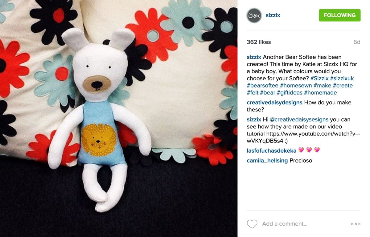
photo credit sizzix
Why It Works
This is kind of a fun photo, and not just because of the cute bear! I would bet that this is just two pillows and a cute bear on black foam core board, but it looks like a fun bed setup. The colors pop on this piece and are truly a fun contrast to the black of the back, while coordinating perfectly with the black flowers on the bear.
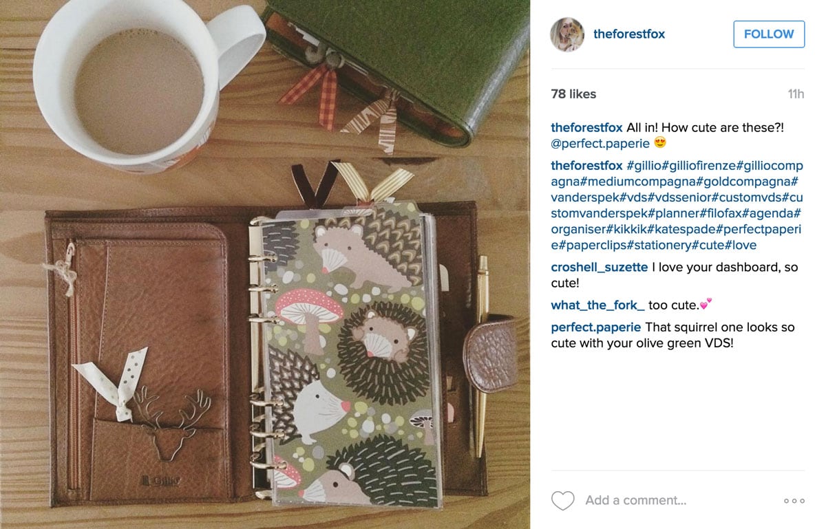
photo source theforestfox
Why It Works
This is such a charming little vignette! There are all kinds of little fun things to look at like the hedgehogs, ribbon clips and the second planner. What I like the most is that the colors are all super complimentary. The green book at the top pulls from the printed page at the bottom and overall it is just a really pleasing picture. The coffee is a similar tone and fills up what would have been a somewhat empty space at the top.

photo credit crochet_knitting_circle
Why It Works
This is a really striking use of color in a photo. Because it is magenta on white, there is super high contrast between the knitting and the background. This one uses shadows a lot to "frame" the story. The top right is light an bright and then there is an almost diagonal line across the middle that separates the light top from the shadowy bottom. The tan pointy stick and the hot chocolate in the middle provide a great bridge between the two really bright yarn bits.
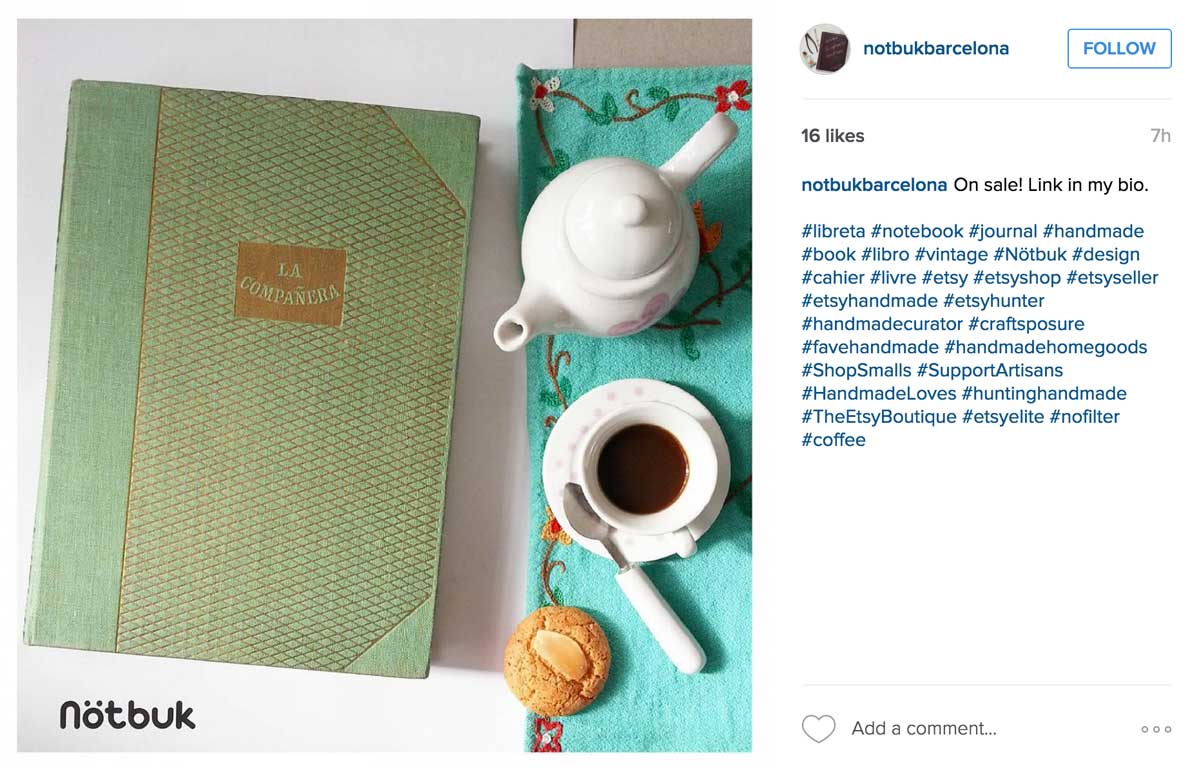
photo credit notbukbarcelona (the picture seems to have been taken down)
Why It Works
The right side of this picture is a straight line with interesting things on it like the teapot, coffee cup and cookie. While I might have moved the turquoise napkin up a bit to cover that gray area, it is still a striking frame for what is going on on the left side, the notebook. Because the blue-green colors are complimentary rather than the same, the notbuk jumps off the page as a focal point.
Flat Lay Photography Wrap Up
Each of these photos has a great lesson to teach us about how to take a stunning flat lay photograph. The styling, shadows and colors are all working together to make a picture that seems to jump off the feed. As you can see, many of these had multiple hearts at the time I screen captured them and most have increased that number since then.
Taking great flat lay photographs for Instagram is a great way to get your feet wet. Most of use our iPhones to do these shots and so no seriously technical equipment is necessary.
>> Check out this post if you would like more on How To Take Super Amazing Product Photography With Your iPhone


