Authority marketing for people like coaches, speakers, and authors is a tricky business. Sometimes talking about how wonderful you are seems to be a little boastful. But if you don't talk about yourself, how can you let the world know all you have to offer?
One tried and true method is to make a personal brochure that you can share with prospects!
For example, say you decide to do a “podcast tour” to promote a new book or course you are launching. Instead of sending the same old, same old about us page or media file via email, why not send an actual, “sent in the mail” brochure to introduce yourself to the host?
Or how about this (that actually happened the first time I got that call to do a national speaking event)? You find out that you are in the running for a keynote speech, but learn that there is another speaker competing with you. Having a personal brochure helps to make you more “official” and stand out. Send your brochure to the organizer to highlight all the benefits of hiring you!
Instant Authority
I have used brochures right from the beginning of my self employed career. When I was starting out as a baby real estate agent I made a personal brochure talking about all the cool marketing experience I had and avoiding the fact that I had zero experience selling houses.
While I knew I would do an amazing job for my clients, without that simple brochure I would have had much less confidence of convincing anyone else of that!
The thought of my clients was, “who would have a brochure like this if they weren't a professional already!”
The neat thing was that it was super easy to make that brochure in Vistaprint and the cost to print it was super small in comparison to the income I gained from those first listings!
All Your Best Assets In One Place
One last thing before I get into what to include in your brochure… Doing this kind of thing really helps you to focus your efforts on defining your value to the world.
As I was doing my speaker / author brochure, I continually refined the message that I wanted to send. While the internet semi-allows you to have a wide range of qualifications, putting your information down in written form helps to corral all of those bits and pieces together!
How To Set Up Your Brochure
If this is the first brochure you have ever done, setting it up can seem a little kerfuffly. There are LOTS of options about layout and kinds of paper to use. So the first thing to do is breathe… just slow down and figure out what you are trying to accomplish with your brochure.
- Will you have lots of pictures and need a bigger space?
- Do you want “just the facts” and need a smaller area to cover?
- Do you personally like to have something in “letter size” or would you rather have it be the right size to put in a brochure box?
What Size To Pick
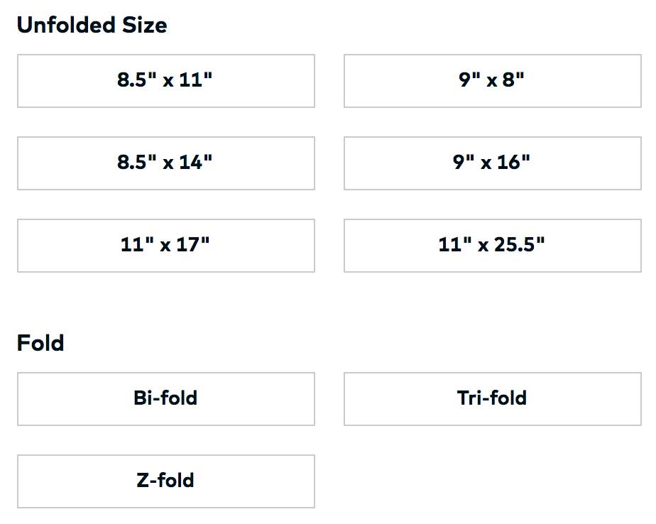 There are generally three types of folds for brochures… bi-fold (which is just a paper folded over once), z-fold (which is accordion style) and tri-fold (where it has a flip open section).
I like to use a tri-fold layout because that gives me 6 total panels to use (front, back, flap and then three natural inside sections). This is the layout that are normally in brochure boxes when set up on letter sized paper.
The cool thing about going with either a tri-fold or bi-fold in 8.5X11 to start is that you can design it and then print it out on your home printer to make sure you like the look of it before submitting it for printing! If this is your first brochure I would start there.
I used the 8.5″ X 14″ tri-fold layout for my brochures as that gave me a little more room for my pictures and words.
I also love a 11″ X 17″ bi-fold as that is functionally two whole letter sized pages when it is folded over. If you like things to be “normal”, this would be a great option for both design and printing as you can carry it around in your regular letter sized folders or planner.
What Paper To Pick
I feel like paper selection is a personal choice, but with a few suggestions that I have learned over the years!
Glossy Paper… back in the day super glossy paper was all the rage and it really is pretty, but shows fingerprints if you have big areas of one color. I remember getting the most amazing brochures from one of our marketing peeps that were stunning (until you touched them and they had little finger marks all over them!)
Matte Paper… I get matte business cards for two reasons. First they are super high quality and look modern and cool. Second because matte tends to hide a few flaws, much the same way that a lower gloss paint hides flaws on your walls.
Recycled Paper… I am a bit of a tree hugger so I decided to go with Premium Recycled Paper for my brochures. It is good for the planet and fits into my brand of conscious marketing.
How To Design Your Brochure
One thing I love about Vistaprint is that they have TONS of great pre-made designs for my non-designer peeps.
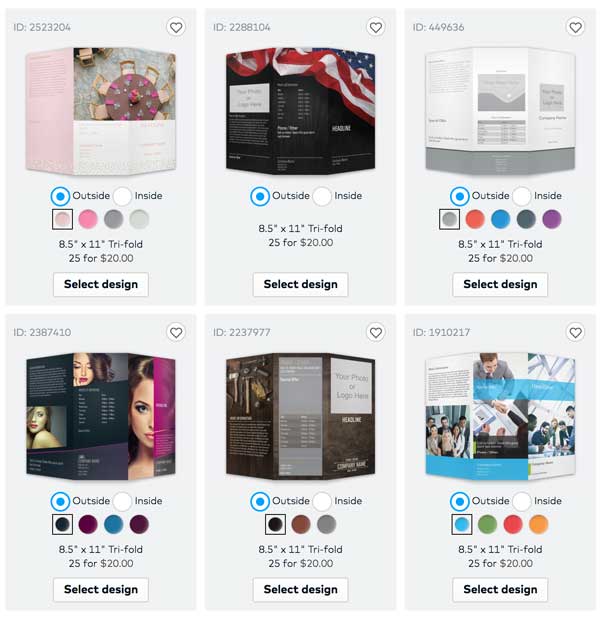
So first off, if you are not a designer, I suggest you use the designs available on Vistaprint (here are just a few of the 4 PAGES of designs you have to choose from if you pick the 8.5″ X 11″ trifold!)
These are super professional and you just need to change the words and swap out pictures to make something truly epic.
If you want a more custom design but are not a designer, Vistaprint has a DIFY (do it for you) option that is great to use as you KNOW that what they make will print out perfectly! Sometimes it is a struggle to get other designers to know the exact requirements needed (which causes a bunch of back and forth designs!)
What To Include In Your Brochure
Doing a brochure can seem daunting until you realize that you probably have most of what you need already done! I pulled together my brochure in a matter of days and was able to use A LOT of what I already had lying around on my website.
Contact Info
Let's just start from the most important part of your content. Having a brochure is great, but if no one can find you after being “sold” on how great you are, then it was a wasted effort!
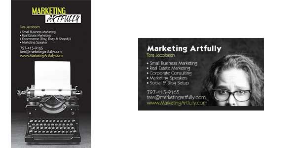
I tent to make my contact us section look like my business card as closely as possible. This is definitely a case where making all your stuff “matchy matchy” will pay off big time in professionalism!
As you can see, they are not EXACTLY the same, but there are similarities that stand out like the same font, bullet points, colors and black & white picture background.
About You
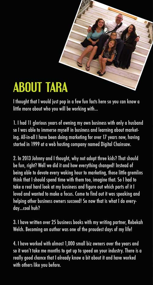 So the first thing you want to decide is how much to share about your work and your life. Some people feel really comfortable with sharing a bunch about their family or personal life (me) and some want to keep it purely business focused.
Either way is fine! Don't let anyone tell you that you have to be “more professional” and share less personal or that you have to be “more personal” if you are only comfortable sharing professional.
I have found that by including information about adopting our kids, finding focus and adapting my business I have an instant rapport with the kind of clients that I want to attract.
Please don't forget that your About Me section is a great place to position yourself to appeal to your perfect customer!
Your Accomplishments
Okay, I know I said there was one “about you section”, but with this Authority Marketing brochure the whole darn thing is about you! So here are some sections that you could include…
- Books you have written
- Courses you are selling
- Speeches you can give
- Testimonials from past clients, podcast & webinar hosts or event planners
- Pictures of you speaking or writing
- Awards you have been given
- Your team
- Your creation process
- Reviews of your products
- Product pictures
- Your timeline of accomplishments
- Celebrity endorsements
- Trust symbols (like where you have been published or where you sell your products)
- Company Mission
- Social positions
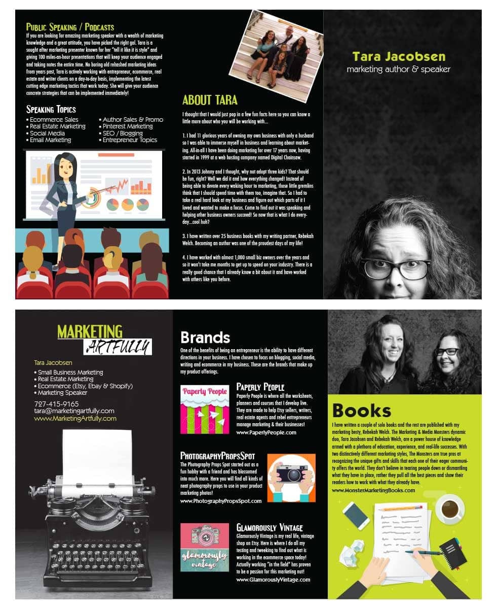
Here is my final brochure design! On the first flap they see I talked about my speaking as that is what I will be using this piece primarily for. The back is about me and the inside talks about my brands and books. As my authority is in Real Estate, Ecommerce and Writer marketing, I wanted to make sure that this was highlighted in my brochure WITHOUT me having to say that over an over again. Just by looking they can see that I have ecommerce shops and have written books, subtly showing that I am an expert, rather than saying I am an expert.
What Not To Include In Your Brochure
Words, Words, Words
When you see all that big open space, it might be tempting to fill it up with words, words, words. But resist that! Make sure that there is negative space in the form of pictures or open blocks without text.
People's eyes need a place to “rest” when they are looking at your brochure. Additionally by having more space you can increase the effectiveness of your headlines.
Crazy Social Links
Do not include all the links to your social media written out like this:
- www.Twitter.com/taradactyl
- www.Facebook.com/marketingartfully
- www.Pinterest.com/tarajacobsen
- www.Instagram.com/tarajacobsen
Very few of your brochure readers will want to sit and type in all your social links! If you are social focused, please make one page and put all the links to your social sites there!
OR better yet, pick your very favorite social media site, include some pictures of your best posts and include that link as a way for them to connect with you! 12 links are bad, one amazing link is great!
A Last Word About Your Authority Marketing Brochure
Last but not least, I want to talk about the finality of doing a brochure. Years ago when you ordered a brochure you had to get 10,000 at a time and spend a fortune. The nice thing now about companies like Vistaprint is that they allow you to order small quantities with a much lower buy-in cost.
Order some brochures (say 25 to start), send them out and see the response. Then if you need to, make some changes and get a new batch. This is going to be a key piece of marketing for you so taking the time to do it right is super important!
About Vistaprint
 I was approached by Vistaprint to write this post and to say I was happy to do it is an understatement. I was thrilled to be able to devote a bunch of time on a topic like this that is so important to my peeps!
I have used Vistaprint for years to do business cards, postcards, fun inserts and more! Their quality is great and the prices mean that I don't have to be precious or hoard my marketing material only for people who are “worthy”.
I give out my business cards to anyone who will stand still and am thrilled to send out my brochure or postcards anytime someone seems like a good fit to work with!
>> Get started on your brochure today!
This is a sponsored conversation written by me on behalf of Vistaprint. The opinions and text are all mine.

