There is a debate raging now about whether plain jane, text based emails work better or if "newsletter style" emails with lots of pictures work better for getting opens in email marketing.
At least there is between my "email guy" and me. I started this project with my flag firmly planted in the "I like pretty emails so that is what I am going to do" camp and he said that my emails were ridiculously long and cluttered which was keeping me on the promotions tab in Gmail.
So I showed him, I sent a plain jane email asking my peeps which they liked better and got over a hundred responses back. Some were mixed but at the end of the day the results were
>> 61 percent liked the plain and only 39 percent liked the pretty....sigh
And That Is From MY List
So think about this, my list, who has been getting beautiful emails from me for years says at almost 2-to-1 that they like plainer emails. For examples, this is one of the great remarks I got...
From you I like pretty emails. I think your Marketing Artfully header adds a personal (because your photo is part of it) yet professional dimension to your emails.
Here are some of the remarks that I got and below I will give you my commentary...
Good Commends For Pretty Emails
- I love your multi-link, multi pictured emails
- I like pretty emails where the brand or personality shines through
- I like pictures!
- I always like the links
- I like a picture or two (but I open my email on my laptop or tablet)
- Plain is not you! I love your pictures and links
- I do not do email on my phone so pics are not a problem
- A picture is worth 1000 words
- I liked your emails just the way they were
- I like your pretty emails
- I find plain text hard to get by the second paragraph, I prefer bullet points and pix!
- So I like something visual, even if it just a funky font, or a different color font
- I do like the pretty ones better; this one felt like "dry toast" for my eyeballs
- I like pretty...artsy, fartsy stuff
- I LIKE the prettier emails better as well…..but the same thing - since MOST people read now-a-days from a phone or tablet (ugh, I don't unless I have to) but my stats show me more people read from those than a computer
- The only thing I would ask is, would it really hurt to have a header?
- Pretty gets my attention and I’m more likely to click through
- But there's a LOT of other people who are just like me...and usually only read emails on their computer
- Yours have always been informative and attractive so the artsy slant didn't detract from content at all
- I like color and it gets my attention, I read emails a day or two behind but always save appealing ones
- I like the pretty ones, they inspire me

Good Comments For Plain
- Honestly I like the plain, the other one is too busy for my brain
- Keep it simple..simple works every time
- I like pretty stuff, but maybe "simply pretty" would be a good mantra!
- TEXT! It doesn't need to be pretty
- I always thought I like fancy emails and different bright stuff that could catch your eye, but I read this email from beginning to the end which is really rare with me
- I think I like plain, weird! (send from her iphone)
- I like it with no pictures! takes less time to read and get thee idea you putting out
- I'll be honest that it took a while to get used to your emails and I often saved them until I had time to go through them
- Too many pictures and I just get overwhelmed
- I live in a very rural area on satellite internet and the plain emails take up less bandwidth
- This would be the first email that didn't land in my spam folder
- Easier on my phone but you are boring (I think they mean the format, not me!)
- I think your email is too long. I would keep it shorter so it fits on a smart phone screen
- I greatly preferred this email to your normal ones, because it was so focused and actionable
- I like pretty emails but find this one very readable but a bit boring
- YAY!!! It Works! It Works! From the primary tab for the first time Tara! (from my email guy)
- If this email was only designed to elicit a reply you have done a very good job
- No offense meant, but I think this is the first email from you that I've actually read in a long time
- I like these, I tend not to read the ones that have too much going on
The Email Details
So here is a comparison between the email that I sent and one of my "normal" emails.
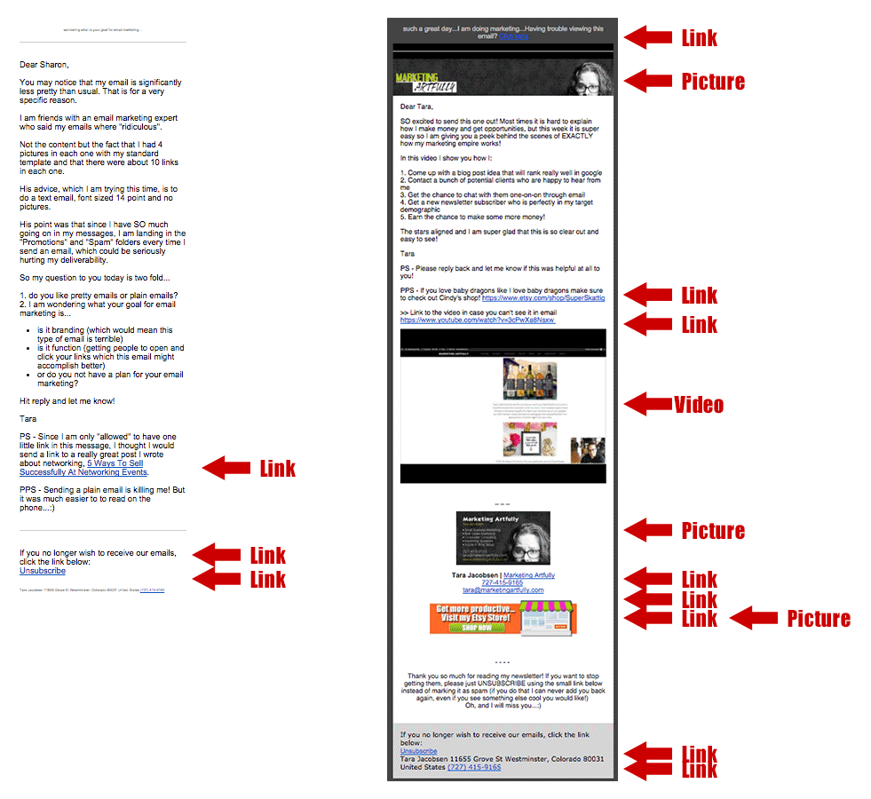
There is one "extra" link in the plain one and the two that Infusionsoft requires. There are 8 links, 3 pictures and one video in the "pretty" one. Hmmm now that I see all those, maybe I was bordering a little on the ridiculous.
The details:
I sent 3,109 emails
26% were opened
3% clicked my link (91 clicks)
this is 8% over my regular open rate
3 were marked spam (that is a tiny bit high, but not unexpected with crazy plain format)
21 people unsubscribed
to give you an idea of how that stacks up, for the second email pictured:
I sent 2,986 emails
20% opened
2% clicked my links (61 clicks)
2 were marked spam
16 people unsubscribed
Holy cow! Open rates were higher and more people clicked.
What Are You Trying To Accomplish?
One thing doing this experiment that smacked me in the face was wondering, what am I trying to accomplish with my email marketing. Here are some possibles:
- Inform my audience about marketing (check, got that one down and that is my primary goal)
- Increase traffic to my website (I got more traffic with my one link than I did putting in 8 links)
- Sell stuff... here is where it gets tricky. Yes! I want to sell things that I think will be beneficial to my audience, but I feel like that is the job of my website more than my email newsletter list. Maybe I am wrong, but this may have to be my next experiment as my goal on my newsletter list has never been to sell, sell, sell.
Do just one thing!
So what came through loud and clear for me was that each email should only try to get people to do one thing. Click through to a longer post, find out more about a product I think they will like or hit reply and tell me something. That is it. Asking them to sift through everything that I had in the crazy email just fritzed my readers out and made sure that they did nothing or worse yet... saved it for later...
Later means never mostly!
One thing I heard a lot was that since they were so information filled, people were saving them "to read later". Oh crap! I have a read later folder and have to say that I rarely get to it (like never). So if my peeps are popping open my emails and then getting overwhelmed, I am thinking that they are reading when I am actually just going into the "maybe someday when I have enough time to look at this" file.
Who Is Your Target Audience?
So here is something that I got anecdotally. The people who like the pretty emails are generally reading them on computers. I read my emails on my computer so they don't seem to "busy" or hard to follow.
My email guy is younger and more technology based than most of my readers so he is probably checking his messages on his phone most of the time. YES! I get it, lots of people read their messages on their phones now, but my target subscriber is a 45-65 year old professional woman who is super busy and who probably does read her emails primarily on some kind of computer or tablet.
This is one comment that I got from a gentleman who is not my ideal reader..."I like the new emails, easy on eyes but not interested please unsubscribe." Ironic that, I DID get to his inbox, but he didn't like my content so it didn't matter anyways.
How Does Your Audience Read Your Message, Phone or Computer?
So I think it is worth considering how people are accessing your content overall to see if they will be primarily reading your emails on a computer or phone. I checked this by looking at my Google Analytics:

72% of my readers online are using a computer and that is where I get my signups so it makes sense that they are probably reading my emails on their computers too!
It also makes sense that not as many people are reading my web content on phones because most of my posts are long (over 1,000) words and are graphics heavy too.
Awesome info I got from a reader for those wanting to do promotions
I got an amazing email from Joe Dively, who did an email marketing campaign for over 10 years. His degree is Security Risk Management so he is pretty proficient with statistical analysis. His personal website is http://joed.com.
My emails would have 4 to 7 paragraphs each covering a specific point, most of these points had a link embedded in it for an action or for more information. The number of links didn't seem to matter so long as they were appropriate to the email. I also allowed sponsors for the email at the top and bottom. These were clearly labeled something like this.
I would like to thank XYZ company for helping to sponsor this weeks newsletter and they a text link by that sponsor. I saw no statistical difference in actions with or without those 2 sponsor links.
My Email Guru (nag)
So all this was brought about by my email marketing deliverability guru, Chris Lang. Chris REALLY cares about how email technically works and how many get to the primary inbox as opposed to hitting the promotions tab in Gmail.
Every week when I sent out my emails, Chris would email me back with helpful information about how I screwed up that week's deliverabilty... HA!
But results don't lie and the results for this week's email show that there is a HUGE difference when you have fewer pictures and links as far as increasing your open rates (I was up 8% which is a pretty big number!)
If you would like to learn more about this, please check out his awesome website, Email Delivery Jedi.

