Selling on Etsy involves lots of moving parts, but one of the biggest ones might be the quality and style of your product photography. You can have the best Etsy SEO and the most awesome descriptions, but if your pictures fall flat you will struggle to convert sales.
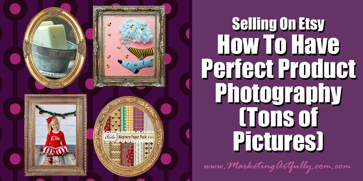
I am a visual kind of girl and when I am shopping I KNOW that the pictures on the products can make or break my pulling out my wallet!
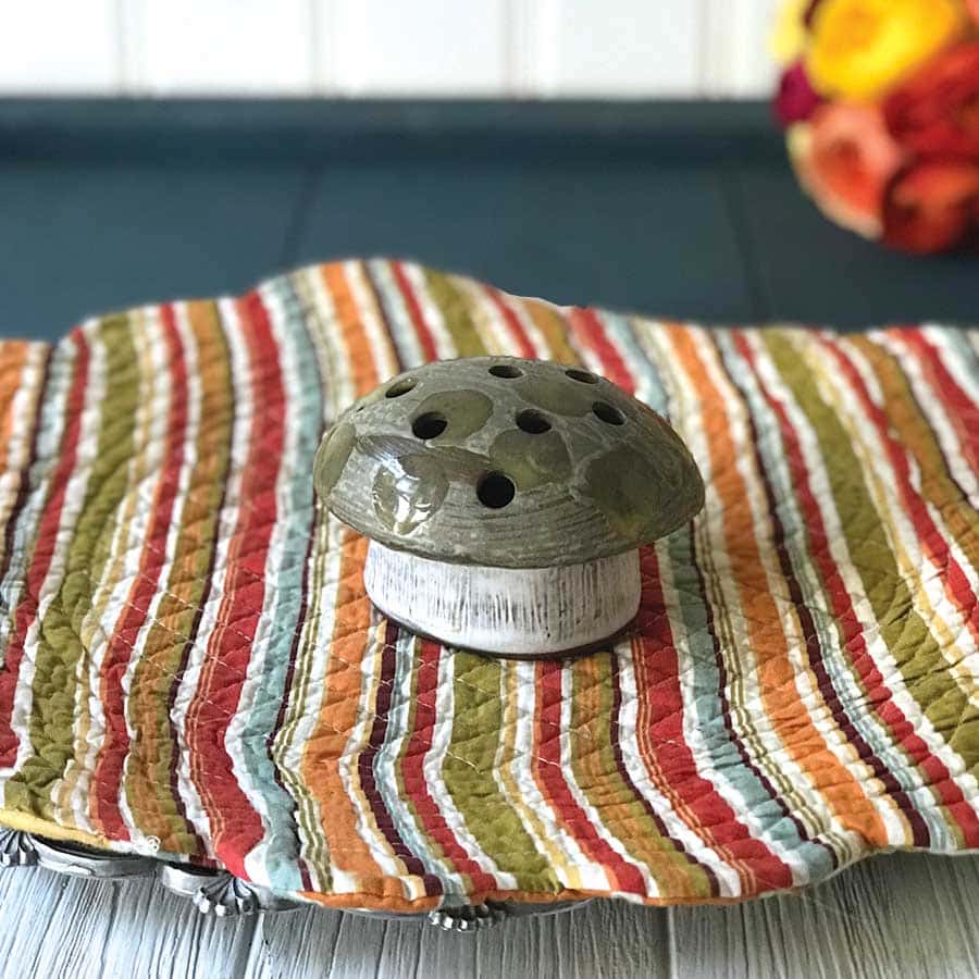
UPDATE! I have been obsessing about taking better product photography and NOW I feel like I can add my picture to the mix! This is a photo that I took for my previous vintage shop and I think it rivals some of the best photos out there!
What Makes A Great Etsy Picture?
After having looked at thousands of pictures for this post and talking with hundreds of Etsy sellers and buyers, there are two things that I found be true:
1. People want to see every bit of the product that they are buying
2. If they can see it "in action" they are much more likely to buy it
I think the first is pretty human and we can understand appreciate that pretty easily. So make sure you are using all 5 of your picture spots.
The second one is much more telling I think. A lot of times we want to show factually correct versions of products, avoiding the whole "this or that is not included in the sale", but it is seeing it in action that makes the most difference to the buyer. I found this to be an important distinction!
How I Chose The Pictures To Include
I used a number of criteria that may seem a little random, but I really wanted to do this once and have a great overview of all kinds of product styling.
1. Professional photography - a couple of the pictures were obviously done by professional photographers and that is great! If you have the money to pay for a professional to take your pictures do it.
2. Good amateur photography - for the rest of us, I wanted to show what could be done with a little bit of forethought and effort. I don't think every product has to have professional photography to sell well.
3. Awesome styling - a lot of these pictures are snazzier because they have extra "bits" around them. This seems like a super easy way to jazz up your pictures!
4. Interesting or different subjects. I get that if you are selling a baby product it would be best to have a picture of a baby using it, but that is not always possible. I liked some of these pictures because they showed how you could present a product without the obvious photograph.
AMAZING Etsy Seller Pictures
I have permission from every one of these awesome sellers to use their work in my post. THANK YOU to you all for your kindness and generosity in letting me share these with the world.
I have included my thoughts about the pictures. All opinions are my own and are simply the reasons I chose the picture and then, where appropriate, a comment about how it will help their marketing efforts. (I am a marketing expert, not a professional photographer)
I also have them all mixed up rather than in categories because that is how my creative mind works. When I am looking for inspiration I want to have an amazing mish-mash of ideas to get the wheels turning.

Okay, the ShopVivaLaGlitter wins my unofficial contest! Brittani, the owner, has a really great picture of the shirt you get, but it is the rest of the "stuff" that really made my marketing heart sing. She includes links to the other stores where you could get the bow, shorts and necklace to complete the outfits. Just in case you are worried that this will make you less successful, just know she has sold almost 35 THOUSAND items to date. YAY Brittani!
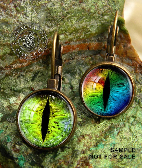
I thought this was a super neat way to display a digital download. It is okay to have a factually correct version of what the product is, but when you see it in action it makes so much more sense and makes me want to do crafts like this. I already favorited a set of cat collage pages and now just have to get crafting! This digital product is from the CobraGraphics shop.
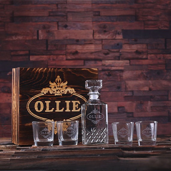
This is a manly picture and I think really helps their marketing. It is immediately apparent that this is a masculine gift and they are marketing it to the "man cave" and groomsmen demographic. Super job! This is from the TealsPrairie shop.
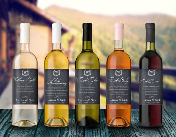
I had a really hard time with this one because I wasn't sure I liked the picture as much as I loved the concept! How cool would it be for my realtor marketing peeps to give a series of these as a housewarming gift. First night in your new home, yay you are unpacked etc. GREAT product concept and really nice photography that explained the item. This digital product is from the I Custom Business shop.

I LOVE the styling in this picture. The snazzy gold ampersand and the gold jingles hanging down make me feel like having this item will make my office more festive! Great to see a printable item like this in action. This digital product is from the ScreenQuotes shop.
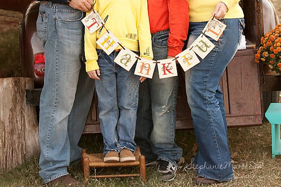
This is a great example of how a professional photographer can evoke the mood of of a product. Just seeing those family legs hanging out there together made me think of the holiday when everyone is happy and loving each other. This holiday product is from the bekahjennings shop.
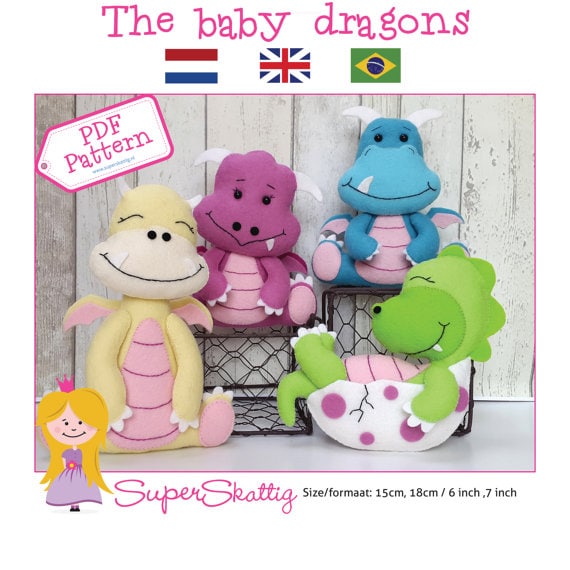
I loved this one first because baby dragons are my sweet spot and then because there was a bunch going on here. Cindy sells patterns and feel like she conveys that very well in this photo. Yes you see the dragons complete, but very plainly she has superimposed a PDF Pattern in a very tasteful way on the picture. This printable PDF is from the SuperSkattig shop.
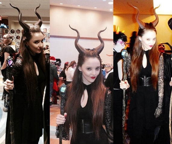
I really like that they are showing the Maleficent horns in use in this picture! Yes they are neat to see by themselves, but when you see them in all their glory you can start to imagine that you will be that beautiful if you buy them too! This is from the MudpiesandMajesty shop.
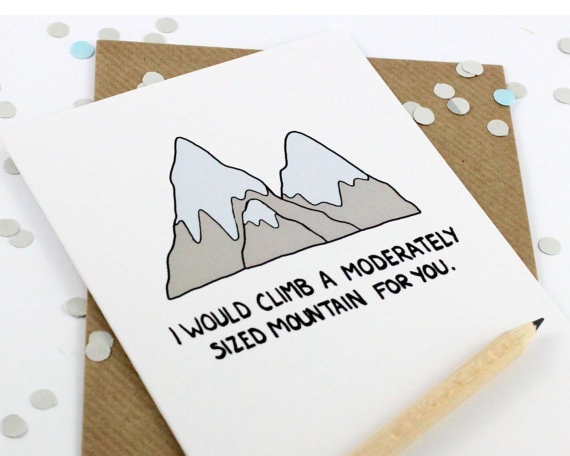
This (very cute card) made the list because the styling is so simple but really jazzes up the card in a way that would not be so obvious if there was just a card with an envelope. This is something that anyone can do! This is from the PostLoveDesigns shop.
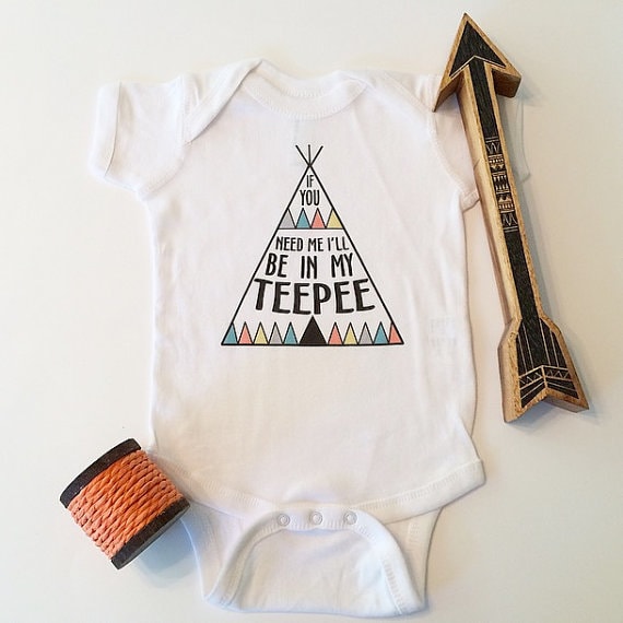
Another easy styling photo! I love the little touches of the arrow and the yarn spool that just add a pop of color and dimensions! I like how these two pictures that are predominantly white are still colorful and pop. This is from the TrendyCactus shop.
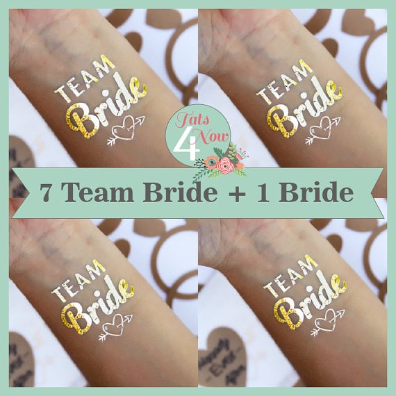
This one is a great example of how to let a buyer know that they are purchasing a set of products. Even though they have the 7 Team Bride on the picture and in the description, I am sure that the repeated image drives that point home! If you are selling multiples of same product it is great to have multiple items in your photos. This tattoo set is from the Tats4now shop.
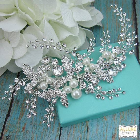
This one is so striking. It is surprising how classy the tone-on-tone of the teal colors looks. That is because while the colors are similar the textures are different. Additionally, they are using the history of "Tiffany's Blue" to subtly connect their product with that very successful company. This bridal product is from the AllureWeddingJewelry shop.
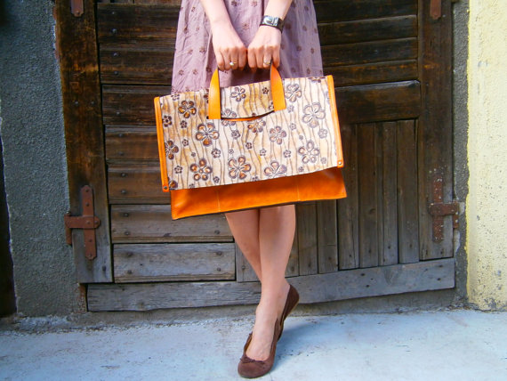
This picture is super feminine and lets the buyer start to think about how owning a briefcase with flowers will set her apart from all the other boring brown briefcases out there! The woman who will own this bag is definitely someone who is not afraid to stand out in a crowd. This is presented by the 74streetbags shop.
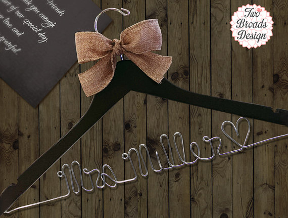
I liked this picture a lot because it is not the "normal" wedding styling of white and tulle. instead it is a little edgier, while still conveying the wedding theme with the invitation in the background. I talked to one of the "broads" and she said this was not a stock image with the hanger overlaid, but you could do that pretty easily. Brought to you by twobroadsdesign.
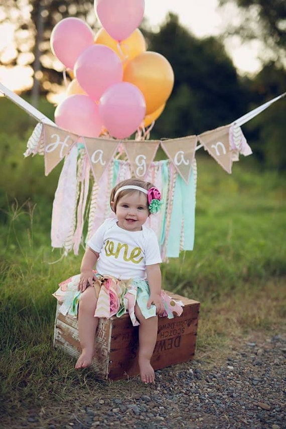
I am not sure if this was taken by a professional photographer or the shop owner, but it is really cute! The expression on the little girl's face alone would help to sell this item. This is a great example of using a human model to demonstrate the product, BUT it would not be nearly as impactful if not for the hanging garlands behind her. This is from the ThePickledPeanut shop.
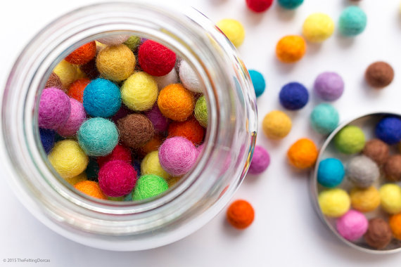
I have no idea what these little felt balls are used for but I LOVE them. Picture-wise the colors pop off the page and really are smashing and fun! This is a case of allowing the product to be the star BUT the glass jar and the lid add to the interest of the picture. This is from the TheFeltingDorcas shop.
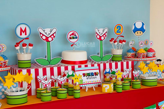
When you are selling a digital product it can feel like it is okay to wimp out and not actually show it "in real life". This shop was not wimpy at all, printing out the entire digital file and showing how fun the birthday party would be if you purchase their file. Great job from the LucasPartyStudio shop.
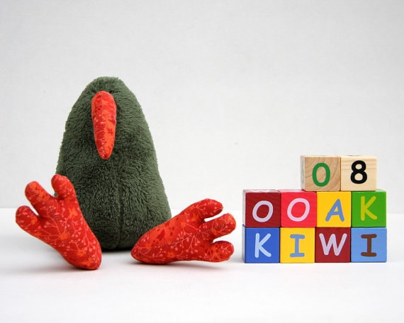
The white background of this picture makes the stuffed plush toy really pop off the page. It would be cute on it's own but adding the little blocks that say kiwi imply that this is an exotic and interesting creature. This product is from the andreavida shop.
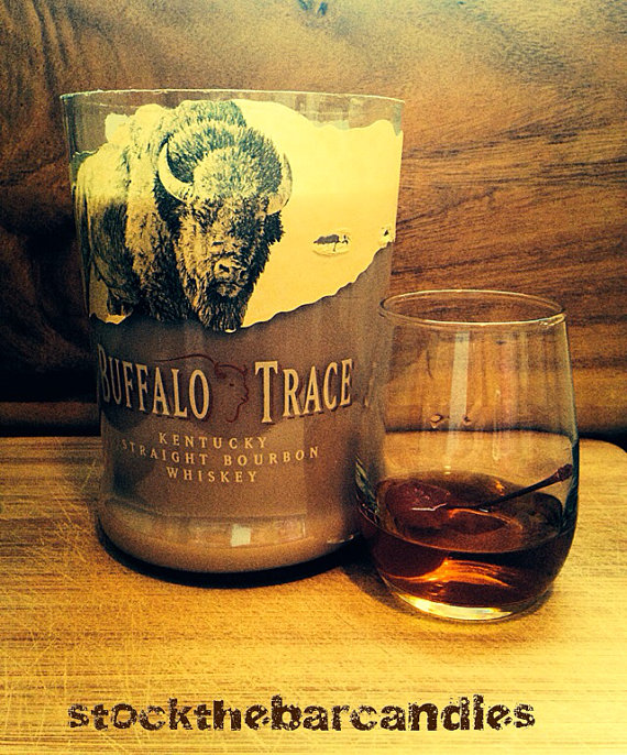
This one is super interesting to me. It is a man candle for sure and you can tell at a glance that it is a little something different. The glass of bourbon is so interesting, I almost feel like I can smell the smokey bourbon that would be the candle scent. This is presented by the StockTheBarCandles shop.
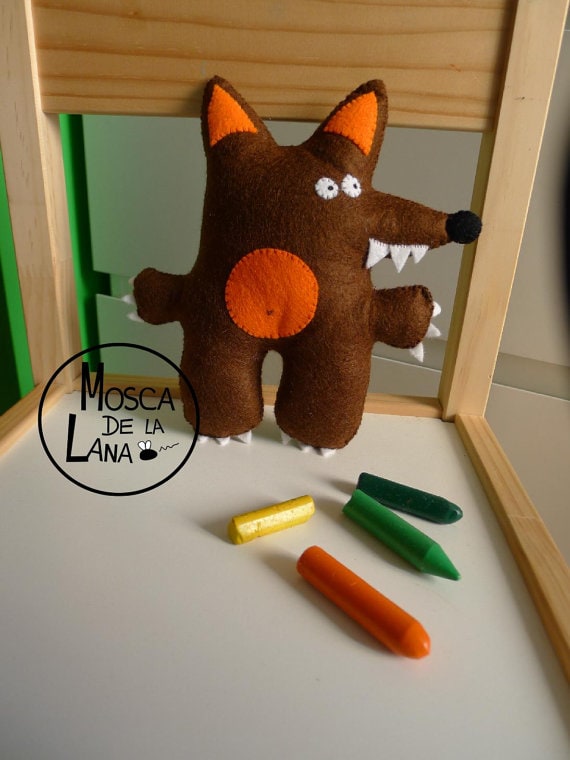

This is really a cute wolf! It is a striking product but adding the chair and colorful crayons evoke a fun, childhood feeling. I don't feel like this would be super hard to style this one, but it creates a big impact. This is presented by moscadelalana.
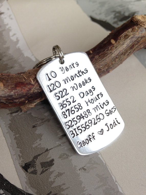
I have to say this is the most clever styling photography of the bunch. It appears to be a piece of paper with the textured tree trunk and then there is a little piece of the real branch that pops up the tag and adds dimension. Taken separately they are nothing special or interesting but the entire composition is really eye catching. This is presented by the TrashedGifts shop.

I feel like this is the picture that started this whole awesome post! I was doing a search for soaps and making a treasury of them when I found this picture. Now, it was a scent I like, but I almost feel like I picked this shop to buy from because the picture just so pretty. This product is sold by the DancingMooney shop.

I LOVE how this Halloween hat is styled. There is a fun texture behind it with the white shutters and then the added touch of the candy corn. It lets you get a feeling of how it would fit into the decor of your home. This is a product from the SlippinSouthern shop.
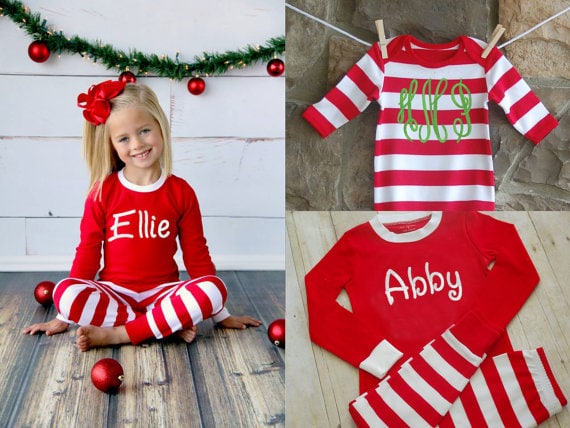
There are a couple of things that I REALLY like about this picture. First I am fascinated with using multiple pictures as your main picture. This is done very tastefully and helps to show a number of different views of the jammies. It also has a really neat touch of Christmas styling without being overwhelming. Presented by JennLorynDesigns.
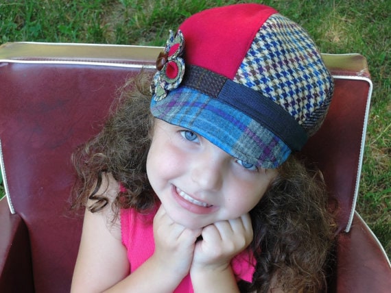
This seems like a fun little candid shot like you would see on Instagram. I am sure that many critics would say it is not "professional" enough, but I LOVE IT. It feels real and like if I got this hat for a little girl she would look cute and be smiley! Sold by the SewMuchStyle shop.

I like picture very much from a marketing perspective. First off, it a good picture that shows off the luster of the opals. BUT the thing that caught my eye is that the picture shows multiple rings on each finger. While no one would probably wear this many rings at one time, they sure might buy more than one instead of just a single product. Sold by HAWKHOUSE.
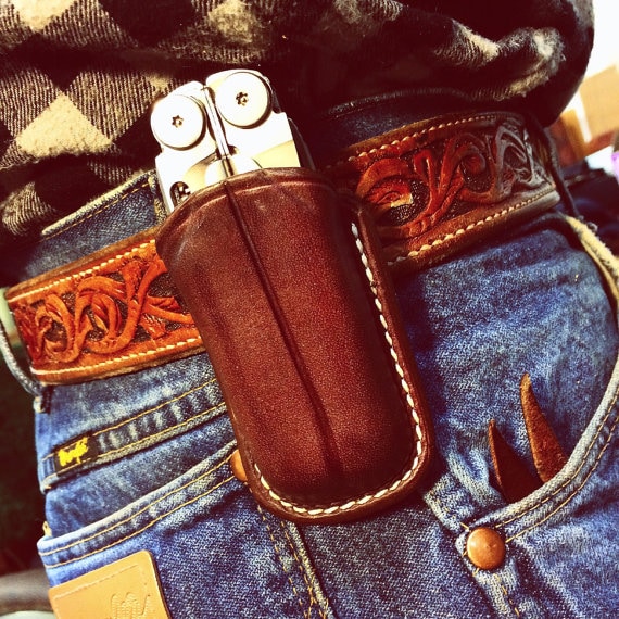
This is a very manly product too, but for me it seemed more like a sales tool to appeal to women rather than a pure man play. I think that a woman looking at this would think, that would look great on my husband's belt. It also has a Western feel that would appeal to different group. This is from the Nayscustomleather shop.
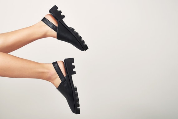
I have been looking at hundreds (or thousands) of pictures for this post and I have to say that this picture really jumped out at me. The different perspective that it shows the clogs from really pops off the search page and makes you think. Brought to you by the NormanAndBella shop.

This is a great example of how to present a "hard to photograph" item. While this is a a fairly dark picture, you can see the product clearly as it jumps off the white background. Adding the green foliage and the brown bases adds to the photo. From the Primigram shop.
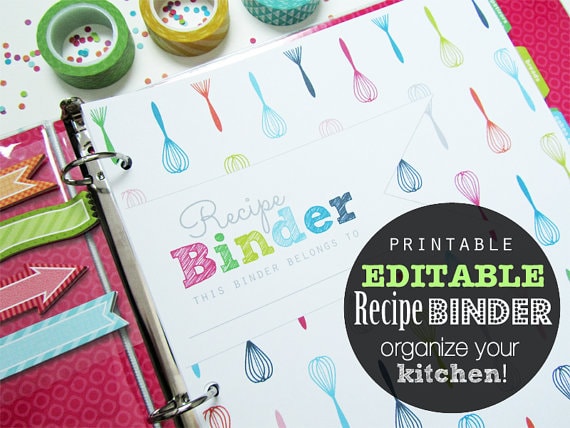
This is a super example of how to present a digital product. Yes she printed out her product but it is the little arrows on the site, the washi on the top and the confetti that makes this product photography pop. Additionally I LOVE that she has the benefit of buying her product in the over lay (organize your kitchen). This product is from the CleanLifeandHome shop.
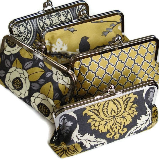
I love this item! It shows clearly that you are going to get multiple items in a really beautiful color scheme (that chartreuse green is my favorite). But it gets better! Not only are they similar enough to be a collection, they are different patterns and pretty styling. Super product photography from cutiegirlie.
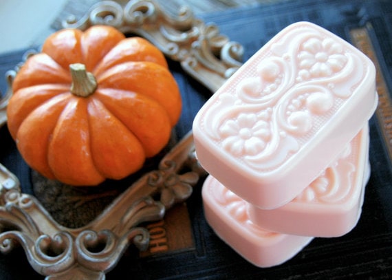
DancingMooney is the only shop that I have included twice, but that is because her pictures are so amazing. For this one, the theme is so apparent, Halloween with the pumpkin and the little words peaking out in orange. But then, she has the pumpkin there too to show that the soap is pumpkin scented. Without that, it would just be a little orange soap! oh my gosh...she is having a giveaway for the pumpkin soap! head on over to her site to check it out
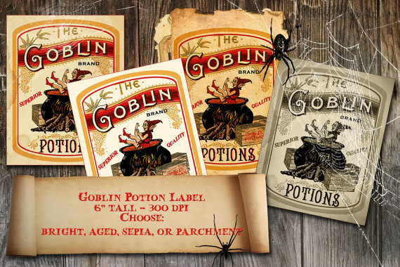
As a digital product creator myself, I have been trying to figure out how to present my worksheets in a physical way. I love a couple of things about this product photography. First that you can tell right away that it is Halloween themed with the spiders and cauldrons and all. And secondly the banner that is describing the product is in that same theme of spooky Halloween. Nicely done chocolaterabbit, nicely done.
Relate Post: How To Sell Your Digital Products With AMAZING Product Photography
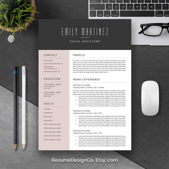
Here is another great example of product photography for a digital product! This might be a "standard" background that they use for each product, but if you were trying to write a resume and saw this, you would feel like it would be easy and stylish to do! Presented by ResumeDesignCo.
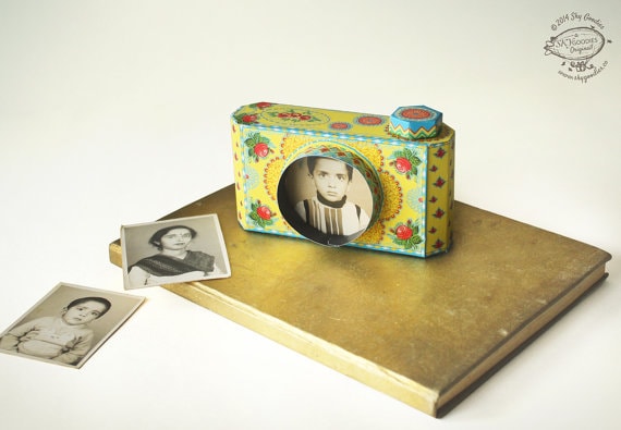
So first off, I am jealous that their product is so darn cute! Of course it is easy to take a picture of the product, but they took it to the next level with the styling of this picture. The shiney gold book it is sitting on and the sepia toned photos just make this product even better! From the SkyGoodies shop.
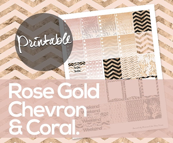
There are A LOT of Erin Condren planner stickers out there, but really felt like this one stood out when doing a search for a couple of different reasons. First off, the whole color scheme is consistent with the rose and gold. Then the overlays feel like they are adding to the picture rather than dominating it. Presented by the BeautifullyPlanned shop.
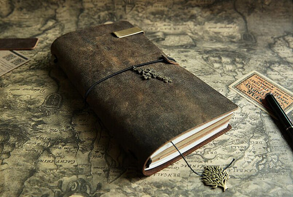
Buyers of Midori planners are travelers and this picture hits all their high notes! From the map background to the ticket stub, everything about this screams, "buy me and you will have adventures!" Presented by Dokipaper.
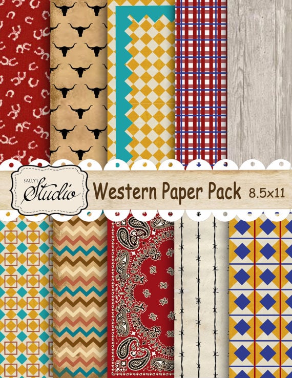
Wow did Sally hit this one out of the park! Not only are the papers all giving a "Western" theme, but the little banner across the middle is great for telling about the product AND adding another little flair of the western. From the shop sssstudio.

If you have been hanging here any time at all you KNOW I love bees, but this product photography is OVER THE TOP! First off, the "styling" is a fluffy blue cloud of some kind of cotton batting and the "hive" is just a yellow yarn wrapped something. I think the bees are photoshopped in over the picture. And HOW COOL is this all together. Socks brought to you by the ManyMornings.
Product Photography For Etsy Sellers Wrapup
I am super excite about this post, although it may have taken me longer than any other post in history to write! I was blown away by how gracious all the sellers were to allow me to use their pictures to show to do product photography in a bunch of different ways!
I will be adding my pictures when I feel like they are up to snuff and would welcome your submission if you think you have a product picture that hits it out of the park! Just convo me over on my Etsy shop, Paperly People and I will take a peek and see if I think it is a good fit!
ADDITIONAL RESOURCES FOR ETSY SELLERS
- Free Etsy SEO Course on Skillshare - https://marketingartfully.com/etsyseossfree
- Free Etsy Shipping Course On Skillshare - https://marketingartfully.com/etsyshippingssfree
- Selling Vintage On Etsy Ebook - https://marketingartfully.com/vintagesellerebook
- Check out all my Etsy articles! - https://marketingartfully.com/category/etsy-marketing/
- Get 40 Free Etsy Listings When You Sign Up! - https://marketingartfully.com/Etsy
- All the cool worksheets and planners for Etsy Sellers
