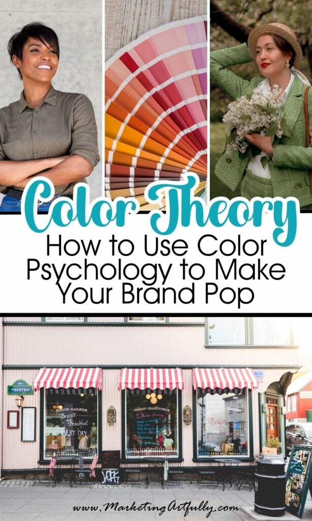
Color isn’t just a pretty design choice - it’s a business tool. In fact, if you’re not intentionally using color psychology in your branding, marketing, or visual content, you might be missing out on one of the easiest ways to build trust, drive engagement, and increase conversions.
As someone with a BA in Psychology and a background in small business marketing (hi, that’s me! ), I’ve seen firsthand how the right color can tell your brand’s story, shape how people feel about your business, and even influence buying behavior.
In this post, we’re going to explore the emotional and strategic power of color in your branding - and how to use it to make your brand pop AND convert.
Let’s get colorful!
1. Color = Instant Communication
One of the simplest ways I used to help my small business clients stand out was through color clarity. We’d start with a basic question:
What do you want people to feel or think when they see your brand?
And then? We’d choose colors that said it without words!
A few fun real-life examples:
- Pat F. was a financial advisor - so of course we leaned into rich, trustworthy green.
- Deb W., The Irish Realtor, used - you guessed it - green and shamrocks (plus her magnetic personality, of course ☘️).
- Sandy K., who ran a flower shop, bloomed with reds and pinks - perfect for passion, romance, and love.
Before they ever read a headline or tagline, their audience felt the vibe.
Color is fast, emotional, and incredibly powerful - and when used intentionally, it gives your brand an instant “ahh, I get it” factor.
")
2. Every Color Has a Personality
Here’s where the psychology really comes in. Each color has emotional associations that can influence behavior, mood, and decision-making. Here’s a quick cheat sheet:
| Color | Emotion | Use In Branding |
|---|---|---|
| 🔵 Blue | Trust, calm, reliability | Perfect for tech, healthcare, finance |
| 🔴 Red | Urgency, passion, energy | Great for sales, food, bold brands |
| 🟡 Yellow | Optimism, clarity, creativity | Awesome for lifestyle brands, coaches, fun content |
| 🟢 Green | Growth, money, balance | Ideal for finance, eco-businesses, wellness |
| 🟣 Purple | Luxury, wisdom, creativity | Beautiful for spiritual brands, creatives, coaches |
| 🟠 Orange | Confidence, enthusiasm | High-converting for CTAs and upbeat brands |
| ⚫ Black | Power, elegance, authority | Great for luxury and bold personal brands |
| ⚪ White/Gray | Simplicity, calm, neutrality | Use for minimalism or to balance out bolder tones |
3. Color Really Can Influence Buying Decisions
Back in the day, when we were testing button colors for clients' websites, red was all the rage. The thinking was “red = urgency = more clicks.”
But over time, guess what color won?
🟠 ORANGE.
Orange buttons consistently outperformed red in conversion tests - not because it’s prettier, but because orange conveys enthusiasm and positivity without triggering anxiety.
It’s a great reminder that even small shifts in color can impact performance. That’s not just design—that’s straight-up psychology.
4. Split Testing Isn’t Just for Websites
One of the BEST things you can do as a small business owner or solopreneur? Split test your colors.
I’m not just talking about websites either. Try this:
- Post two Pinterest pin designs with different color schemes—see which gets more saves or clicks.
- Use two different colored flyers at your vendor booth.
- Wear a bright pink shirt one week and a black one the next at your farmers market and watch what happens.
Color impacts engagement everywhere. And you don’t need fancy software - just observe and adjust!
")
5. Ask Your Audience What They Like
Color theory is amazing, but guess who knows best? Your ideal customer!
Start with something simple like:
- “What’s your favorite color?”
- “What color would you associate with [topic]?”
Once you gather a few answers, start posting color combos and run this or that polls.
Pro tip: Don’t ask about color directly in the second round. Just show two versions of a logo, flyer, or social graphic with different colors and ask, “Which one do you like best?”
Most people aren’t trained in color theory - but they know what they like. And that’s the sweet spot!
6. Your Brand’s "Color Culture" Might Surprise You
Here’s a fun story from my own business…
Whenever I design a freebie with purple, my people GO NUTS. 💜 Seriously—it gets downloaded like hotcakes.
And now I know: My ideal readers are purple people!
They associate purple with creativity, magic, and maybe a little woo - and they see themselves in that. That one simple realization helps guide how I design content, what I post on Pinterest, and even what colors I wear in photos.
So ask yourself:
- What colors light YOU up?
- What colors get the most response from your audience?
- What’s the emotional message your color palette is sending?
7. Use Color Psychology to Connect and Convert
When you align your color palette with your audience’s values and your brand personality, you’re not just creating pretty designs - you’re building trust, signaling clarity, and guiding people toward action.
Whether you’re:
- Picking a new brand color scheme
- Designing pins, flyers, or emails
- Or just choosing what to wear for your next headshot
Let color psychology lead the way.
Because a well-chosen palette? That’s not fluff. That’s strategy!
Here are some more great articles that you might love!
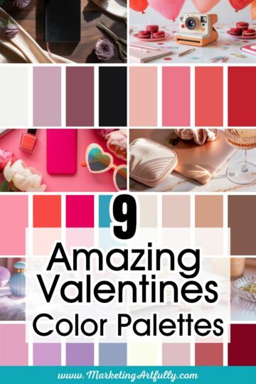
- 9 Stunning Mid-Century Modern Color Palettes
- How To Pick A Signature Color For Your Coaching Business
- 11 Bold Branding Color Palettes That Stop the Scroll