If your brand is feeling a little “meh” after winter content, it’s time to bring in a little luck - and a LOT of color - with these playful, punchy St. Patrick’s Day color palette ideas.
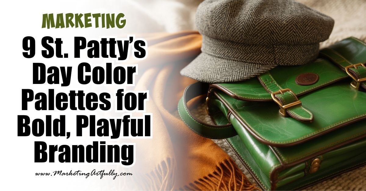
We’re going beyond plain green here. These palettes are inspired by Irish charm, spring freshness, cozy cottage vibes, and just a touch of rainbow magic!
Perfect for coaches, creatives, product-based businesses, and Pinterest content queens - these color combos are made for bold spring launches, seasonal freebies, and scroll-stopping graphics.
Let’s dive into the gold at the end of the branding rainbow, shall we?
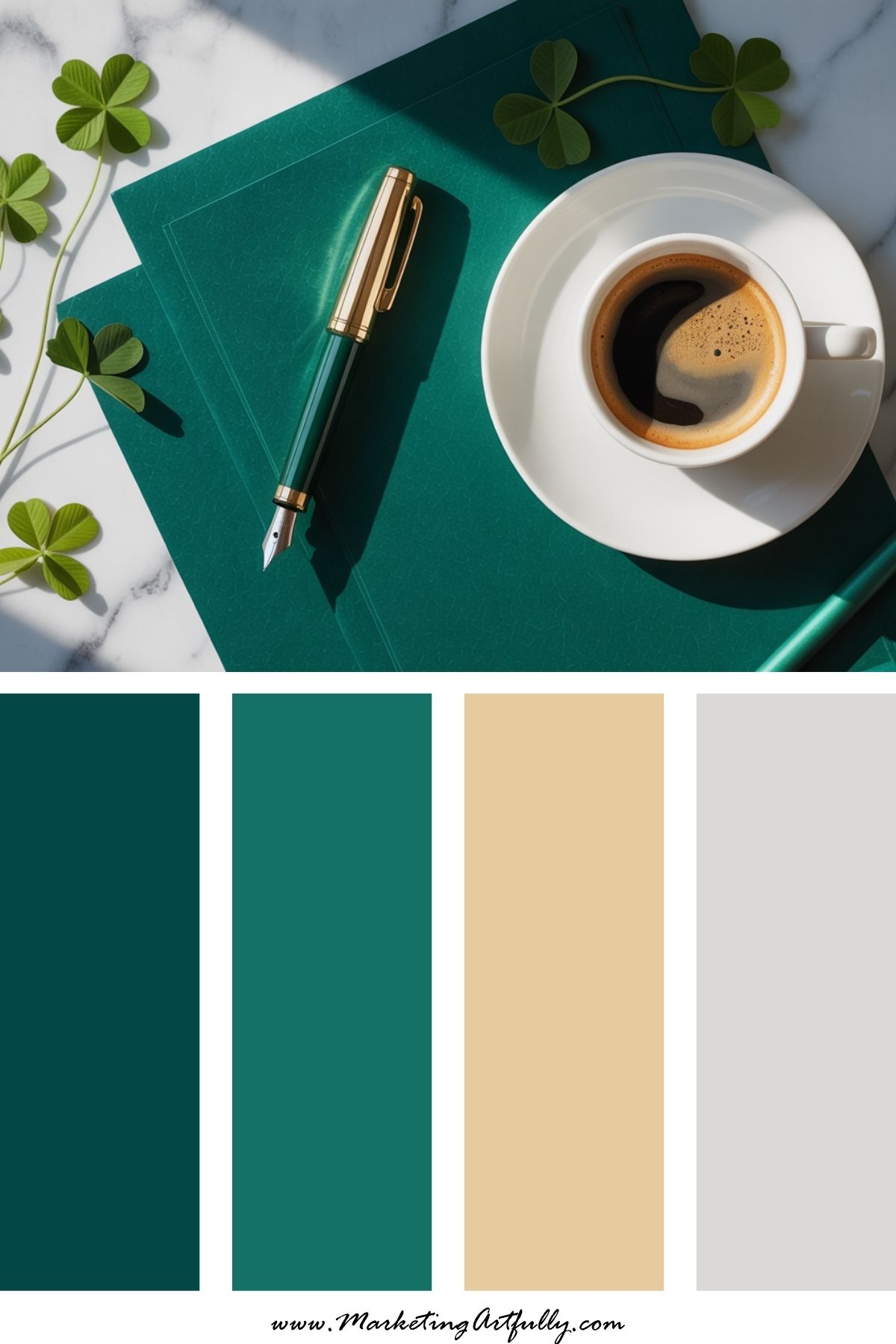
1. 🍀 Emerald Green + Gold + White
Vibe: Classic + crisp
This one’s for the elevated traditionalist. Emerald and gold are timeless and bold, while white adds freshness. Use this for promos, Pinterest pins, or anything that needs a confident Irish twist.
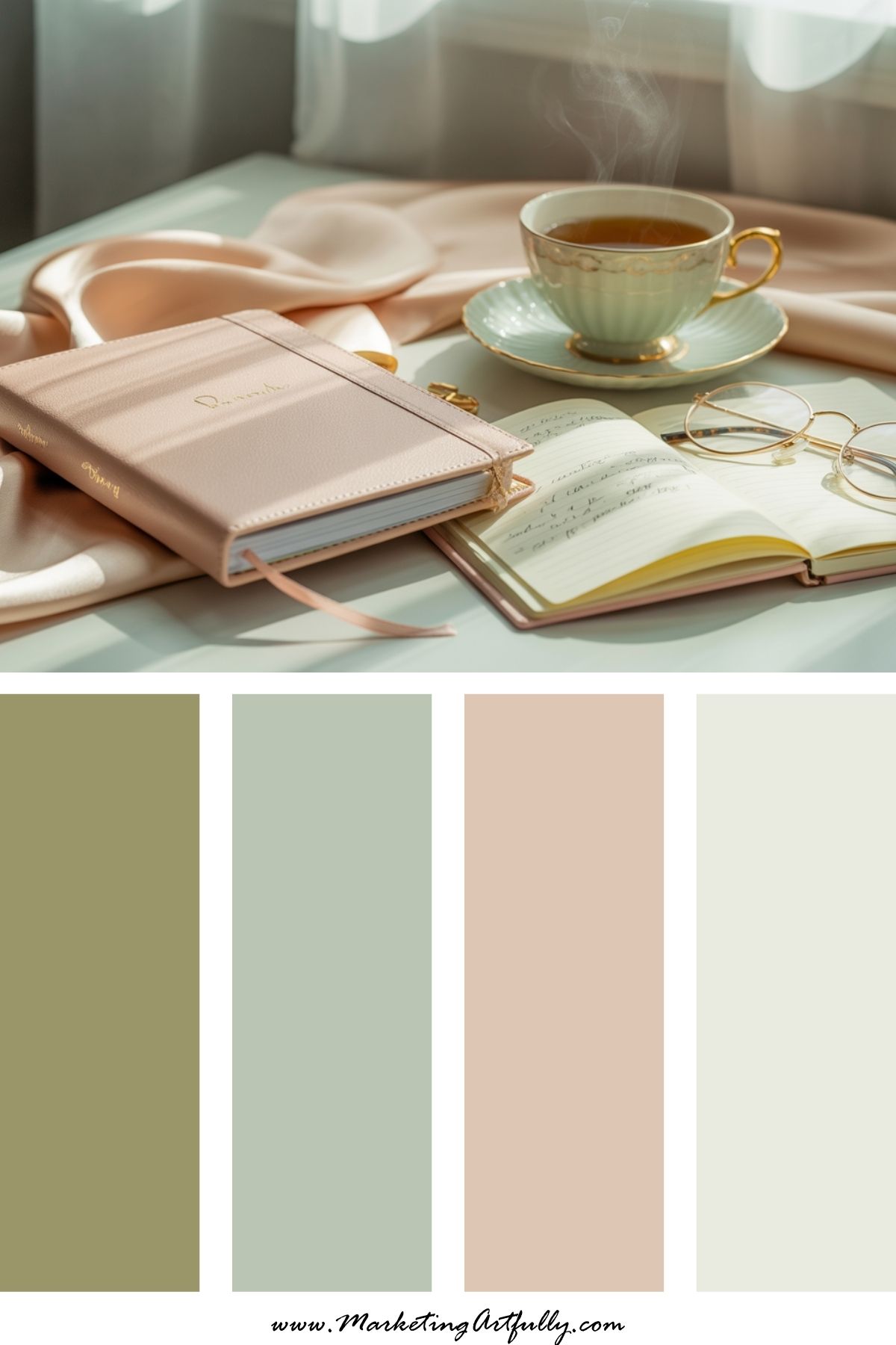
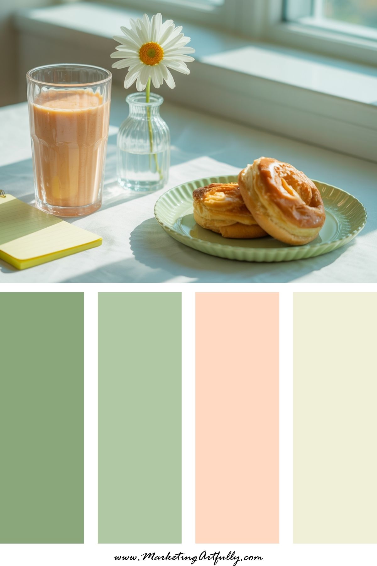
2. 🌱 Sage Green + Blush + Cream
Vibe: Soft & unexpected
You didn’t expect this one, did you? Sage brings the spring vibe, blush adds charm, and cream keeps it grounded. Perfect for lifestyle brands, Instagram carousels, and non-literal St. Patty’s content.
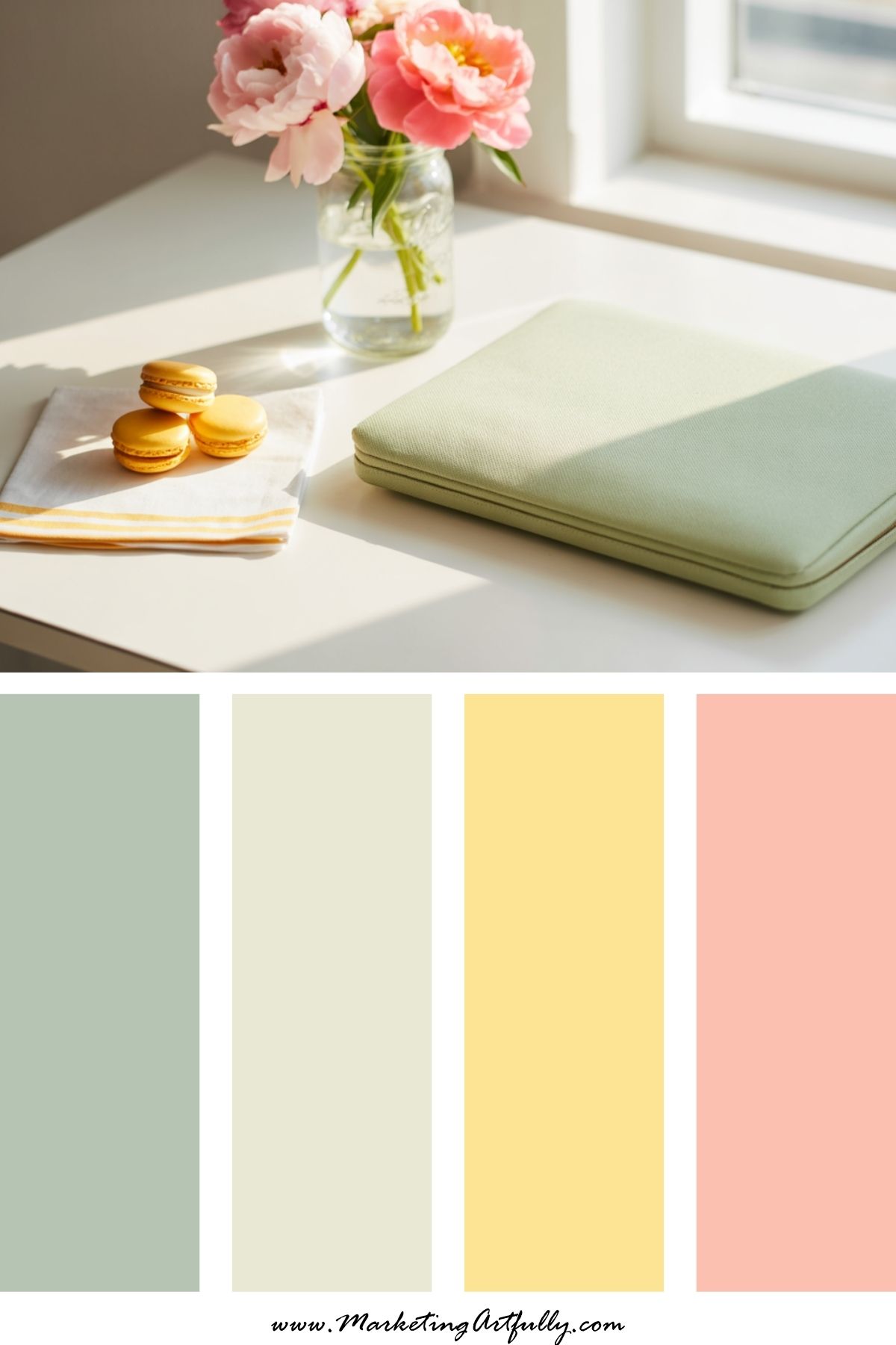
3. 🌈 Mint + Sunshine Yellow + Coral
Vibe: Cheerful & fun
This one’s rainbow-adjacent without screaming Lucky Charms. Mint = freshness, yellow = happiness, coral = energy. Use this combo for freebies, product promos, or Pinterest templates that pop.
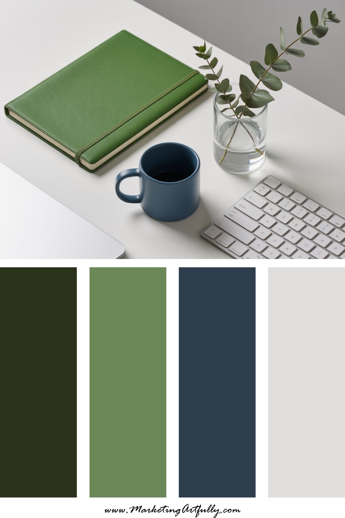
4. 💚 Kelly Green + Navy + Ivory
Vibe: Bold & modern
Kelly green keeps it festive, navy gives depth, and ivory lightens it all up. A great palette for Canva templates or Pinterest pins that need energy without chaos.
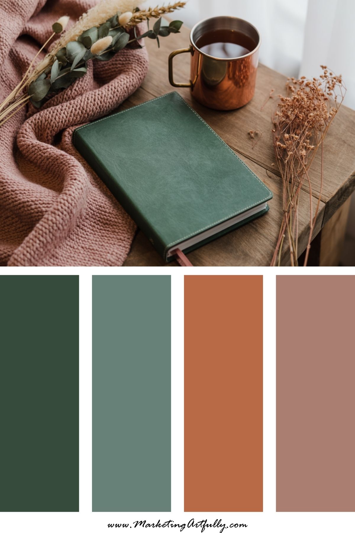
5. 🍻 Forest Green + Copper + Dusty Rose
Vibe: Cozy Irish pub meets high-end brand
This combo feels grounded, warm, and nostalgic. Great for product photos, cozy blog headers, or seasonal freebies with heart.
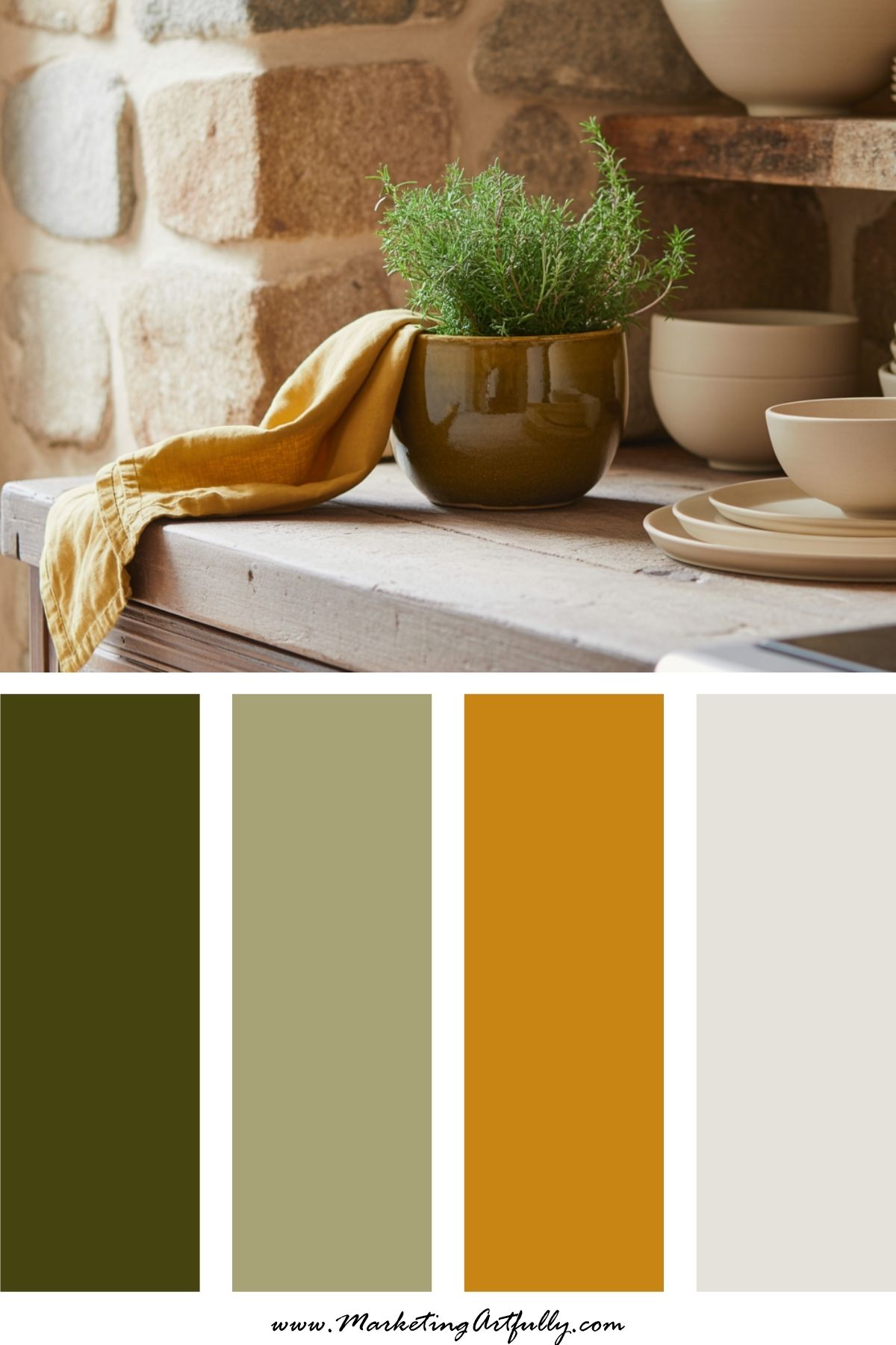
6. 🍯 Olive + Mustard + Cream
Vibe: Warm, earthy, and grounded
Perfect for brands that lean into rustic, vintage, or slow living. This color palette has Irish countryside energy with marketing-friendly contrast.
7. 🪩 Chartreuse + Lavender + White
Vibe: Bright, playful, and unexpected
If your brand is a little quirky (in the best way), this one’s for you! It’s giving “lucky and lovely” with a modern twist. Use for pins that feel fresh and flirty.
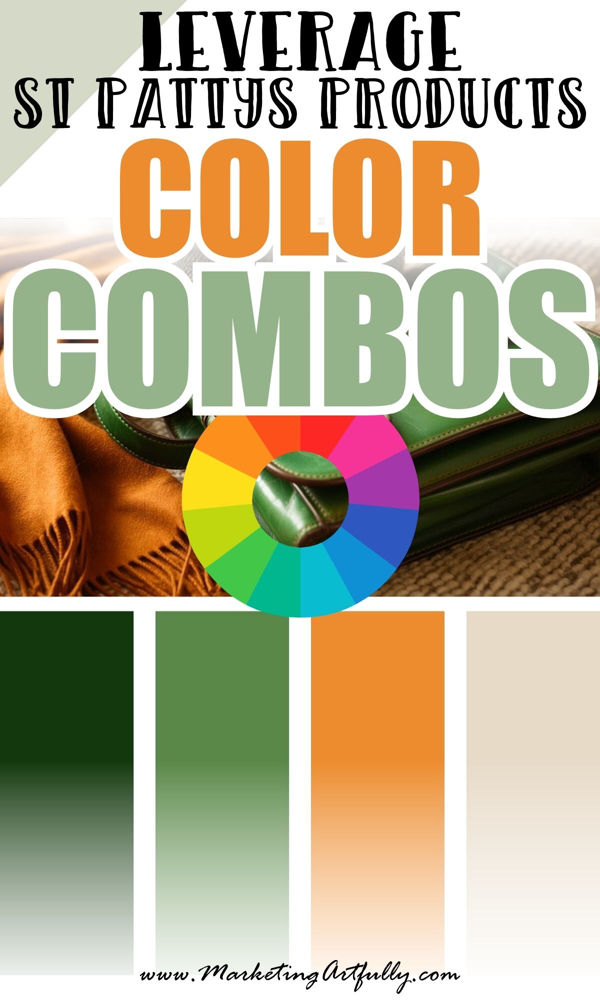
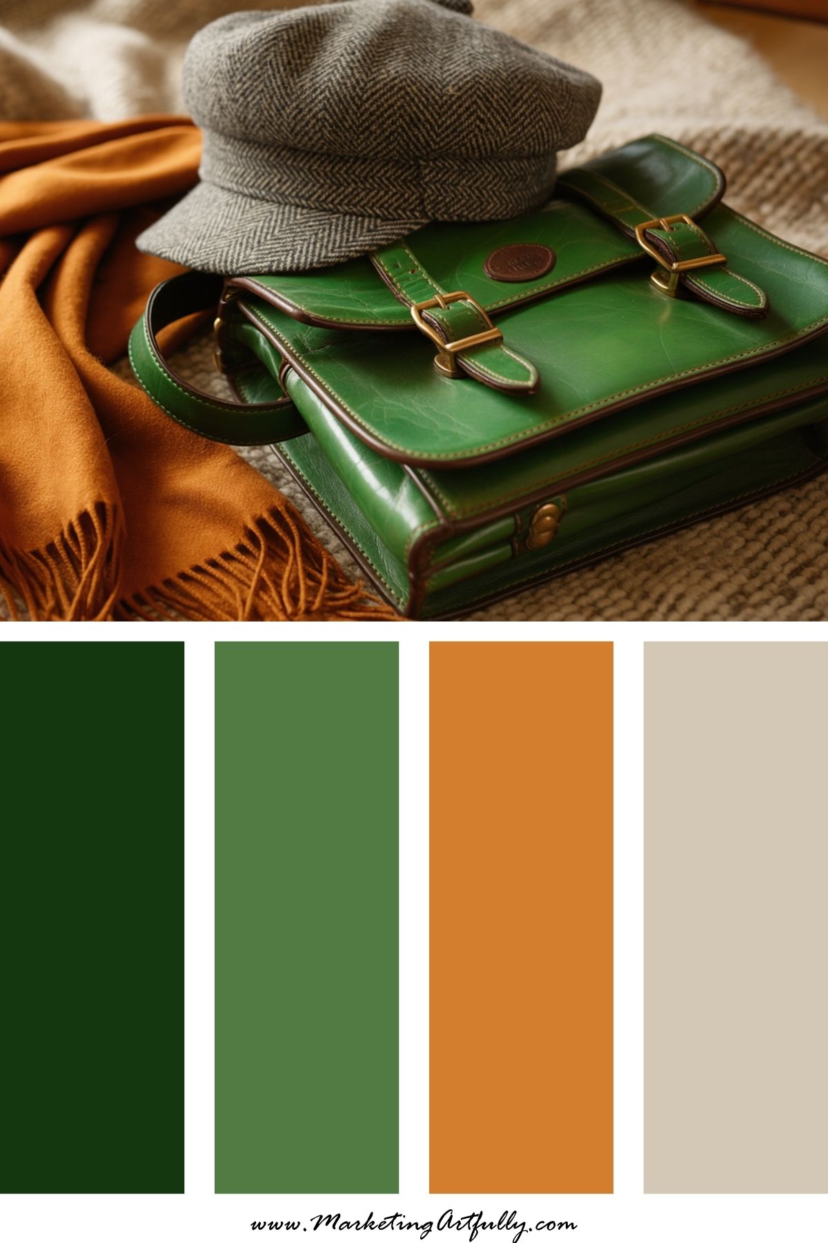
8. 🧡 Burnt Orange + Kelly Green + Beige
Vibe: Irish roots + retro charm
This palette feels nostalgic in the best way. Inspired by vintage postcards and old-world warmth, it’s great for storytelling brands and cozy spring visuals.
9. 🌼 Pistachio + Peach + Pale Yellow
Vibe: Light, fun, and springy
This soft, sunny palette has just enough green to feel festive - but stays bright and brand-friendly. Use for lighthearted content, pins, and social promos.
☘️ Ways to Use These Palettes:
- Build your next Pinterest pin batch using St. Patty’s Day colors
- Update your Canva templates for seasonal promos
- Plan an “on-brand” March freebie or mini launch
- Create bold carousels or graphics that stand out in the spring scroll
You don’t need a leprechaun mascot to get noticed - just a bold color palette and a little bit of that lucky girl energy!
Here are some more great articles that you might love:
- Spring Color Palettes for Fresh, Fun Marketing Vibes
- 11 Free St. Patricks Day Pinterest Pin Templates in Canva
- 5 Free St. Patricks Day Planner Covers or Dashboards