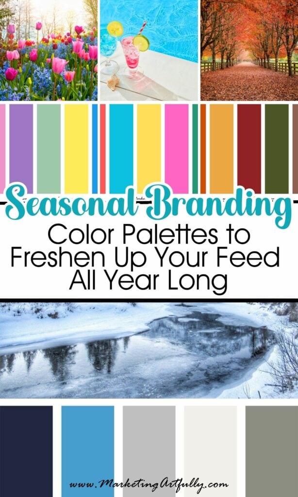
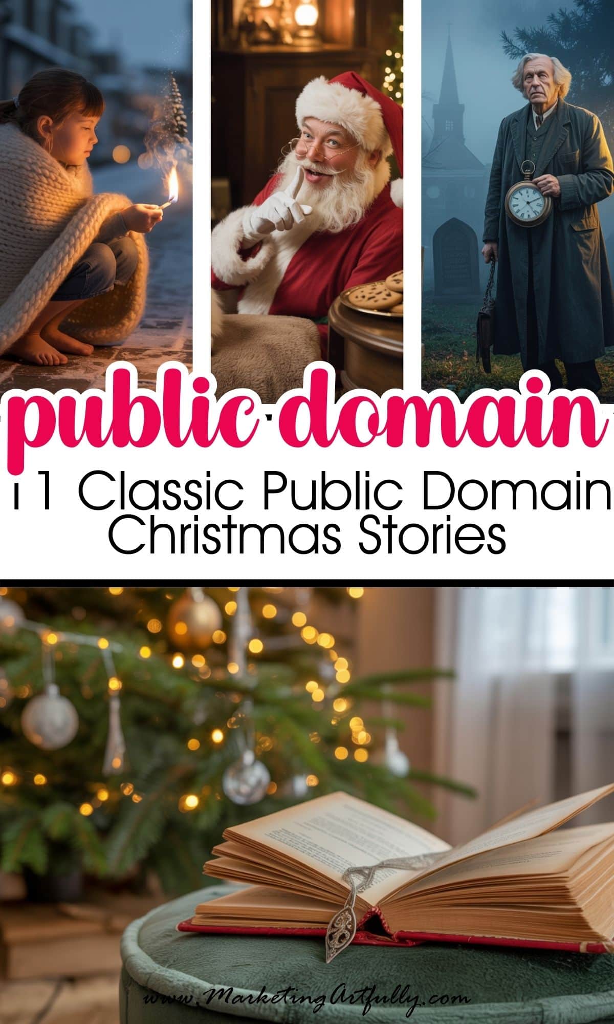
If your branding has been feeling a little… samey, a seasonal color palette refresh might be exactly what you need. Just like fashion trends and coffee shop menus, your audience's attention shifts with the seasons - and your content should too!
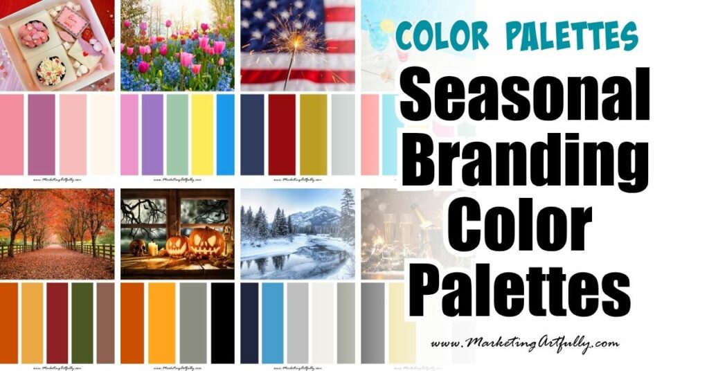
Seasonal branding is a fun, smart way to keep your social media, pins, and email graphics fresh while still staying on brand. And no, you don’t have to throw your entire color scheme out the window. Just think of it as a quarterly glow-up.
Let’s walk through each season, the color vibes that dominate, and how to work in holiday-specific palettes in a way that feels intentional, strategic, and still 100% YOU!
1. 🌸 Spring Vibes: Soft, Fresh, and Full of Hope
Spring is all about new beginnings - and your color palette should reflect that. This season leans into soft pastels and cheerful hues that feel light, hopeful, and fresh. Think blooming flowers, baby animals, and fresh notebooks.

Seasonal Color Cues:
- Soft pinks
- Lavender
- Mint green
- Butter yellow
- Sky blue
Holidays & Branding Tips:
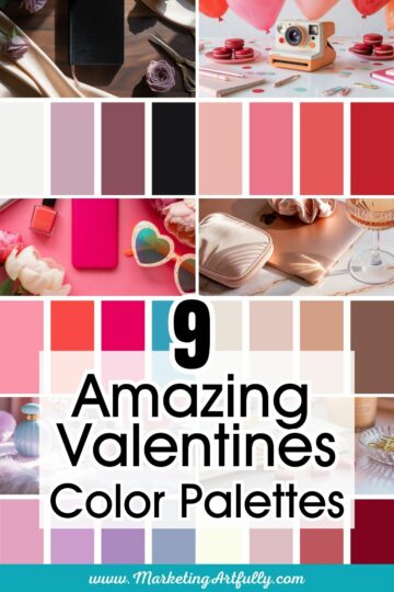
🌷Valentine’s Day:
Classic reds and pinks work great, but for branding, go soft - dusty rose, mauve, blush, and creamy neutrals give it a more modern, elegant feel.

☘️St. Patrick’s Day:
You can go full shamrock, but if you want to keep it subtle, pair emerald or olive green with a grounding neutral like tan or navy for a more elevated vibe.

🐣Easter:
This is pastel heaven. Lilac, robin’s egg blue, soft coral, and mint scream spring and feel fresh without being cartoonish. Layer in white to keep it crisp.

2. ☀️ Summer Vibes: Bright, Bold, and Playful
Summer branding is your permission slip to GO BIG with your color palette. This is the season for vibrancy, saturated tones, and punchy contrast. Think beach towels, popsicles, and lemonade stands.

Seasonal Color Cues:
- Coral
- Aqua
- Sunflower yellow
- Hot pink
- Turquoise
Holidays & Branding Tips:
🎆Fourth of July (U.S.):
Classic red, white, and blue can feel a little overdone - but branding it up with navy + bright red + gold accents gives it a luxe Americana vibe.
 - Color Palette")
☀️General Summer Branding:
Try a bold color palette like fuchsia, teal, and lemon yellow for a content refresh. Great for launches, pop-up offers, and anything with fun, high energy.
3. 🍂 Fall Vibes: Warm, Cozy, and Rooted
Ahhh, fall - the season of PSLs, flannel, and cozy content. This is where we get to dip into the deeper, richer side of the color wheel. Fall branding feels warm, grounded, and comforting. Perfect for thought leadership, heart-led content, or launching cozy offers.

Seasonal Color Cues:
- Burnt orange
- Mustard
- Burgundy
- Forest green
- Rust + taupe
Holidays & Branding Tips:
🎃Halloween:
Orange and black are classics—but you can give it a modern twist with burnt orange + charcoal + gold, or even plum + sage green for a spooky-chic aesthetic.

🦃Thanksgiving (U.S.):
Think harvest tones: rust, goldenrod, cranberry, and soft brown neutrals. These palettes feel inviting and are great for gratitude posts, reflections, and community-building content.
 - Color Palette")
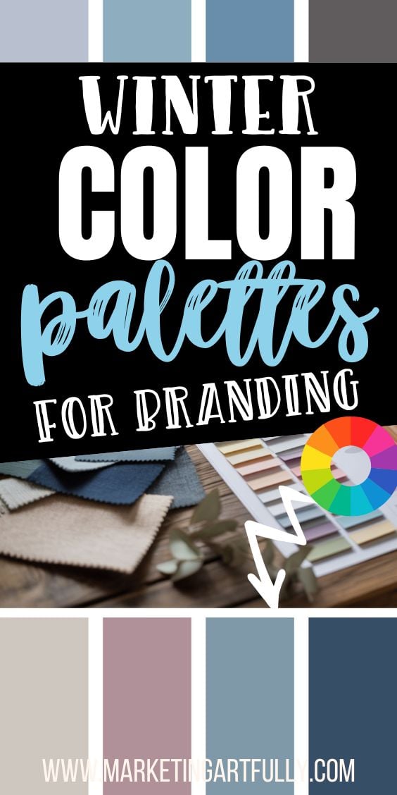
4. ❄️ Winter Vibes: Crisp, Luxe, and Magical
Winter branding is where elegance meets sparkle. It’s clean, cool, and can swing minimalist or glam, depending on your vibe. Think cozy cabins, fresh snowfall, or glitzy NYE parties.

Seasonal Color Cues:
- Deep navy
- Icy blue
- Silver + gold
- Deep emerald
- Cranberry
- White + charcoal
Holidays & Branding Tips:
🎄Christmas/Holiday Season:
Go beyond red + green. Try cranberry + sage, navy + gold, or forest green + ivory for a festive but elevated look.

🎉New Year’s Eve:
This is your excuse to go glam! Use black + gold, silver + white, or even deep plum + champagne for a luxe celebration aesthetic.

5. ✨ Bonus: Year-Round Tips for Seasonal Brand Color Swaps
You don’t need a full rebrand every season. Instead, try these easy seasonal branding refresh ideas:
- Change accent colors in your templates each quarter
- Create holiday-specific content blocks with matching palettes
- Use seasonal color swatches in your Instagram story highlights
- Launch seasonal freebies or content upgrades with palette-matching covers
- Update your Pinterest pin designs to reflect seasonal colors and energy (this is where the scroll-stopping magic happens!)
6. 🧠 Why Seasonal Color Palettes Work
Color psychology is all about emotional alignment. When your brand’s visual energy matches the energy of the season, your audience feels that subtle connection. It builds trust, boosts engagement, and shows that you’re paying attention - not just posting the same evergreen content year-round.
It also makes your brand feel alive.
And that? Is powerful.
So whether you're posting about gratitude in fall tones or creating a pastel lead magnet for spring, let your seasonal color palette support your message.
Because when your colors match your content and the moment? THAT’S branding magic!
Here are some more great articles that you might love!
11 Bold Branding Color Palettes That Stop the Scroll
The Ultimate Guide to Marketing to Shabby Chic Customers
The Ultimate Guide to Marketing to Dark Academia Customers