I have been focusing on seasonal marketing for a few years now, and one thing I have seen over and over again on both Pinterest and Google is this: if you jump from holiday to holiday, you can keep interest flowing all year long!
Instead of hoping one piece of content carries the weight for months, you’re giving the algorithms something new to chew on constantly.
Whether you sell products, run a blog, create digital downloads, or promote services, hooking your wagon to a holiday like Mother’s Day is one of the easiest ways to turbo boost your marketing.
People are already searching.
They’re looking for gifts, ideas, inspiration, colors, graphics, and anything that helps them celebrate moms, grandmas, and the amazing women in their lives.
So if you show up with beautiful visuals and helpful ideas, you’re meeting them exactly where they are.
And that’s where color palettes come in!
Updating your graphics with a seasonal color scheme is one of the simplest ways to make your marketing feel fresh without rebuilding your whole brand.
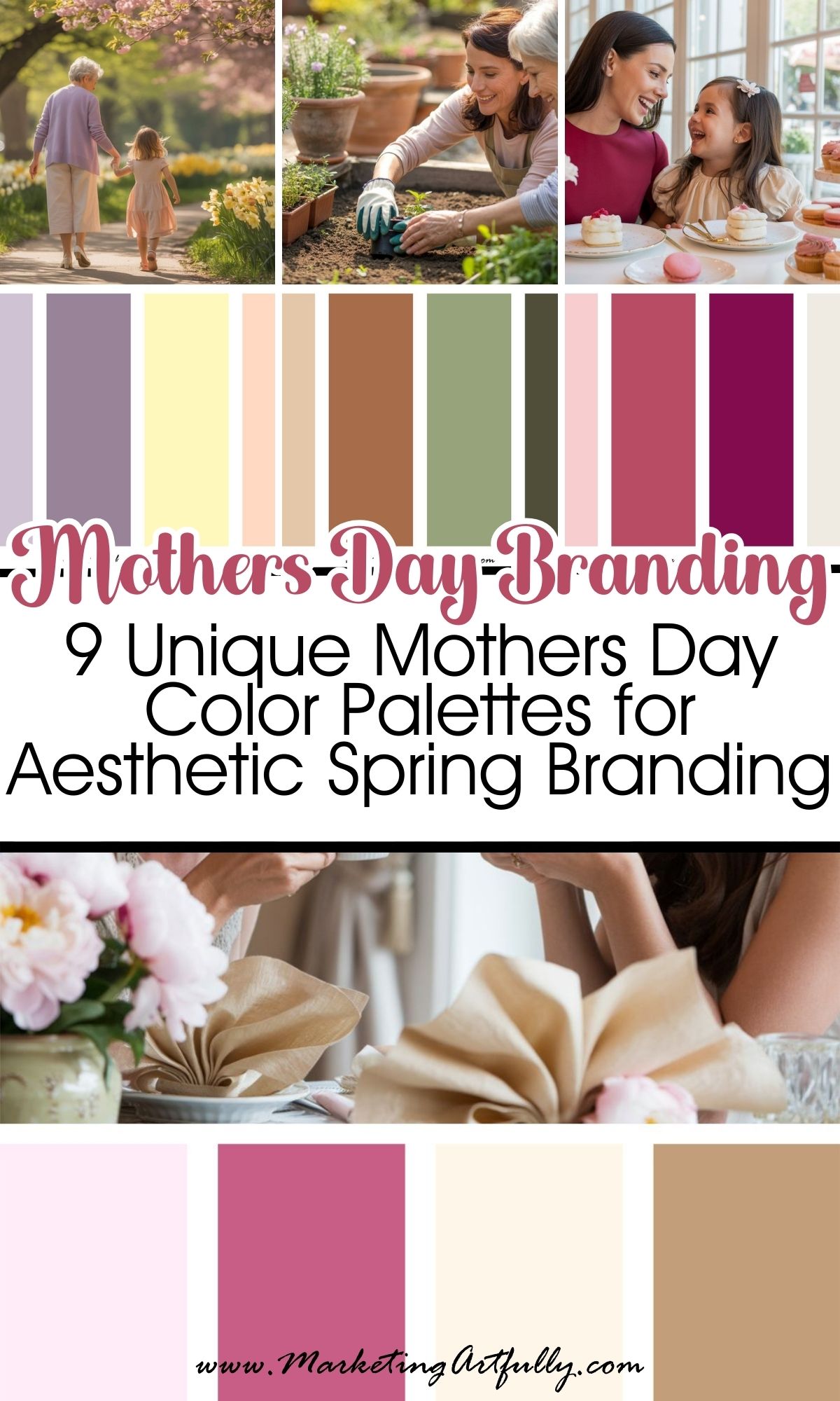
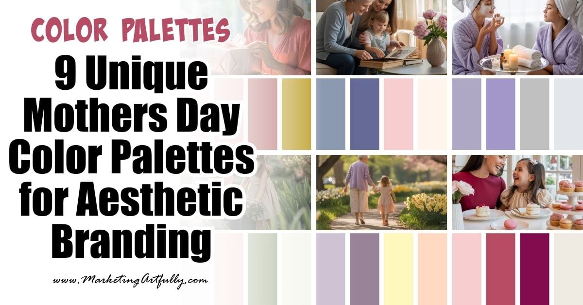
Below are 9 Mother’s Day color schemes that work beautifully for spring promotions, social media graphics, Pinterest pins, and seasonal campaigns.
1. Rose Pink + Champagne + Cream
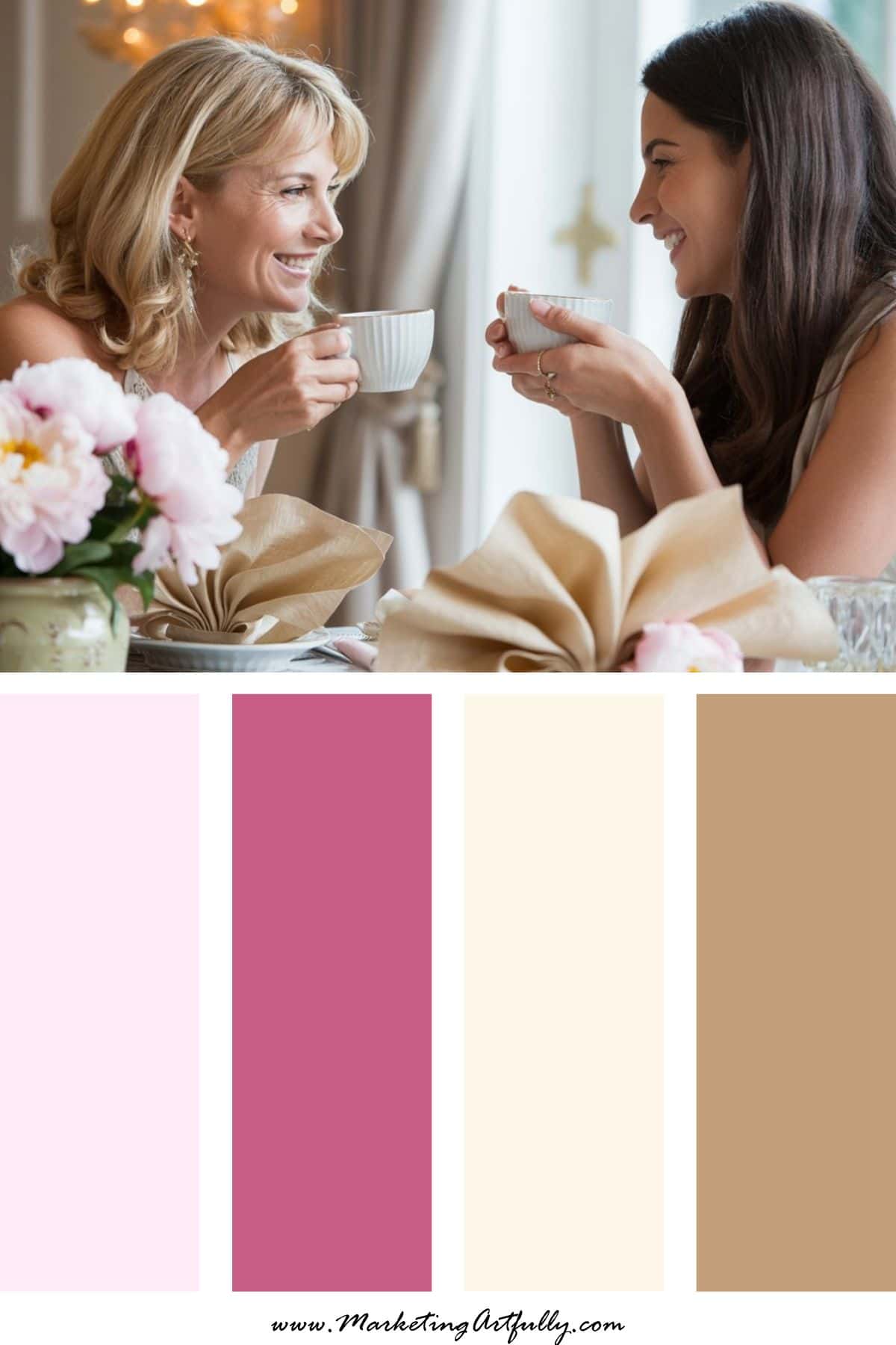
Vibe: Elegant and heartfelt
This palette feels like fresh roses, handwritten cards, and a quiet brunch with someone you love.
It’s classic Mother’s Day energy without feeling old-fashioned.
Perfect for boutiques, handmade products, gift shops, and bloggers who want a soft but polished look.
Great for:
• Gift promotions
• Email graphics
• Pinterest pins
• Product photography backgrounds
2. Peony Pink + Sage + Ivory
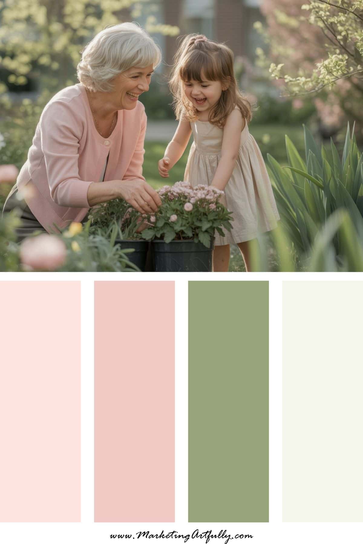
Vibe: Garden brunch chic
Light, airy, and very spring.
This combination feels like flowers on the table, sunshine through the window, and a relaxed Mother’s Day gathering.
If your brand leans feminine or lifestyle-focused, this palette is a natural fit.
Great for:
• Lifestyle brands
• Etsy shops
• Spring product launches
• Social media campaigns
3. Lavender + Silver + Soft White
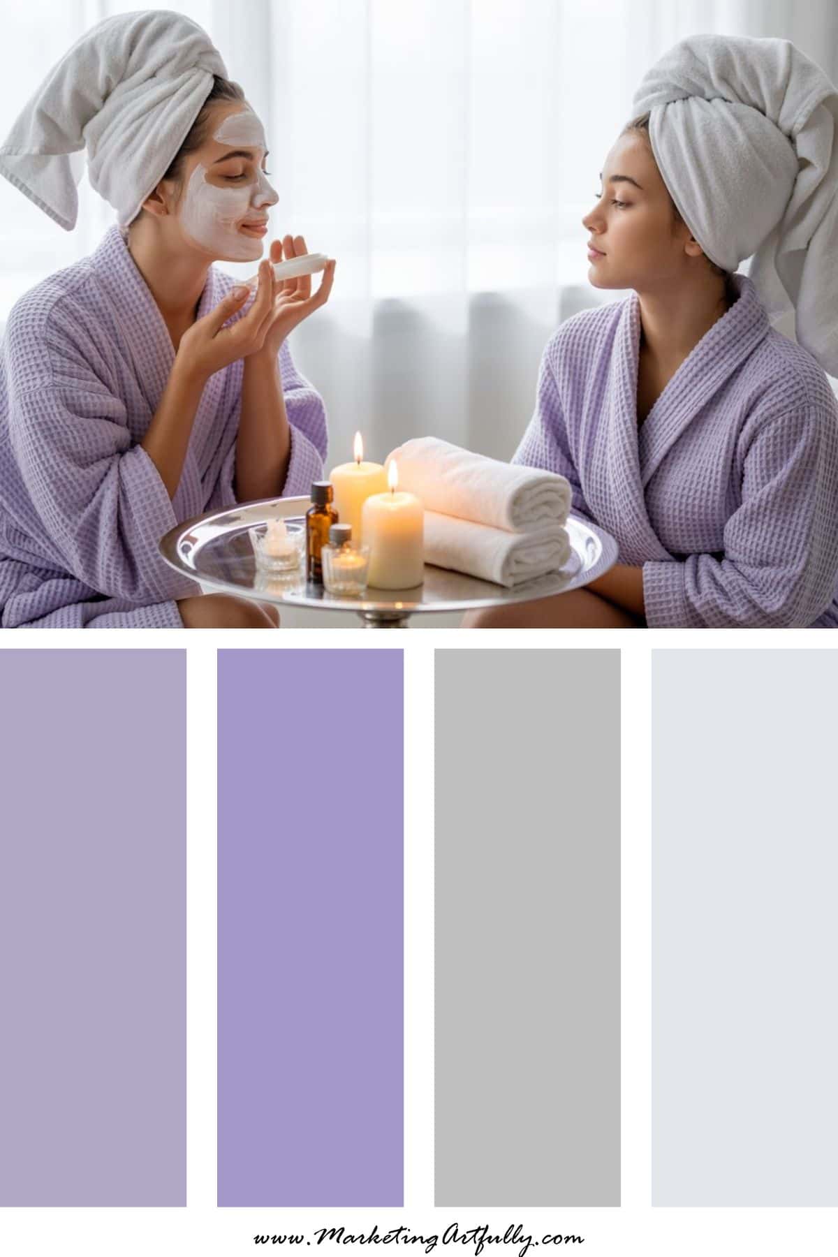
Vibe: Spa day for mom
Calm, relaxing, and a little luxurious.
This palette works beautifully for wellness brands, beauty products, or anything connected to self-care.
It signals relaxation and appreciation.
Great for:
• Beauty brands
• Self-care marketing
• Wellness businesses
• Coaching promotions
4. Coral + Blush + Gold
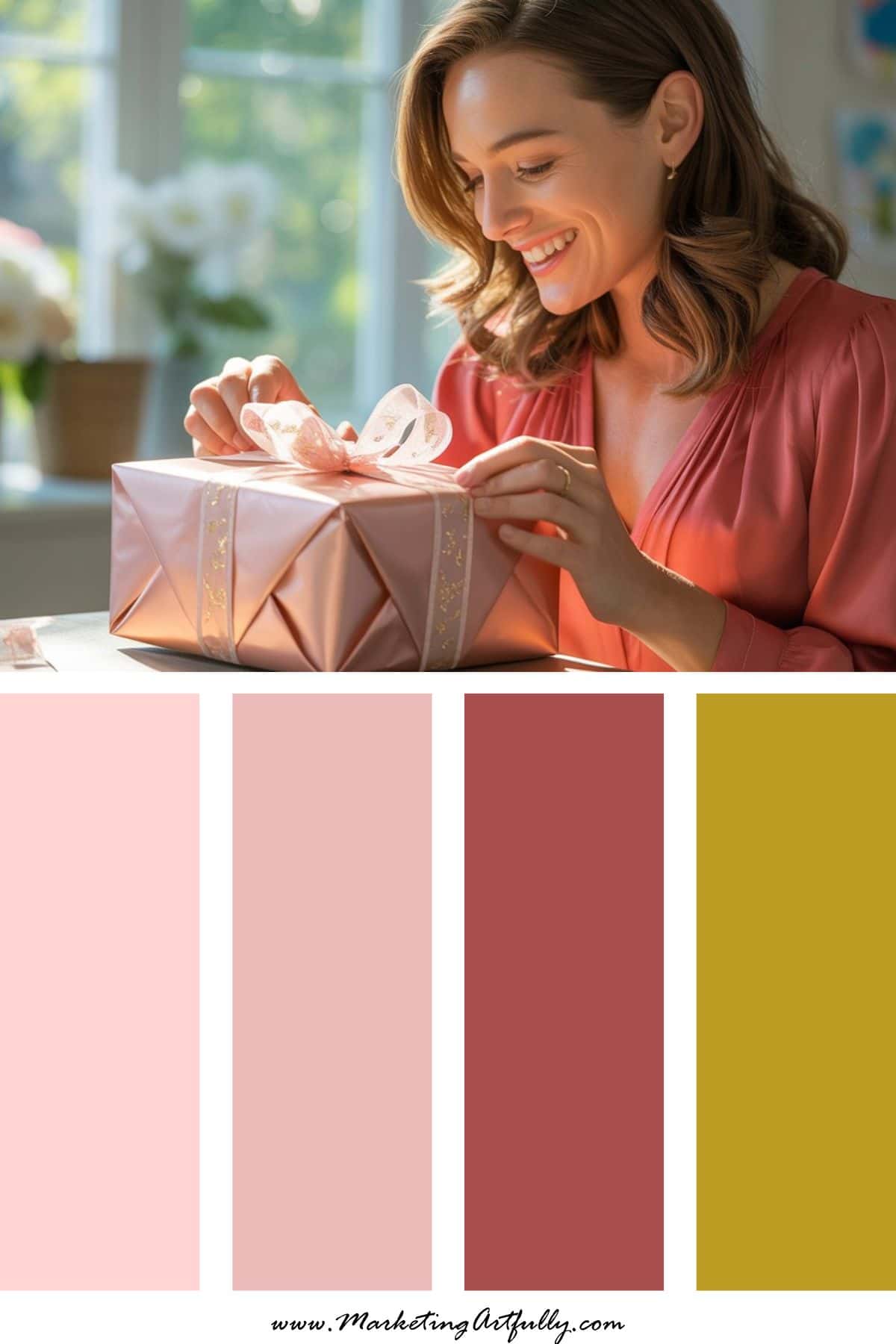
Vibe: Joyful celebration
This palette has energy but still feels warm and feminine.
Coral grabs attention, blush softens things, and gold adds a touch of sparkle.
It’s perfect for brands that want their Mother’s Day graphics to pop on Pinterest or social media.
Great for:
• Retail promotions
• Holiday sales
• Product launches
• Instagram graphics
5. Dusty Blue + Soft Pink + Cream
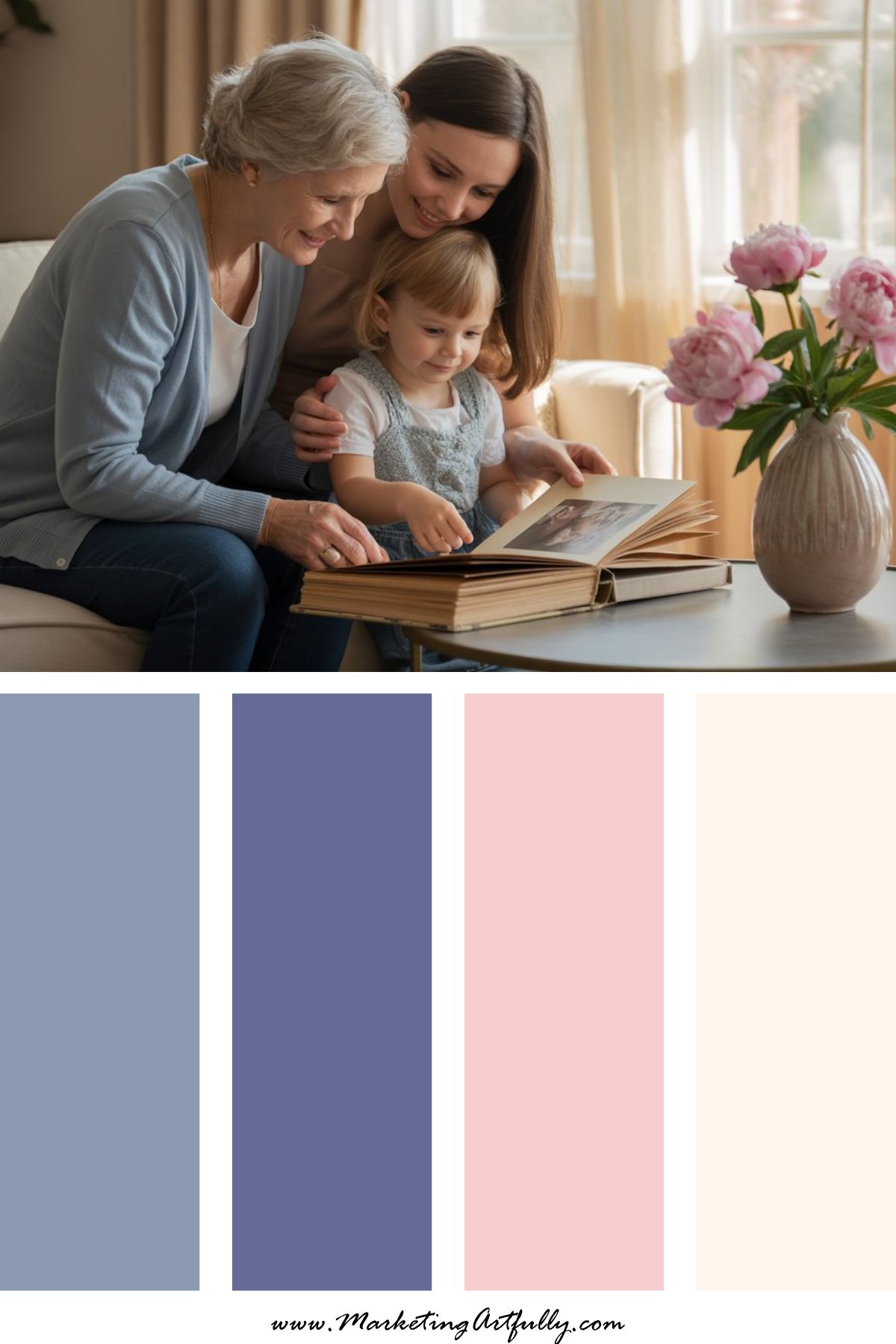
Vibe: Nostalgic and sentimental
This combination feels like family photo albums and meaningful memories.
It’s great for brands that focus on connection, storytelling, and heartfelt gifts.
Great for:
• Memory books
• Photography businesses
• Family brands
• Keepsake products
6. Raspberry + Petal Pink + Vanilla
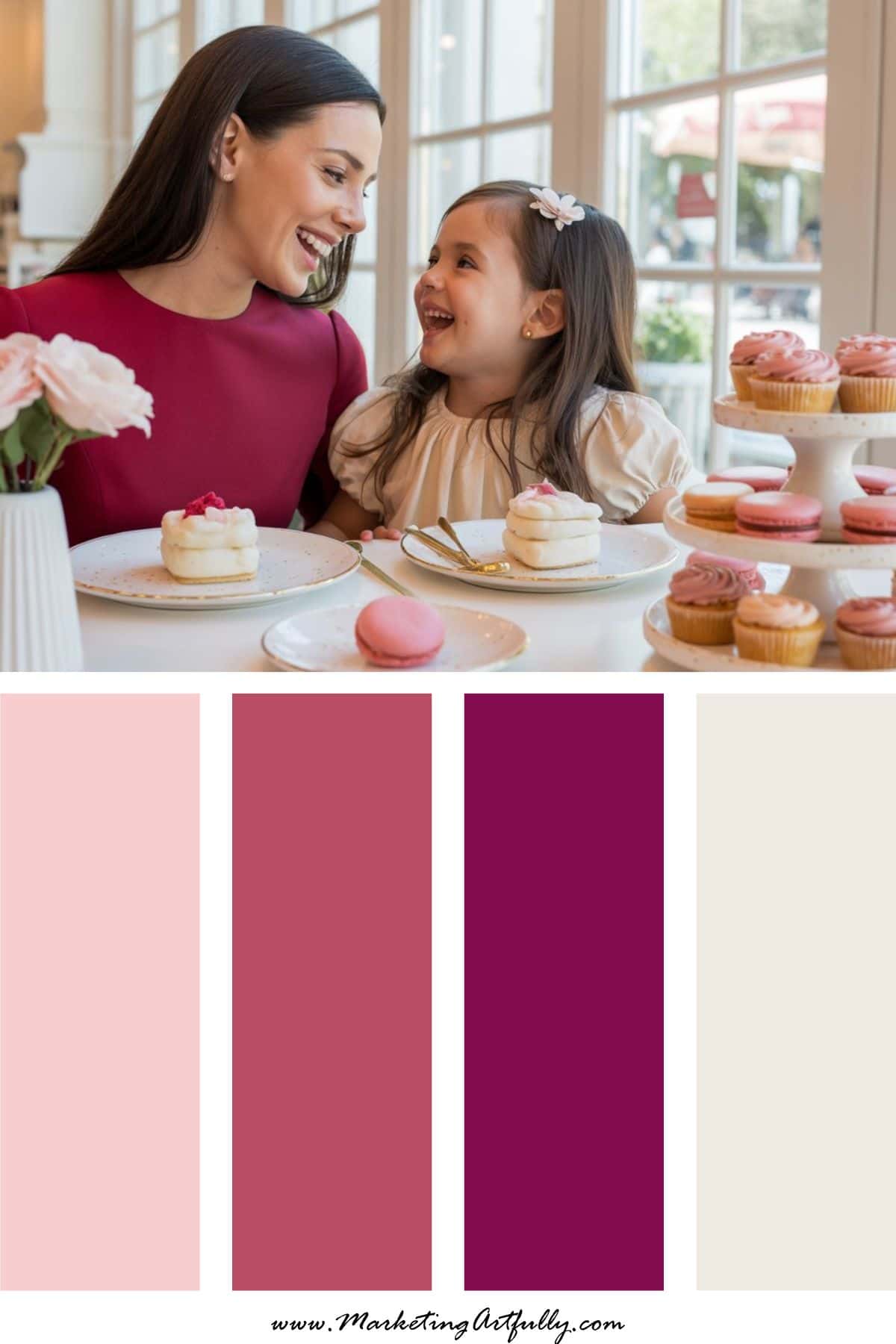
Vibe: Sweet but confident
This palette has more punch than traditional pastels but still keeps that Mother’s Day softness.
It’s playful, modern, and very Pinterest friendly.
Great for:
• Digital products
• Social media graphics
• Course promotions
• Online shops
7. Terracotta + Blush + Olive
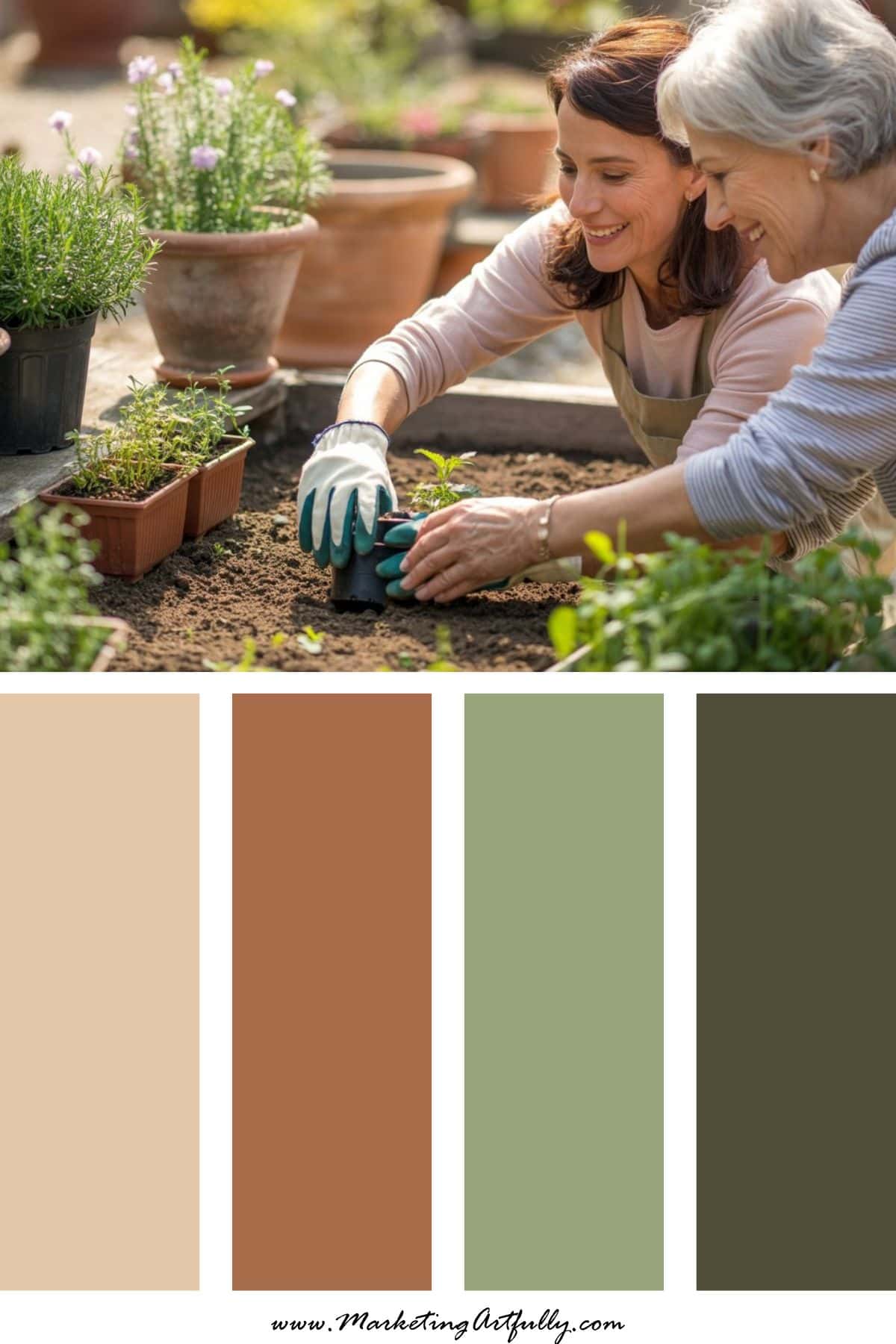
Vibe: Earthy modern motherhood
If you’re not into sugary pastels, this palette gives you a grounded, stylish option.
It feels warm, natural, and very on-trend.
Great for:
• Handmade brands
• Wellness products
• Sustainable businesses
• Lifestyle creators
8. Lilac + Butter Yellow + Soft Peach
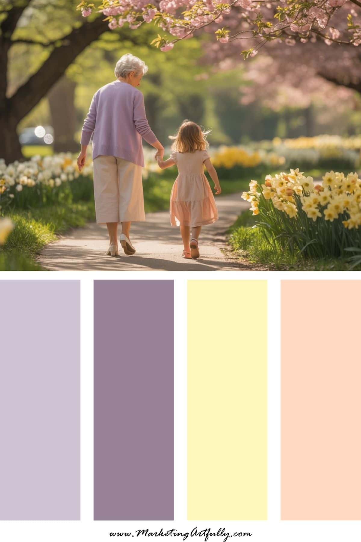
Vibe: Soft spring sunshine
Light, cheerful, and incredibly shareable.
This palette screams spring without being overpowering.
It works beautifully for Pinterest graphics and seasonal content.
Great for:
• Printables
• Bloggers
• Craft brands
• Creative businesses
9. Hot Pink + Tangerine + Coral
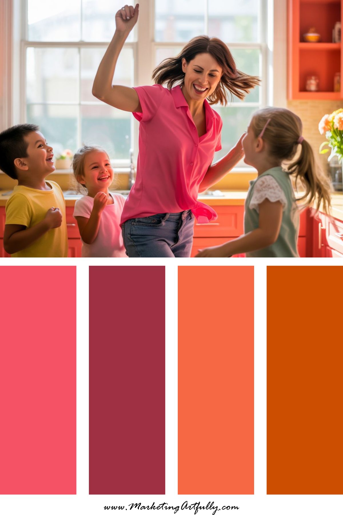
Vibe: Fun mom energy
Not every Mother’s Day campaign has to be quiet and sentimental.
This palette is bold, joyful, and attention-grabbing.
Perfect for brands with personality.
Great for:
• Bold promotions
• Flash sales
• Social media campaigns
• Modern brands
How to Use These Mother’s Day Color Schemes in Your Marketing
The beauty of seasonal palettes is that you don’t have to redesign everything.
Small updates can make a huge difference.
You could:
• Refresh your Pinterest pins with seasonal colors
• Update email graphics for a Mother’s Day promotion
• Create limited-edition Canva templates
• Style product photos around a color scheme
• Launch a themed freebie or sale
Even a small seasonal tweak can help your content feel timely and relevant.
And when your marketing aligns with what people are already searching for, you’re stacking the odds in your favor.
Why Holiday Marketing Works So Well
Here’s the simple truth.
People search differently around holidays. They are actively looking for ideas, inspiration, gifts, and solutions.
If your content shows up at that exact moment, you’re not interrupting them… you’re helping them.
That’s why building content around holidays like:
Valentine’s Day
Easter
Mother’s Day
Summer
Halloween
Christmas
can all create steady traffic all year long.
Instead of one big spike, you create a rhythm and rhythm is what builds sustainable traffic!