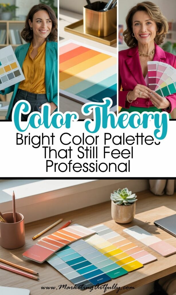
Let’s just say it: not every brand needs to be beige. Or blush. Or that weird muted sage everyone’s using lately!
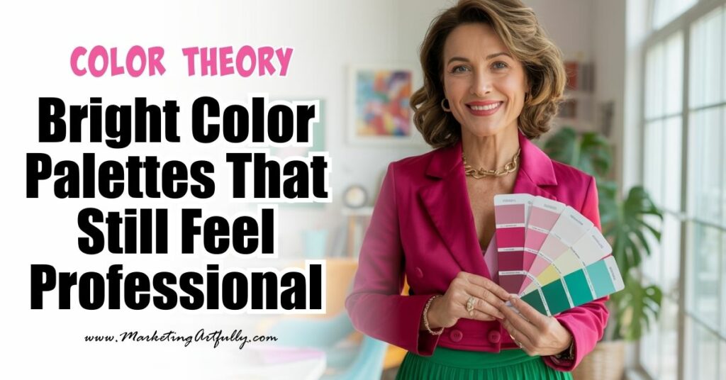
If you're a coach, designer, course creator - or honestly, any kind of fabulous solopreneur - who’s ever been told to “tone it down,” let this be your permission slip to do the exact opposite. Because bold, bright color palettes can look professional. In fact? They might just be the thing that makes your brand unforgettable.
Why Bright Colors Get a Bad Rap (and Why That’s Nonsense)
Somewhere along the way, bright colors got typecast. They’re "too loud." "Not serious enough." "Too playful for professional settings." But let’s break that down...
Color psychology tells a different story:
- 🔴 Red commands attention and signals confidence.
- 🟡 Yellow radiates optimism, warmth, and energy.
- 🔵 Bright blue evokes trust and clarity—with more personality than navy.
- 🟣 Magenta is creative, modern, and full of personal flair.
- 🟢 Teal and lime? Fresh, energized, and innovative.
Bright doesn’t mean chaotic. And it definitely doesn’t mean unprofessional. It means vibrant. Memorable. Lively. YOU!
Your Brand = Your Energy
Let’s be real - most of us are our brand.
We're the face of our Instagram. The voice in the newsletter. The reason our clients keep coming back. So if your personality is bright, bold, and full of life, why are your brand colors whispering when you’re out here trying to shine?
This reminds me of my friend Deb Ward. She doesn’t just wear color - she lives in it. We’re talking peacock patterns, floral prints, pink handbags, and turquoise suitcases. You could drop her into a grayscale crowd and still spot her immediately - she’s a walking mood board of joy and self-expression!

And here’s the thing: Deb doesn’t dress like this to be loud. She dresses like this because it’s who she is. And it never feels unprofessional - it feels confident, magnetic, and 100% authentic!
That’s the power of color. When your brand reflects your true personality, it becomes unforgettable!
How Bright Colors Can Still Look Polished
Here’s the thing: it's not the color itself that makes a brand look professional—it’s how you use it.
Here are a few color theory tricks to help bright palettes feel intentional and elevated:
1. Balance with Neutrals
Pair a pop of bold coral or electric teal with crisp white, soft gray, or rich charcoal. It tones down the intensity and adds that clean, polished finish.

2. Use Color as an Accent, Not the Whole Canvas
Instead of an all-over bright design, use your boldest color for CTAs (calls-to-action), headers, or feature highlights.
3. Go Monochrome With a Twist
Choose a bright base color—like hot pink or royal blue—and build out a palette using lighter and darker shades from the same family. Feels cohesive and colorful.

4. Leverage Contrast for Clarity
Bright doesn’t mean busy. High-contrast combos (like turquoise + white or magenta + charcoal) create visual hierarchy and draw the eye—perfect for marketing.
Real Talk: Professional Doesn’t Mean Dull
Let’s stop pretending that “professional” has to look like a law firm in 1998.
- Your brand can feel buttoned-up and vibrant.
- You can be trustworthy and loud.
- You can walk into a strategy call wearing a hot pink dress and still close the deal.
Your brand is about making people feel something. And bright colors? They spark joy, energy, and connection!

When Bright Is Exactly What Your Brand Needs
Here’s when bright color palettes shine the most:
- When you're building a personal brand and want your visuals to match your vibrant energy
- When you're a coach or course creator who wants to inspire and energize your audience
- When you're a creative entrepreneur in a sea of beige brands and want to STAND OUT
- When your ideal client is fun, bold, expressive, and wants to work with someone who gets it
Just like Deb wears her colors boldly and beautifully in real life, your brand can do the same online.
Because guess what? The clients who love your vibe are looking for someone who shows up like you do - with joy, style, and sparkle!
Final Thoughts: It’s Okay to Be Seen
The truth is, going bold with your colors isn’t just about aesthetics—it’s about confidence. It’s about claiming space. About saying, “Hey, I’m here. I’ve got something to say. And I’m not afraid to say it in sunshine yellow.”
So if you’ve been holding back on using bright colors because you're afraid it might look “too much,” this is your sign to GO FOR IT!
Use the hot pink. Embrace the electric teal. Take a note from Deb and show up fully in all your colorful glory.
Let your brand reflect your magic - the bold, bright, brilliant YOU!
Here are some more great articles that you might love: