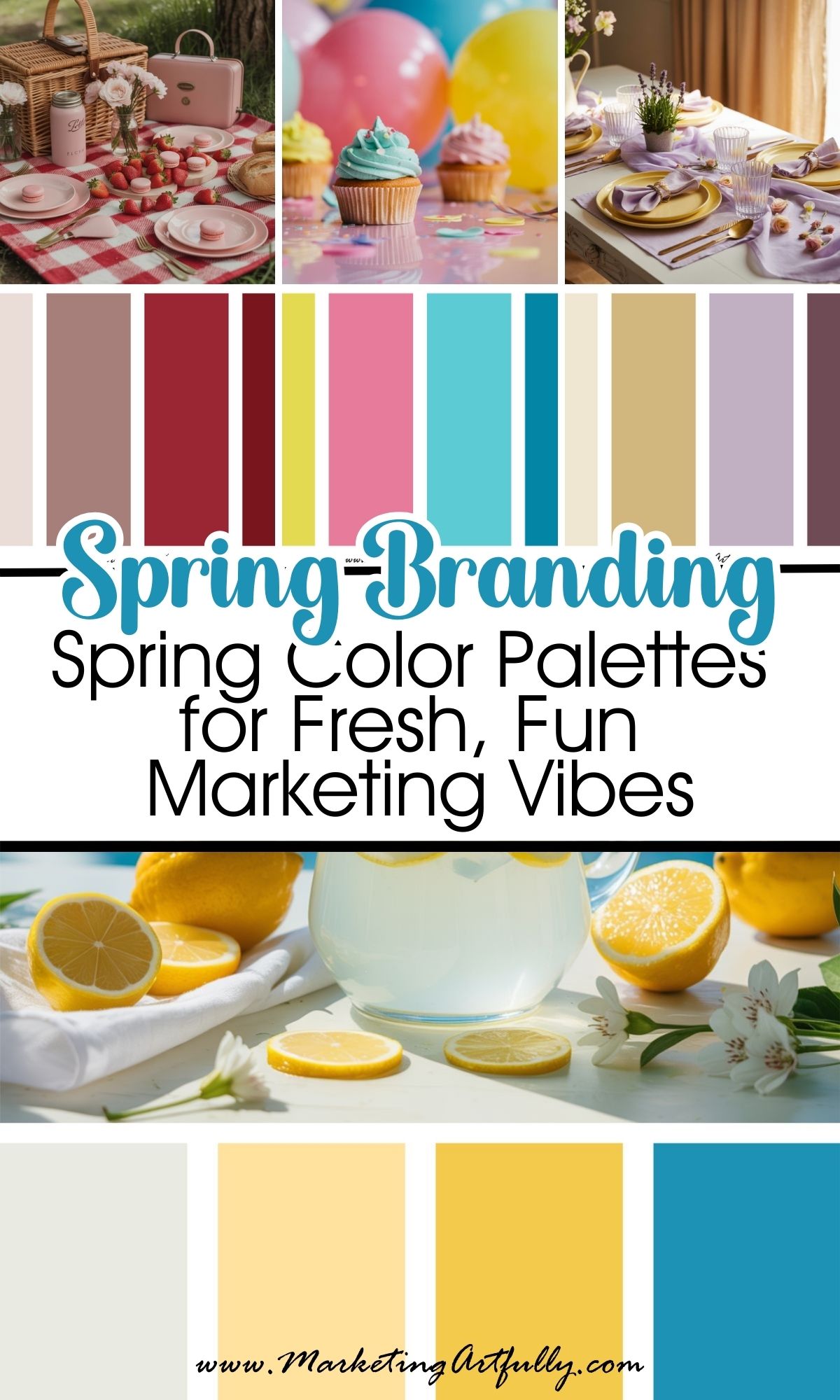
If your brand has been feeling a little too “gray hoodie and leftover Valentine’s chocolate,” it’s time to open the windows, breathe in that spring air, and give your visuals a fresh seasonal makeover!

Spring is the season of new beginnings, which makes it the perfect time to update your color palette. These spring color palette combos are playful, fresh, and emotionally aligned with what your audience is craving right now: hope, renewal, and a little joy.
From sweet pastels to bold florals and a few unexpected pops of color - these 11 spring branding palettes will help you step confidently into the season!
1. 🌷 Blush Pink + Sage Green + Ivory
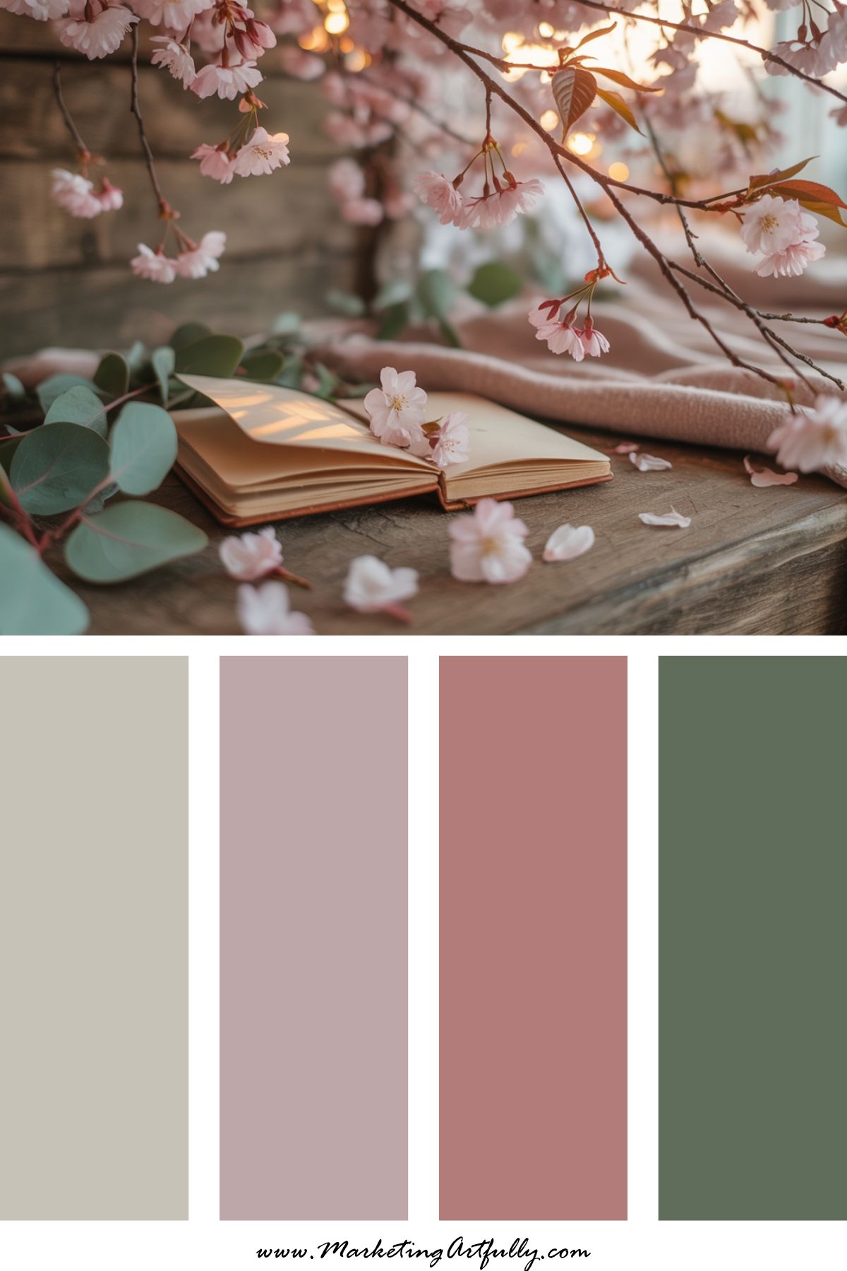
Vibe: Soft, romantic, and earthy
Perfect for: Lifestyle brands, personal brands, coaches with heart
This is the ultimate “new beginnings” palette - blush brings warmth, sage feels grounded and clean, and ivory keeps everything light. Feels like journaling under a cherry blossom tree.
2. 🍋 Lemon Yellow + Sky Blue + White
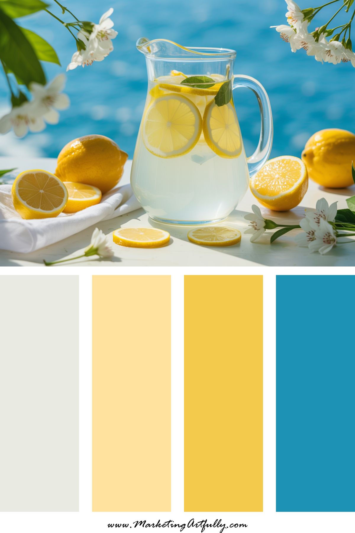
Vibe: Cheerful, bright, and high-energy
Perfect for: Course creators, email opt-ins, Pinterest templates
This combo is basically a fresh glass of lemonade on Canva. Yellow sparks joy and confidence, while sky blue adds calm. Use for spring launches or content promos that need to stand out.
3. 💐 Lavender + Mint + Peach
Vibe: Fresh, fun, and a little retro
Perfect for: Designers, digital product shops, Instagram carousels
This soft yet playful palette is spring perfection. It brings color without overwhelming. Bonus: it looks amazing in flat lays and Pinterest pins.
4. 🪻 Periwinkle + Butter Yellow + Rose
Vibe: Feminine, dreamy, and Pinterest-friendly
Perfect for: Bloggers, DIY creatives, Etsy sellers
There’s a reason these colors are spring classics - they’re eye-catching but soft. Use this combo for feel-good content, creative tutorials, or anything you want people to save.
5. 🌼 Coral + Teal + Soft Cream
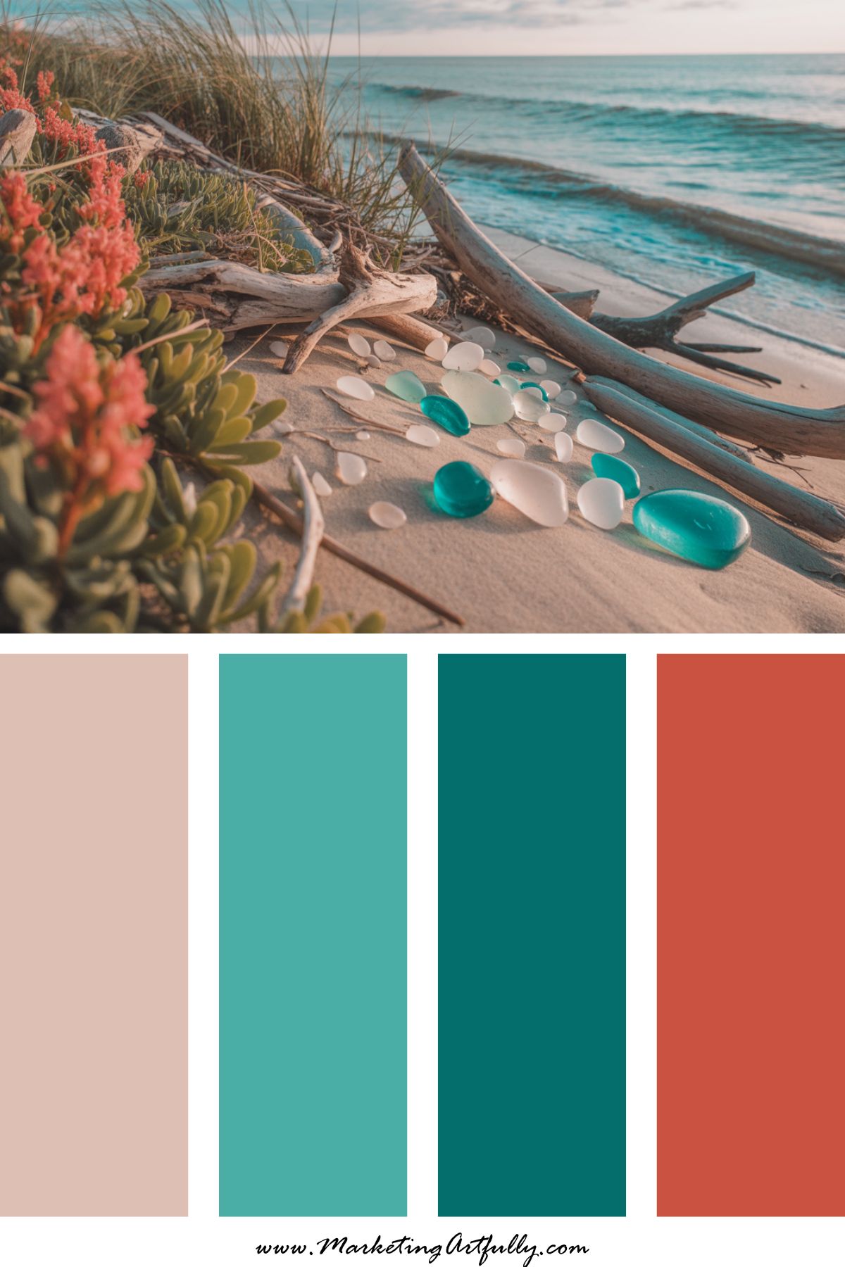
Vibe: Bold but balanced
Perfect for: Bold brands that still want seasonal energy
If you want a bold color palette that still feels like spring, this is IT. Coral and teal play beautifully together, and cream helps ground it. Ideal for reels, lead magnets, or social templates.
6. 🐣 Baby Blue + Pale Yellow + Cotton Candy Pink
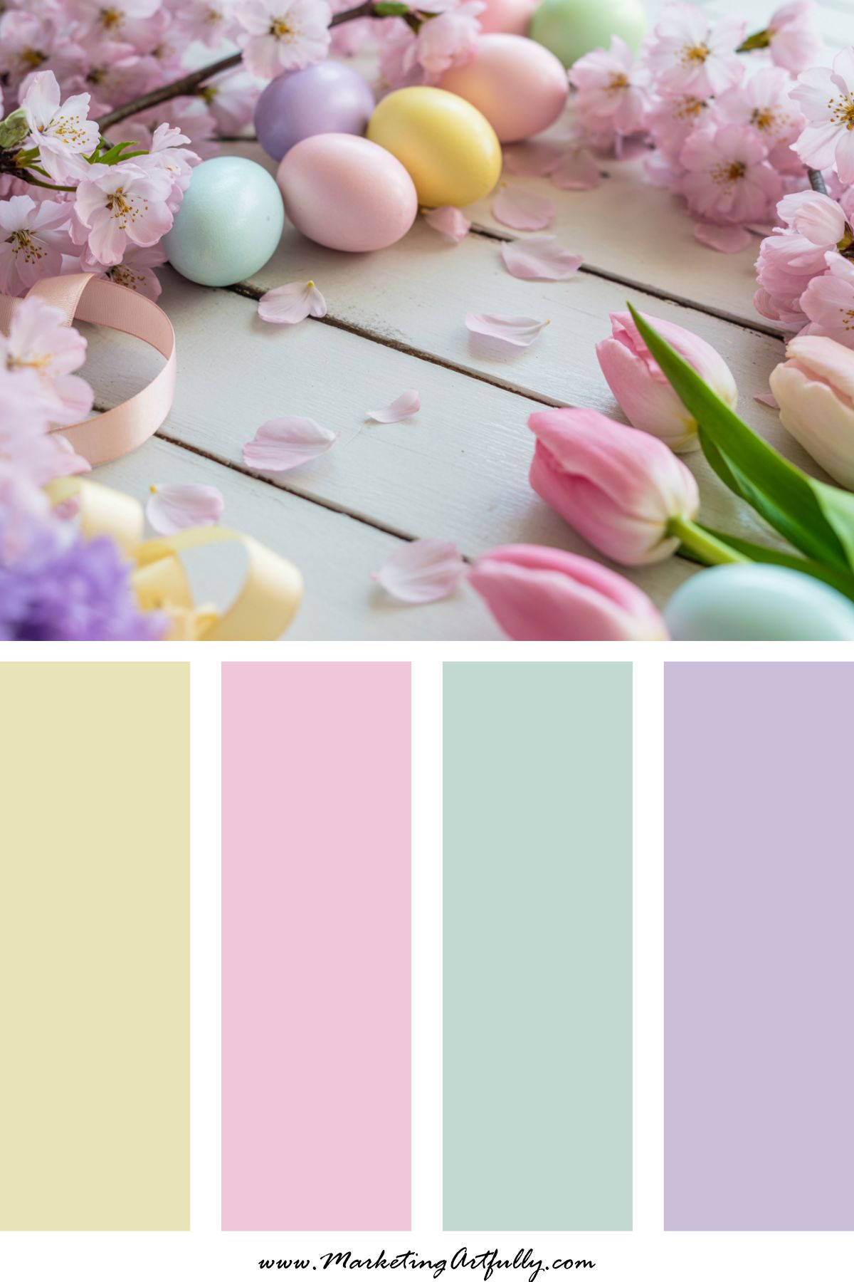
Vibe: Pastel overload (in the best way)
Perfect for: Seasonal promotions, printable products, spring freebies
This one screams SPRING HOLIDAY. Perfect for Easter vibes or anytime you want to infuse fun and softness into your feed.
7. 🍓 Strawberry Red + Pale Pink + Soft Tan
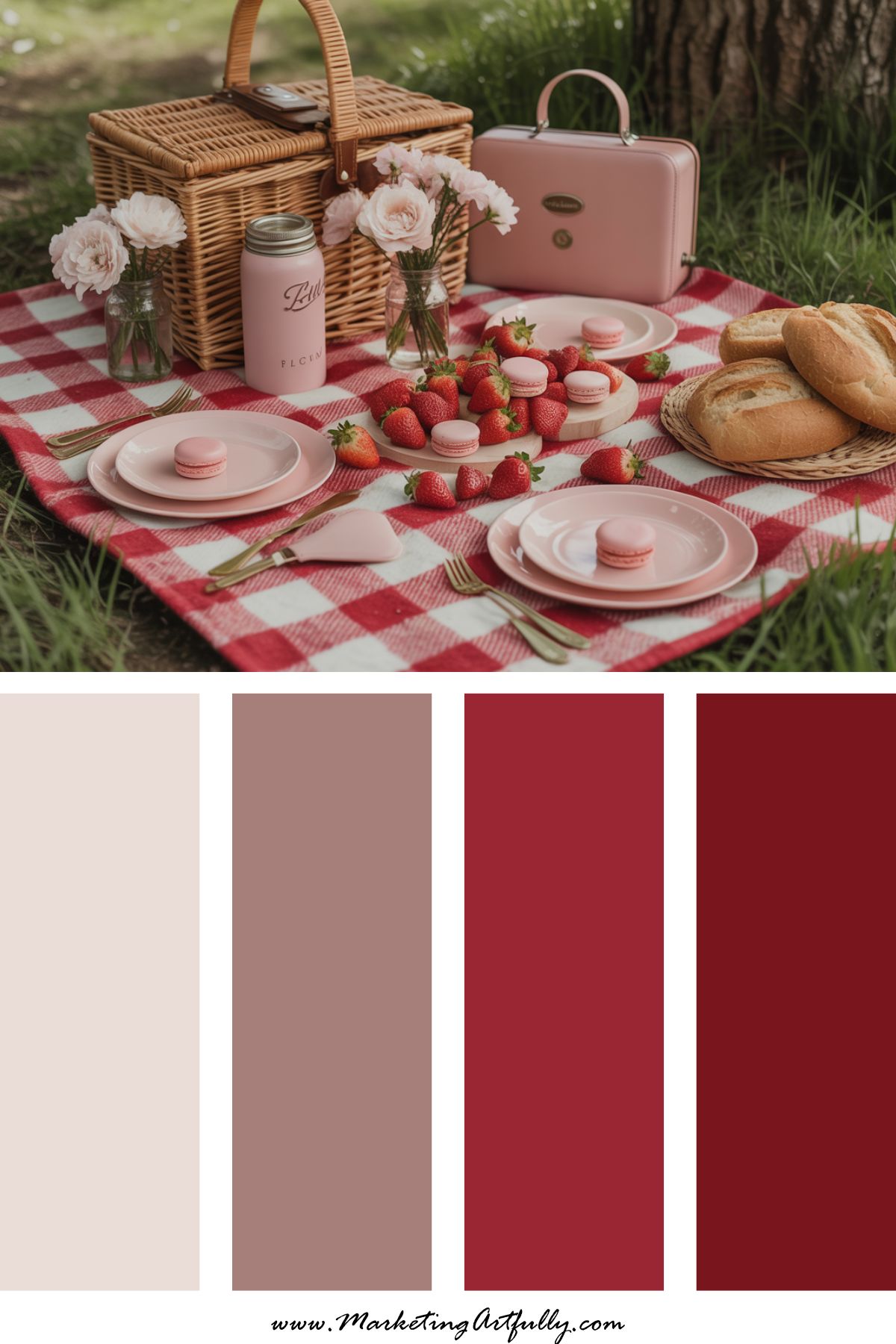
Vibe: Playful but grounded
Perfect for: Product-based businesses, packaging, and content calendars
Red for spring? YES - but softened with pale pink and grounded with a neutral. It’s fun and flirty but still polished.
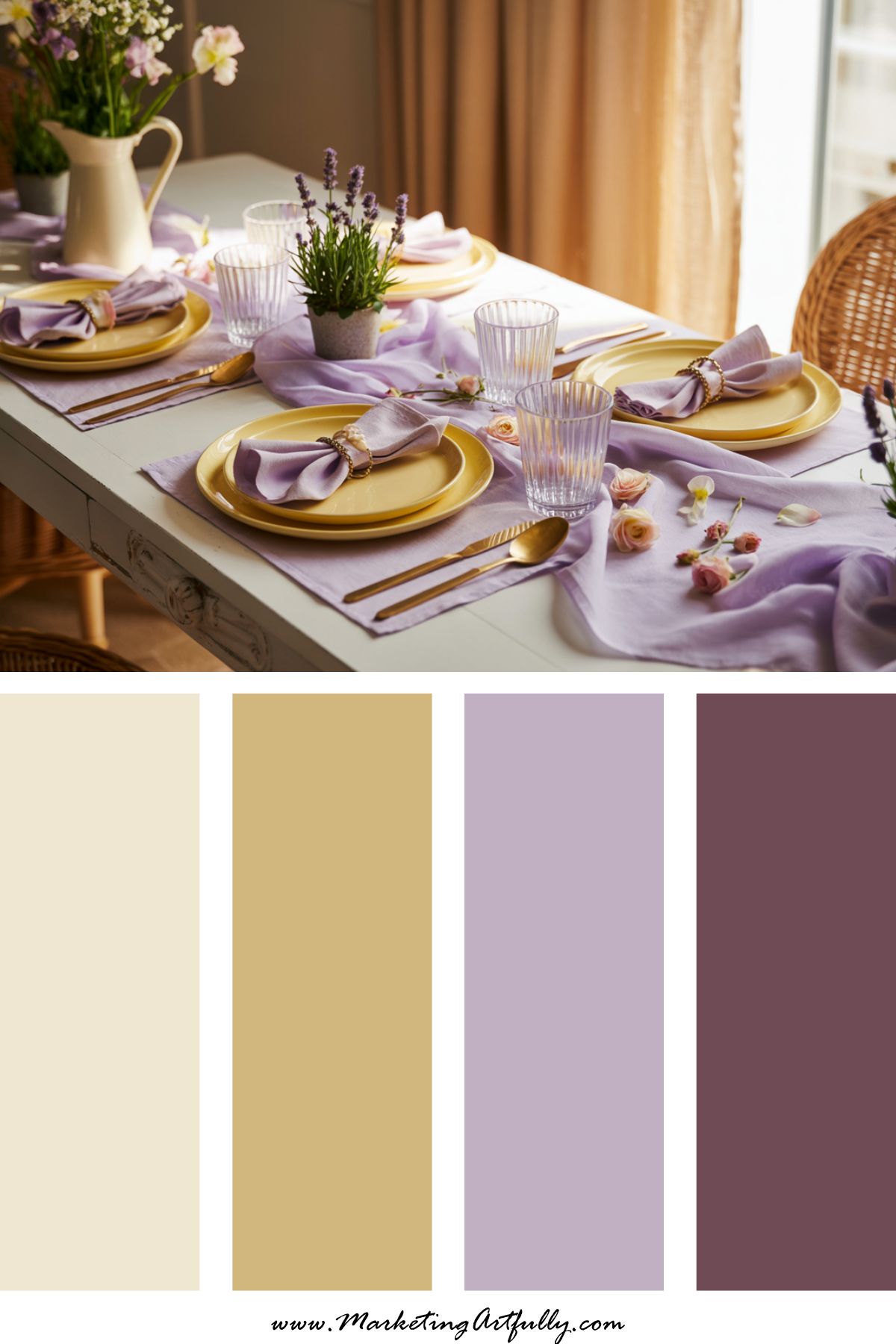
8. 🌿 Olive Green + Lilac + Warm White
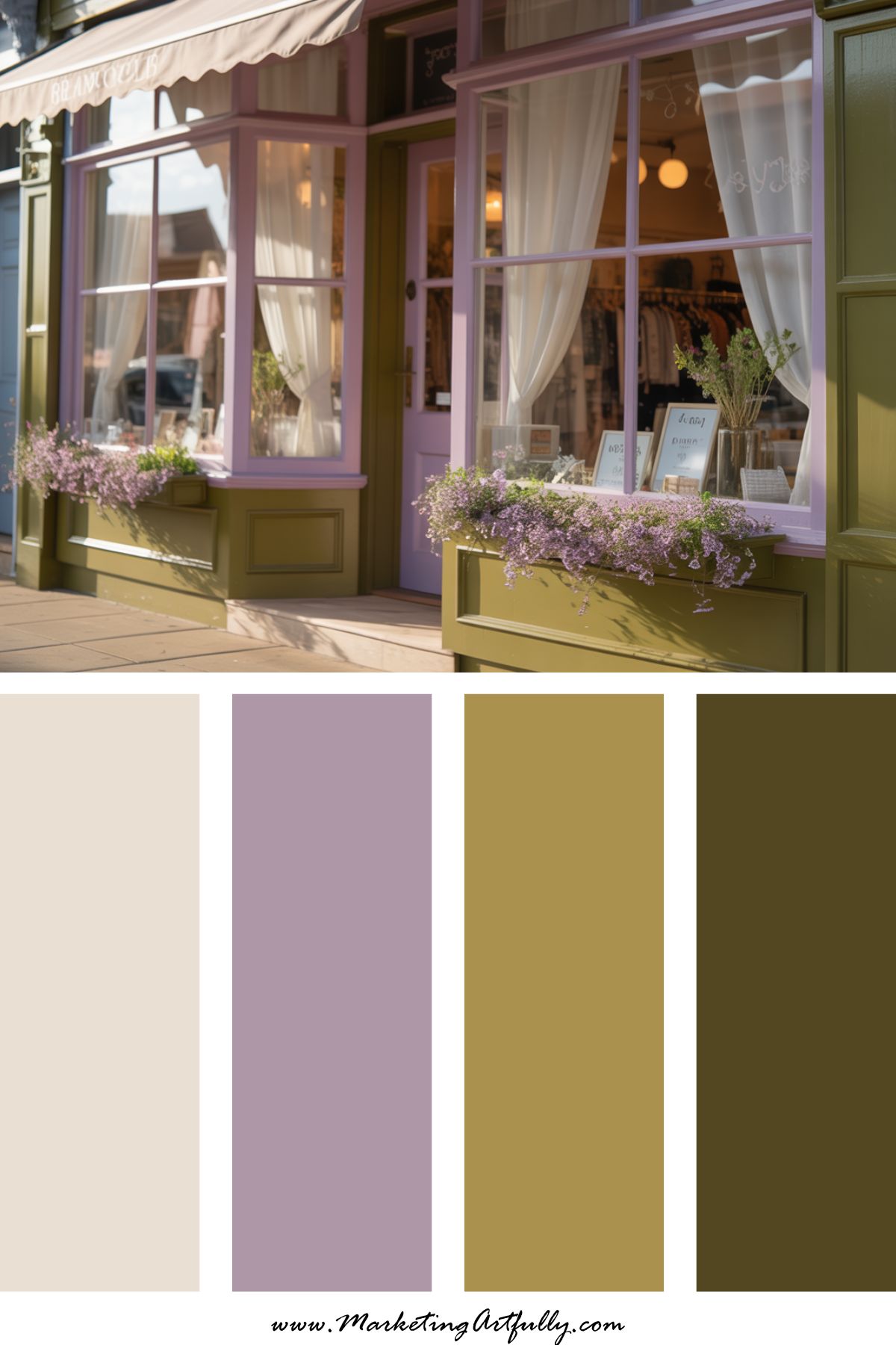
Vibe: Soft sophistication
Perfect for: Creatives, personal brands, high-end digital offers
A little moodier for spring, but still fresh. The olive gives structure, lilac adds personality, and warm white keeps it light. It’s giving "smart AND pretty."
9. 🌸 Dusty Rose + Robin’s Egg Blue + Cream

Vibe: Vintage spring charm
Perfect for: Storytelling brands, feminine-focused businesses
This trio feels like a handwritten letter and a flowy skirt. A beautiful mix of calm, class, and whimsy.
10. 🧁 Aqua + Bubblegum Pink + Lemon
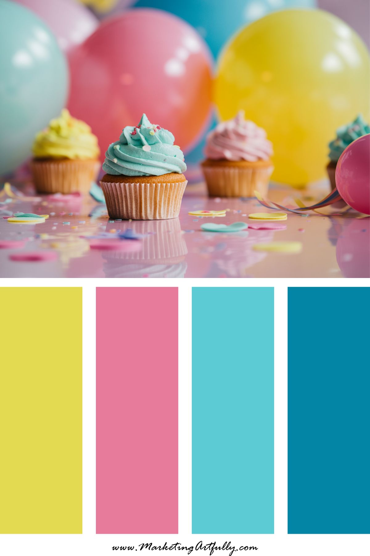
Vibe: Fun, fresh, and wildly clickable
Perfect for: Pinterest graphics, planners, kid-friendly or playful brands
This bright color palette is MADE for visual-first content. It feels like cupcakes and confetti, and it draws attention in all the right ways.
11. 🐇 Dusty Lavender + Sage + Light Peach
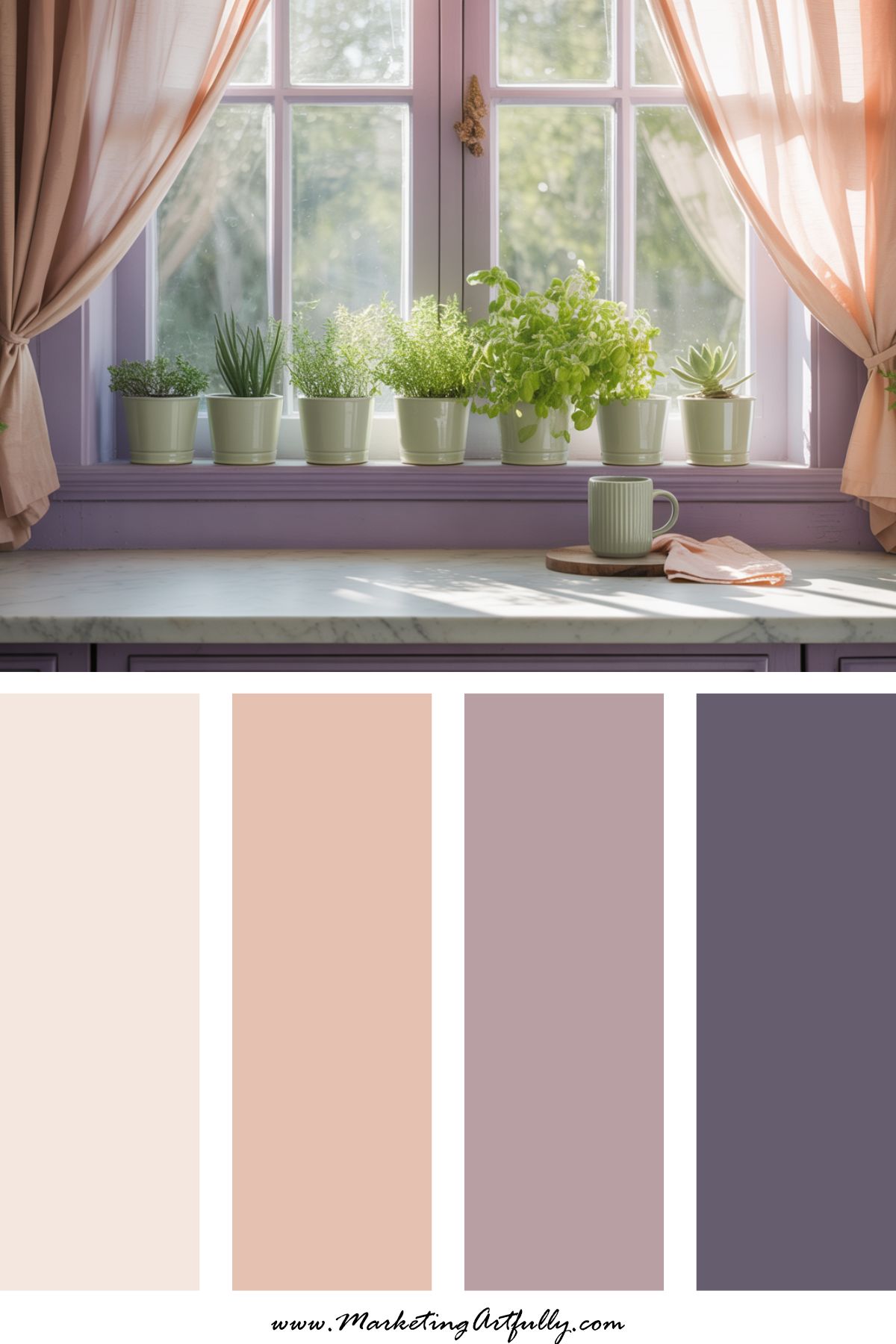
Vibe: Calming, clean, and earthy
Perfect for: Wellness brands, coaches, springtime mindset content
If your brand wants to feel grounded and calm but still on-trend with spring energy, this is your go-to palette. These tones are soft without being sleepy.
🌿 Quick Tips for Using Spring Color Palettes Strategically:
- Update your Canva templates with seasonal accents
- Create spring-themed freebies or pop-up offers with matching palettes
- Design fresh Pinterest graphics and opt-ins for your top seasonal content
- Use color psychology! Lighter colors = more clicks + calmness
You don’t need a full rebrand - just a little spring refresh!
Because the content you’re about to create deserves colors that feel alive.
Here are some more great articles you might love!
- 9 Stunning Mid-Century Modern Color Palettes
- Seasonal Branding Color Palettes to Freshen Up Your Feed All Year Long
- How to Use Color Psychology to Make Your Brand Pop (and Convert!)