Winter branding doesn’t have to mean glittery red bows and Frozen-Elsa teal - unless you want that vibe. But for luxury brands, coaches, service pros, and creatives who want something a bit more sophisticated? It’s time to embrace winter’s magic without the cheesy tinsel!
Enter: the cool-toned, snow-dusted, metallic-infused winter color palette. These branding colors bring all the elegant, high-end, “just stepped out of a fresh snowfall with my $15 latte” energy - without falling into cliché territory.
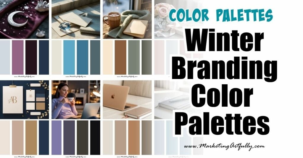
Whether you're planning your winter content strategy or refreshing your seasonal visuals, these color palette ideas are made to shimmer!
Let’s dive in!
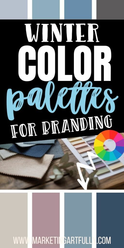
1. Icy Blue + Soft Gray + White

This combo is winter branding in its most minimalist form. It’s clean, crisp, and perfect for modern brands who want to communicate clarity, professionalism, and calm.
Why it works:
- Icy blue feels refreshing and peaceful
- Soft gray adds a grounded, stable tone
- White keeps things light and airy
Best for:
Coaches, consultants, wellness pros, productivity brands
2. Charcoal + Silver + Dusty Lavender

Moody, luxe, and just a touch unexpected. This palette brings mystery and depth without going full gothic.
Why it works:
- Charcoal is strong and grounding
- Silver brings in winter shimmer
- Dusty lavender softens the edges and adds a creative twist
Best for:
Creatives, stylists, designers, and intuitive brands
3. Navy + Gold + Cream

This palette screams cozy luxury - like velvet chairs and candlelight meetings. It’s warm and wintery, but still elevated and grown-up.
Why it works:
- Navy is bold and trustworthy
- Gold adds festive elegance
- Cream softens the palette and keeps it classy
Best for:
Luxury brands, personal brands, high-ticket coaches
4. Pearl White + Champagne + Blush

This is for the romantic dreamers. Soft, glowy, and oh-so-brandable, this palette is wintry without being cold.
Why it works:
- Pearl white keeps it crisp
- Champagne adds shimmer and polish
- Blush adds warmth and femininity
Best for:
Coaches, personal brands, lifestyle bloggers
5. Forest Green + Slate + Gold

If you’re going for a subtle nod to the season without falling into Santa’s lap, this is your go-to. Elegant, deep, and rich - but still totally brand appropriate.
Why it works:
- Forest green is natural, grounded, and timeless
- Slate balances it with a neutral cool tone
- Gold gives it that hint of celebration
Best for:
Nature-inspired brands, handmade businesses, spiritual entrepreneurs
6. Plum + Midnight + Silver

Let’s get cosmic! This dramatic palette feels powerful and slightly magical - like a branding palette that reads tarot cards by moonlight. ✨
Why it works:
- Plum adds richness and emotional depth
- Midnight (navy/black) keeps it elegant
- Silver adds light and luxury
Best for:
Spiritual brands, artists, deep thinkers, and personal brands with edge
7. Teal Gray + Glacier Blue + Ivory

Okay, okay, we’re almost talking Frozen teal - but this one’s for the bold brands who want just a hint of Elsa sparkle without the princess vibe.
Why it works:
- Teal gray brings the moodiness
- Glacier blue adds a pop of cool contrast
- Ivory keeps things grown-up and clean
Best for:
Bold coaches, course creators, digital product businesses
8. Rose Gold + White + Deep Taupe

Unexpected for winter, but so effective. Rose gold adds warmth, while deep taupe keeps things grounded and winter-appropriate.
Why it works:
- Rose gold feels luxurious and soft
- White keeps it crisp
- Taupe brings in a neutral, grounded contrast
Best for:
Lifestyle brands, boutique product shops, feminine-forward entrepreneurs
9. Slate Blue + Mauve + Cream

This palette is what happens when cozy meets classy. Soft and moody in all the right ways, it’s ideal for content with depth and calm.
Why it works:
- Slate blue is thoughtful and chill
- Mauve adds sophistication and softness
- Cream keeps it balanced and light
Best for:
Mindfulness brands, journaling or productivity tools, content creators
10. Black + Metallic Gold + White

Nothing says "New Year energy" like a little black dress palette. This combo is powerful, polished, and ready to party (or pitch your high-ticket service).
Why it works:
- Black = strength, mystery, confidence
- Metallic gold = celebration and premium vibes
- White = space to breathe
Best for:
High-end brands, launches, year-end content, coaches
11. Cinnamon + Ivory + Sage Green

If you want a palette that brings winter warmth without being “Christmas,” this one's for you. Cozy, herbal, and grounded - it’s more cabin retreat than tinsel town.
Why it works:
- Cinnamon = warmth and comfort
- Ivory = balance and elegance
- Sage = earthy, calm, modern
Best for:
Handmade shops, coaching brands, service providers with heart
How to Use These Palettes Without a Full Rebrand
A few quick ways to bring winter into your branding without a big overhaul:
- Change out your Canva accent colors for seasonal palettes
- Create a seasonal landing page or lead magnet
- Make a series of winter pins or social posts in your chosen palette
- Design winter-themed product mockups or highlight covers
- Update your seasonal blog post graphics to match the tone of the quarter
Remember: Winter Can Be Warm, Luxe, or Moody - Not Just “Cold”
You don’t have to freeze your brand into one-dimensional snowflakes. Whether you lean into cozy creams, sparkly golds, or cool blue hues, winter branding is a chance to show off your personality in a way that still feels seasonal and aligned.
✨ Go metallic.
✨ Go moody.
✨ Go magic.
Your winter content is about to slay!
Here are some more great articles that you might love!
- Seasonal Branding Color Palettes to Freshen Up Your Feed All Year Long
- 9 Stunning Mid-Century Modern Color Palettes
- 11 Bold Branding Color Palettes That Stop the Scroll