I have a really cool Etsy marketing newsletter and one day a gal named Sally replied back to my welcome email saying..
"Very excited to have found you! I think I found a link from playing around with Etsy Rank. I'm putting a lot of time into my 2 Etsy shops and only seeing sporadic sales. Maybe a couple a month. Seems like every month gets worse. But staying positive; if others can do it so can I."
Awww, so nice that she is still working and hopeful!!! I clicked over to her first shop and was not confused at all about why she wasn't getting many sales. Her shop was a hot mess.
So instead of writing back a quick message about what I saw, I asked her if she wanted some suggestions and if I could write a post about them. She said she was super brave and really wanted to know the truth about how to make her shop better so go ahead!
Sally's Shop
So this is her shop.... SallyJGoodrich
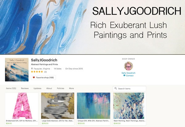
So near as I can tell from first glance, she sells rose letters and... hmmm... abstract art? So first things first...
The Header Image
I know that the header image is a big deal for some Etsy sellers, it does help brand your work and is cool and all, but it takes up A LOT of room. So the first thing that I would do is take off the header image so buyers can see more of her work right off the bat!
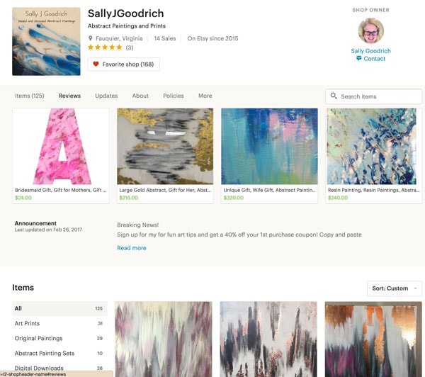
If you are trying to brand yourself, then the header is great, but Sally wants to sell pictures and prints so letting buyers see more of her great artwork is a bonus! Maybe the copper in that bottom one will strike a chord with someone and they will be intrigued!
Her Pictures
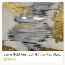 I am going to be factual rather than kind, I am not sure this picture is the best way to sell a piece of art that is $200+. We are not going to talk pricing here, although I think with some tweaks to her marketing her prices are probably a bit on the low side for handmade, high quality artwork.
Functionally this looks like a blob of gray withs some gold and white bits...sigh.
Think about it from the buyer's perspective, they are trying to find something glorious to hang in their home and this probably will not make them excited to check it out!
A word about Etsy's rules... So Etsy's rule is that you cannot use a mockup of your art as the first picture. It must be an actual picture of the item you are selling so we have to help Sally figure this out!
Sally's First Pictures
Digging around a bit, I found Sally does have a setup that she could use to take "real" pictures that looks fancier. The left one is the one in her listing and the right one is just brightened a bit and I removed the wall plug with Photoshop (she could just move the easel down).
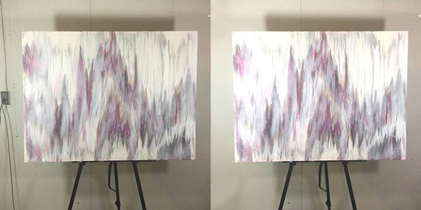
So now Sally's listing for this one will look a little differently on the page...
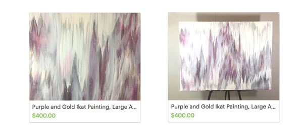
Is it perfect? I don't know, but I DO know that Sally has the materials and lighting to do this kind of listing picture! It would be great if we all had huge lighting kits and $6,000 cameras, but sometimes keeping it simple is the best way to go.
Sally could take all of her picture with this same or similar setups, showing the actual pieces in their best light instead of just picking a random part of the pattern as the first picture for her listing!
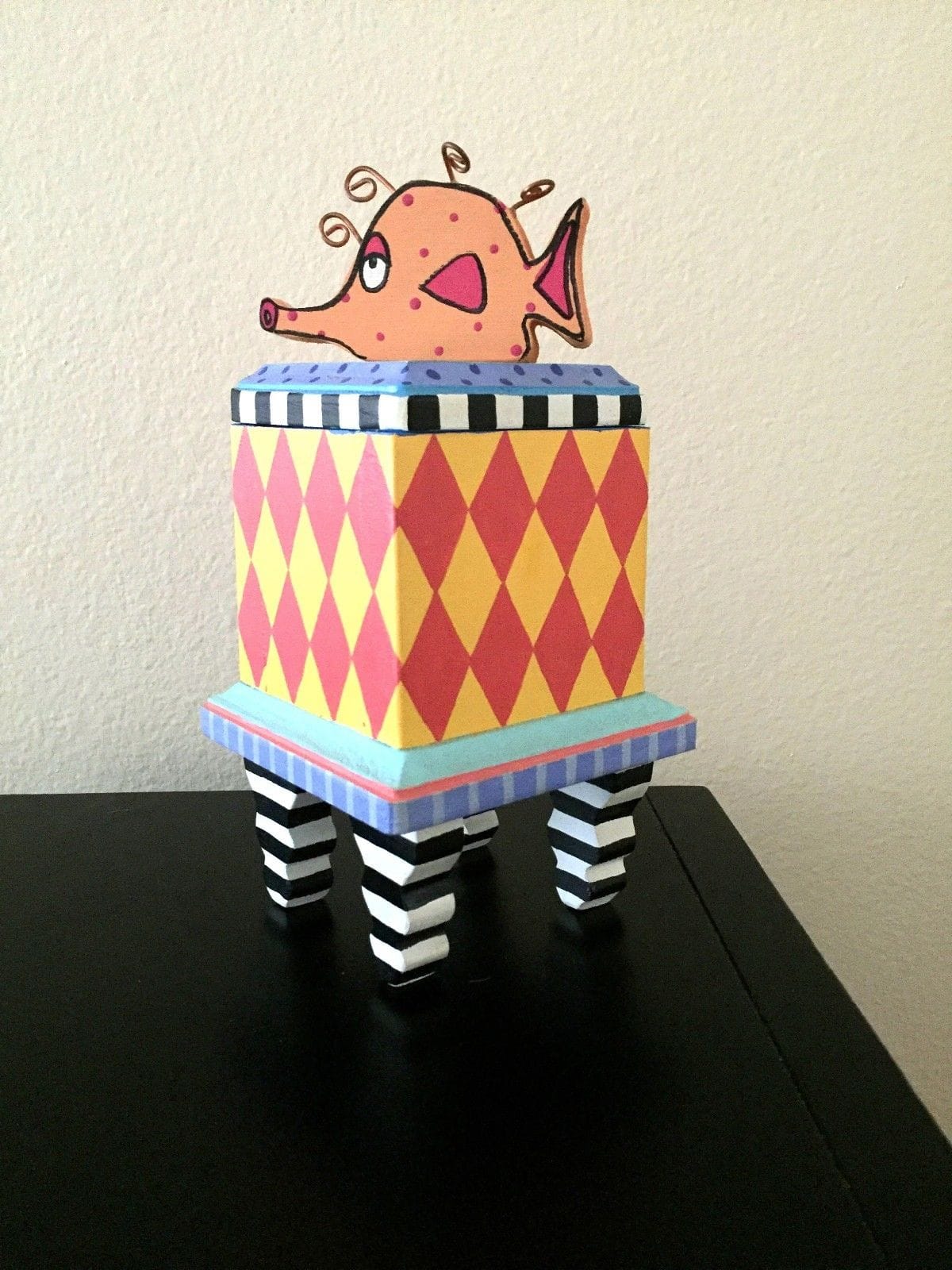 As she goes she will get better and better at finding good lighting or finding a place in her house where she can take a picture.
I know one of my favorite places is up against a wall on an old dining room table I have in my workroom. Like Sally I have some shadows and it is not perfect, but the brightness of the picture and clean background make it okay for this little piece.
This was taken in my front room with my iPhone during the brightest part of the afternoon. Sally could do something similar with just a black table and her wall as a background which would be perfect for her modern ascetic!
Mockups of Her Artwork
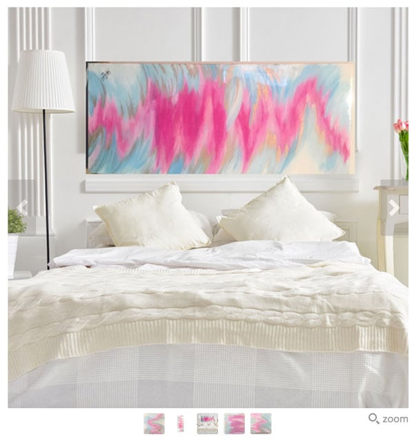 Something I think Sally did well on a couple of her listings to do mockups of the artwork!
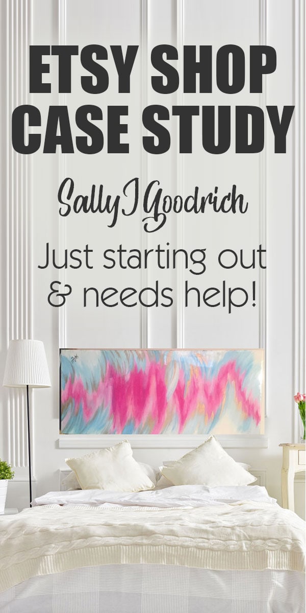
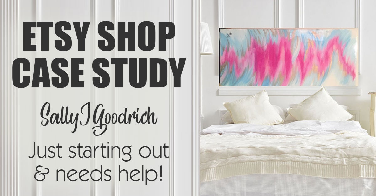
One of the reasons I feel okay about giving her some of these suggestions is that THIS picture is hers. The setting is AMAZING and the picture is DROP DEAD GORGEOUS!
You can find free mockup "rooms" using a site like All Free Mockups - Mockup World! Some of them require your email address and some require you to share on your socials, but once you have that file you can use it for your pictures going forward!
But what if you are not a photoshop whiz? You could hire someone like this from Fiverr!
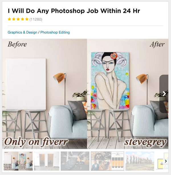 You would just send him your mockup picture, your regular picture and $5 and he will send it back to you in 24 hours!! How freaking cool is that?
So I know some of you are thinking, I am not making any money so how can I spend $5 a picture? A couple of things...
First off you could figure out how to use a free Photoshop tool like Gimp or get good at using an online tool like Canva or PicMonkey.
Second, you probably will continue to struggle with sales until you get pictures that make people want to buy your product.
Lastly, you could get better at styling your own photos when you take them!
Pricing
Ha, I said I was not going to talk to talk about pricing but I am NOT able to hold my tongue! Funny pictures aside this HANDCRAFTED piece of art is $16... what the what?
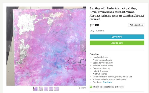
She used a canvas, paint, resin and her TIME to make this and is only charging $16. I would assume that it would be super low quality or that there is something majorly wrong with it! No artist worth her salt would charge that little for a painting.... but it gets worse!
On many listings Sally has this as her last photo...

So not only is she willing to sell her work for peanuts, but she is willing to discount even that paltry sum... argggg.
Okay, this is what I think when I see a coupon like that... she is pricing her work too high so she can discount it (obviously NOT Sally's problem) OR she is desperate to sell anything OR she is a terrible artist who I will be wasting my money on no matter how cheap the price is.
How To Have A Sale
Now don't get me wrong, I am not a precious pearl about having sales, but sales are a one time thing that can help drive urgency and get people to pop.
I feel like almost 50% off is too much for handcrafted, what about 10-20% that you can turn on and off with a service like Etsy On Sale.
I send out a coupon with every sale I have made on my vintage shop that is for 10% off their next purchase. This is driven a number of repeat customers, but I wouldn't suggest offering your whole store on sale for this much or continuously.
Etsy SEO
So last but not least, let's talk about Sally's keywords. Here is what she has on that stunning piece in the bedroom above...
- Pink Blue Ikat Painting, Large Ikat Paintings, Wedding Gift, Ikat Painting, Ikat Paintings, Extra Large Wall Art, Large Abstract Decor
Once she has "Ikat Painting" and "Ikat Paintings" that keyword is covered so she could free up two of her keywords for others like...
- Original, Abstract Painting, Mixed Media, Boudoir Painting, Girl, Pretty, Modern Baby, Hand Painted
I found a few of these using Marmalead... my favorite Etsy SEO tool!
Etsy Case Study - Sally J Goodrich Wrapup
So there you have it! First off a huge shoutout to Sally who was brave and let me talk about her shop. This is what she said when I asked her if I could use it...
Absolutely! Please write this and share! I've gotten such good stuff from other Etsians and anytime I can give back I'm all in.
That is one stand up Etsy seller who is going to get this figured out and start soaring!!! Good on you Sally Goodrich, good on you!!!
Secondly, it is hard to really look at our shops honestly and figure out what we might be doing wrong. I can't do a post like this for everyone, but you could ask a friend or colleague to tell you three things they think you need to fix! Just those honest insights can sometimes point out a glaring error that we might have missed!!

