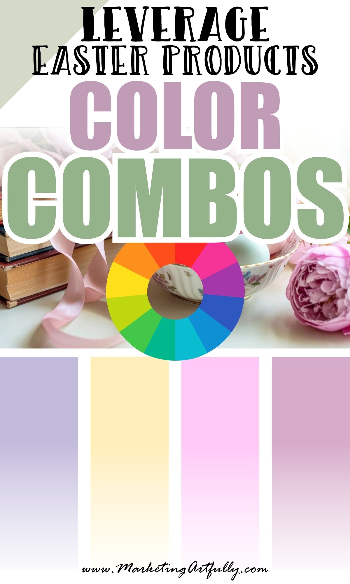
Easter is the underrated queen of color! Spring branding doesn’t have to mean pastel overload or cartoon bunnies (unless that’s your thing - and honestly, I respect it!) Easter is actually one of the BEST seasonal opportunities to refresh your brand visuals without completely reinventing yourself.
Soft tones, nostalgic warmth, playful brights, earthy renewal - it’s all fair game.
So whether you're launching a spring freebie, refreshing your Canva templates, or just want your Pinterest feed to feel like a breath of fresh air… here are 9 Easter color palettes that feel aesthetic, elevated, and 100% brandable.
1. Butter Yellow + Blush Pink + Soft Sage
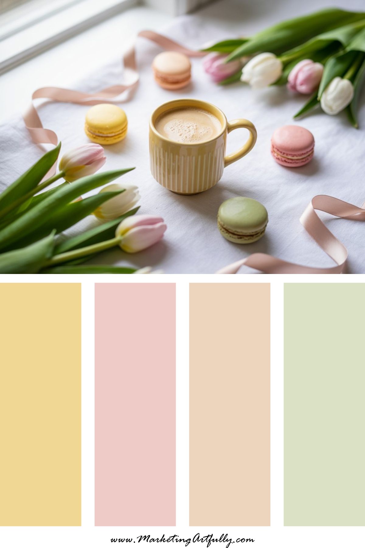
Vibe: Soft, airy, and quietly romantic
This is your Pinterest spring morning palette. Think fresh tulips on the table, linen curtains in soft sunlight, and a gentle “new beginnings” energy.
It feels feminine without being sugary and works beautifully for lifestyle brands, bloggers, coaches, and anyone launching something fresh this season.
Use it for:
Spring opt-ins, email header refreshes, feminine sales pages, Pinterest graphics that whisper instead of shout.
2. Robin’s Egg Blue + Cream + Warm Taupe
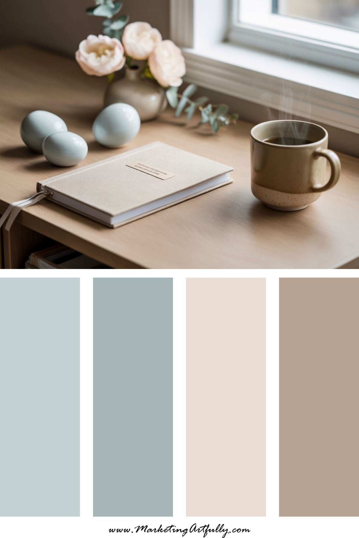
Vibe: Elevated, minimal, and calm
This palette says, “Yes, it’s Easter - but I run a business.”
Robin’s egg blue keeps it seasonal, while cream and taupe ground everything in modern sophistication. It’s clean, intentional, and polished.
Use it for:
Website banners, launch graphics, coaching promotions, refined Canva templates.
If your brand leans neutral but you still want a spring nod, this is your girl.
3. Lilac + Buttercream + Ballet Pink
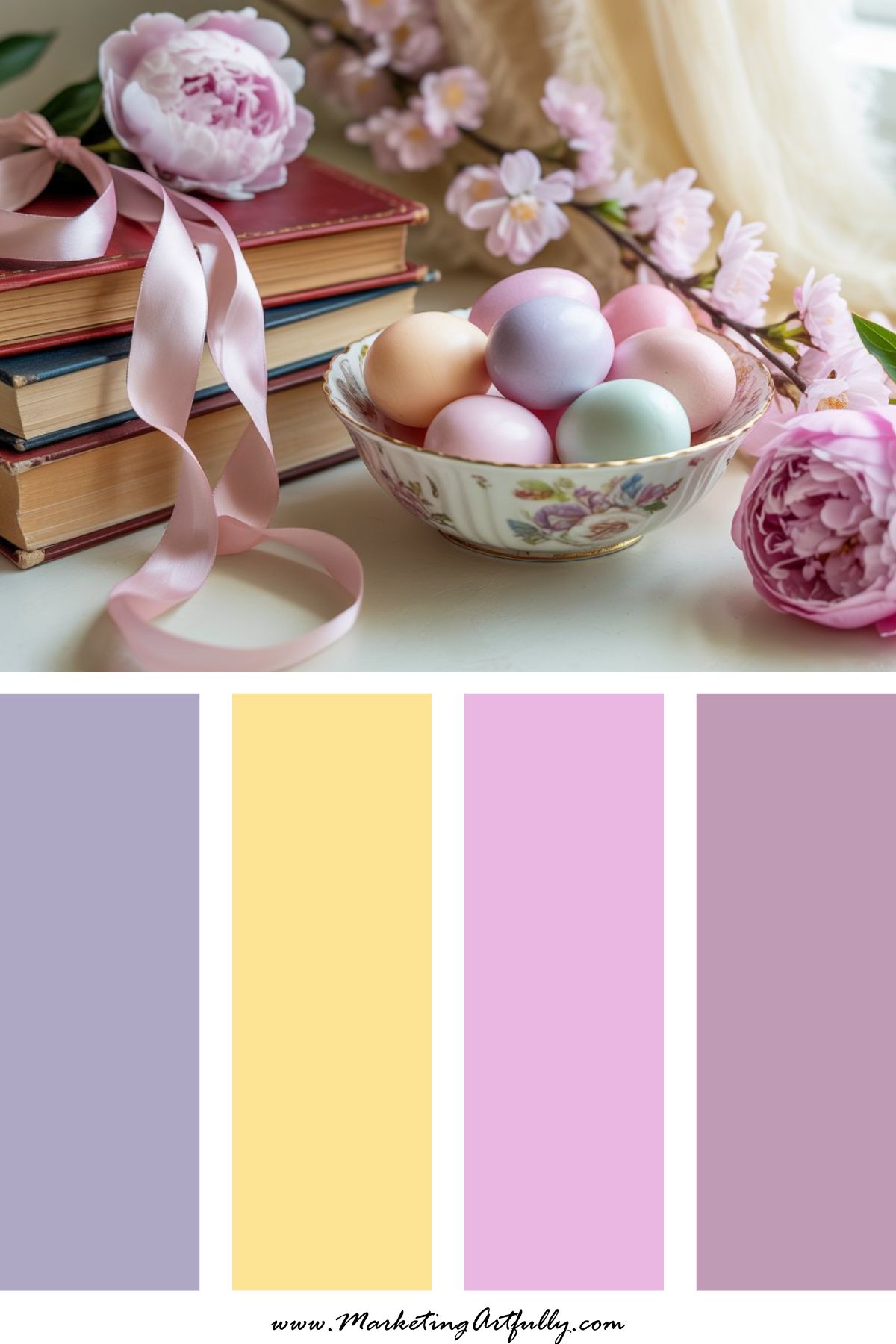
Vibe: Storybook sweet but grown-up
Soft nostalgia without feeling juvenile. This palette feels like vintage stationery and handwritten notes tied with silk ribbon.
It’s romantic, gentle, and beautifully on-trend for Pinterest.
Use it for:
Printable downloads, planners, digital product covers, feminine Instagram carousels.
This one is dreamy without being childish - which is a delicate line and we nailed it.
4. Coral + Mint + Vanilla
Vibe: Fresh, playful, slightly retro
This one flirts with 1960s Easter postcard energy - bright but not neon.
Coral adds punch. Mint keeps it light. Vanilla softens the edges.
It’s perfect for brands that want seasonal energy without losing their personality.
Use it for:
Etsy shops, product-based promotions, fun seasonal sales graphics, bold Pinterest pins.
5. Dusty Rose + Sage + Ivory
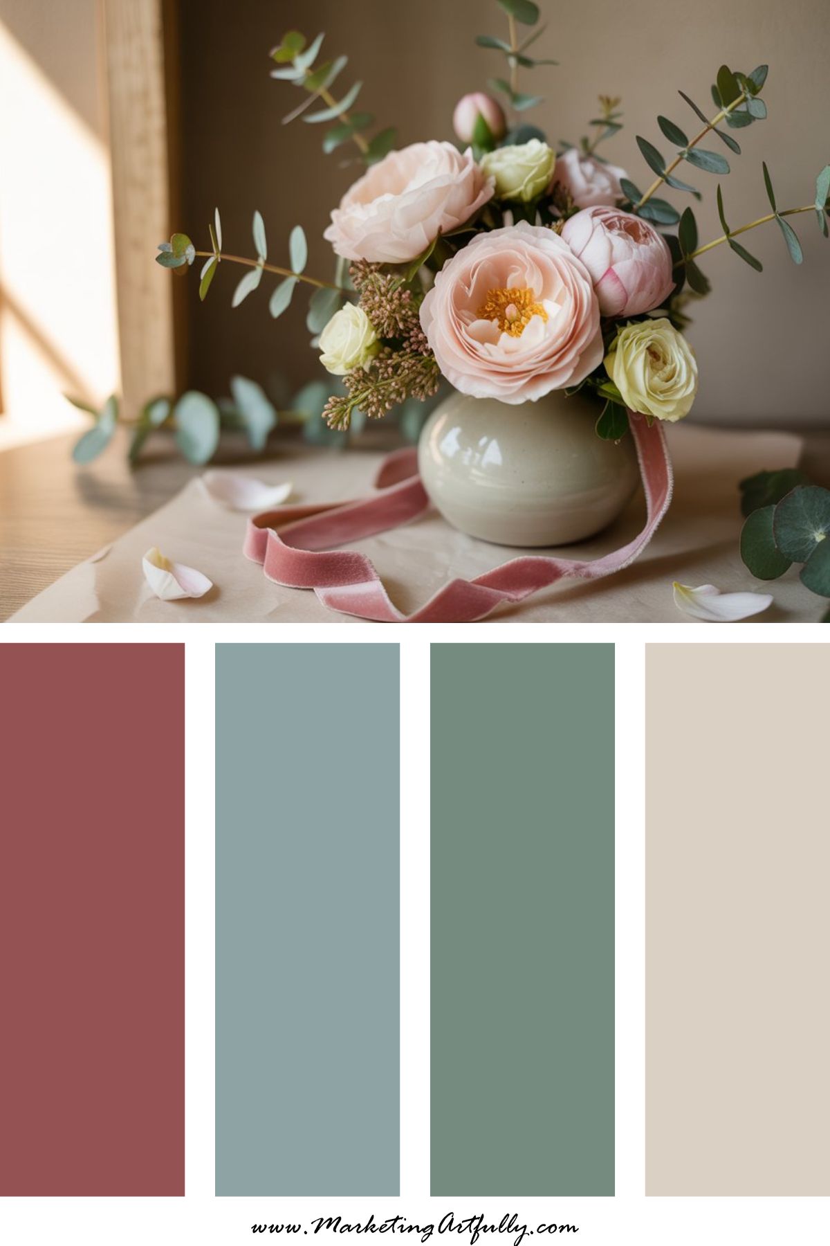
Vibe: Mature romance, slow spring bloom
This palette is for brands that want Easter vibes without candy-store sweetness.
Dusty rose keeps it warm. Sage grounds it. Ivory adds elegance.
It feels timeless and intentional - especially powerful for personal development, wellness, and coaching brands.
Use it for:
Course launches, heartfelt sales pages, personal brand photography overlays.
6. Lavender + Sky Blue + Soft Peach
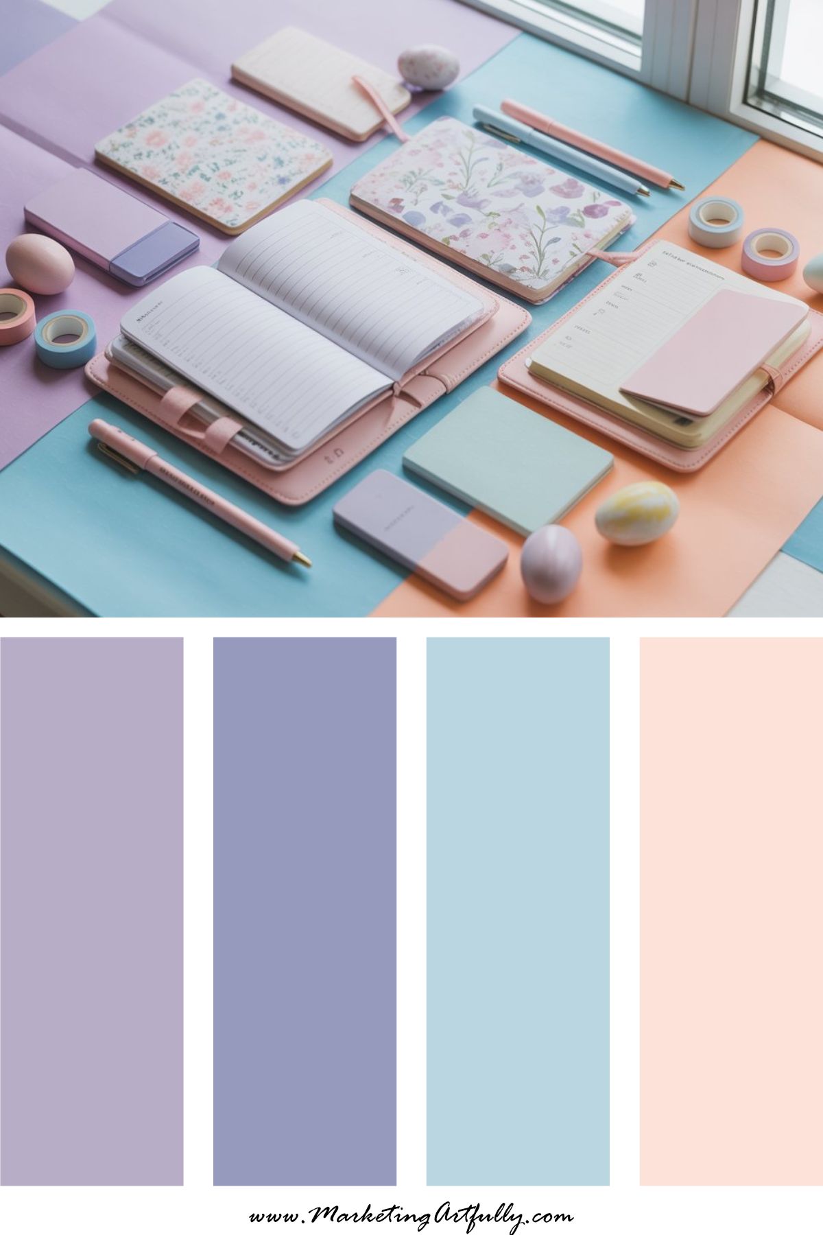
Vibe: Dreamy Pinterest-core
This is pastel magic done right.
Lavender and sky blue create that airy spring feeling, while peach adds warmth so it doesn’t feel cold or flat.
It’s playful and extremely scroll-stopping.
Use it for:
Pinterest graphics, social media carousels, Canva template refreshes, spring content batching.
This palette photographs beautifully and performs beautifully. Win-win.
7. Mustard + Dusty Aqua + Cream
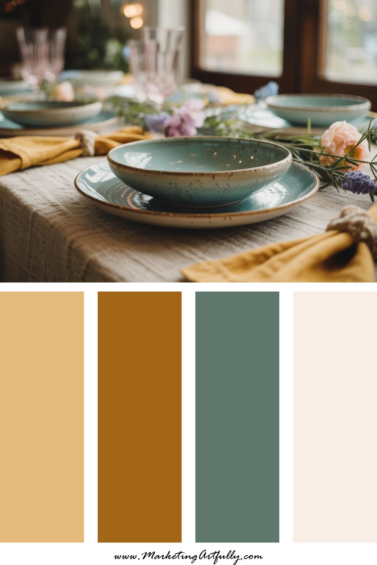
Vibe: Retro Gen X Easter (but chic)
Slightly muted. Slightly nostalgic. Unexpected for Easter - which makes it powerful.
Mustard adds warmth, dusty aqua cools it down, and cream keeps everything wearable for branding.
If you love a vintage vibe or your audience skews nostalgic, this is such a fun seasonal twist.
Use it for:
Creative entrepreneurs, retro brands, storytelling campaigns, personality-driven launches.
8. Hot Pink + Lemon + Pale Blue
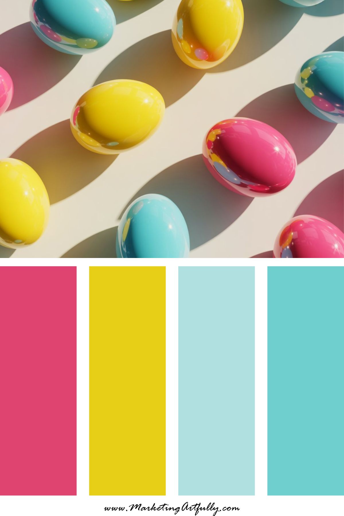
Vibe: Bold spring energy
This palette is not here to whisper. It’s here to convert.
Hot pink grabs attention. Lemon keeps it fresh. Pale blue prevents overwhelm.
It’s energetic, confident, and ideal for promotional campaigns.
Use it for:
Course launches, flash sales, high-energy email campaigns, product drops.
If your brand already has personality, this palette amplifies it.
9. Soft Terracotta + Sage + Blush
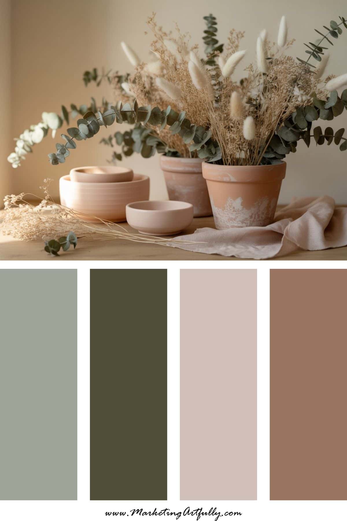
Vibe: Earthy spring renewal
For the grounded entrepreneur who prefers warmth over sugar pastels.
Terracotta gives depth, sage keeps it seasonal, and blush adds softness without overpowering.
This palette feels calm, natural, and deeply brandable.
Use it for:
Wellness brands, sustainable businesses, mindful marketing campaigns, earthy product photography.
How to Use These Easter Color Palettes in Your Brand
Here’s where the strategy comes in.
Instead of completely rebranding for Easter, try:
• Adding seasonal accent colors to your existing Canva templates
• Refreshing your Pinterest pin backgrounds
• Updating email graphics and lead magnet covers
• Creating a limited-time spring promo using one cohesive palette
• Styling your flat lay photos to match one of these combos
You don’t need a total visual overhaul - just a seasonal flirt. Spring is about renewal. Your visuals can reflect that without losing your brand identity. Because your business deserves to bloom a little, too.
Here are some more color palette inspirations for you:
- 9 Unique Valentine’s Day Color Palettes for Your Coquette Core Loving Heart
- Seasonal Branding Color Palettes to Freshen Up Your Feed All Year Long
- 11 Bold Branding Color Palettes That Stop the Scroll