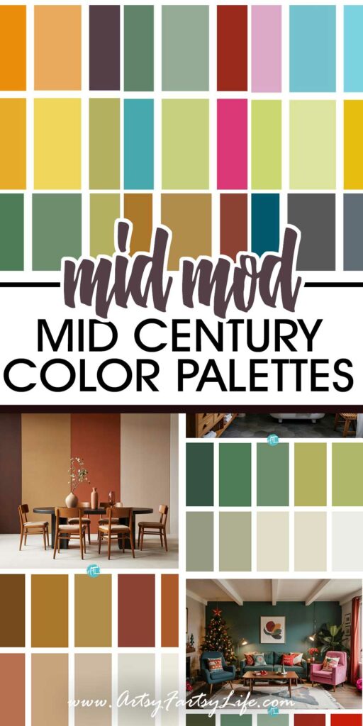
If there’s one thing mid-century modern design nailed, it’s color. Whether it’s a moody olive green accent wall or a perfectly peachy-pink chair that looks like it came straight out of a 1960s sitcom set, this iconic style just KNOWS how to use color in ways that feel bold, fun, and timeless all at once!
Whether you're planning a room makeover, designing digital products, or just drooling over vintage decor on Pinterest, having a well-balanced color palette can make your whole project sing!
Why I Wrote This Post
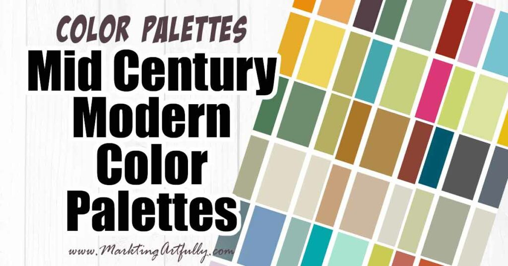
I am doing a big Mid Century Modern art project and I wanted to pull together color families for different gallery wall products.
With that in mind I hand picked out colors I would be using in my artwork and then thought, hey maybe I should share these with the peeps... so here you go!
I used AI to generate the images at the top with the colors of each palette so we could visually see
Below you’ll find 9 dreamy mid-century modern color palettes that will help you channel those vintage vibes with total confidence. Let’s dive in, color-lover!
1. Colorful Mid-Century Magic
This one is for the bold hearts out there—the retro rainbow lovers who want to mix deep forest green with vibrant yellow and coral pink without flinching. It’s like a Palm Springs motel met an Eames-inspired art studio. With pops of mint, teal, coral, and sunny yellow, this palette is high-energy but still beautifully balanced thanks to the grounding navy and warm brown. It’s perfect for spaces where you want a happy punch of nostalgia without looking like a literal circus.

2. Greens & Greys: The Understated Power Duo
Moody forest green, deep teal, and charcoal gray come together to create a palette that’s quietly confident. Add in some softer sage, cream, and pale yellow-green, and you’ve got a look that says, “I’m classy, not flashy.” This combo works wonderfully in living rooms, offices, or even bathrooms where you want to keep things chill and elevated. Think: lots of natural textures, wood tones, and matte black accents.

3. Back to Nature: Earthy Browns Done Right
This palette brings the hearth and home energy. Rich chocolate, sienna, and golden brown play beautifully with pale sage, warm beige, and creamy whites. It’s like a stylish nod to your grandpa’s favorite armchair—worn in all the right ways. This is a great palette for spaces with wood floors, vintage furniture, and warm lighting. It makes everything feel grounded and just the right amount of nostalgic.

4. Green Dream: Botanical Mid-Century Feels
If your soul craves plants, avocado toast, and a good sunbeam to bask in, this palette is for you. Five gorgeous shades of green (from forest to sage) are paired with warm neutrals like soft beige and clean white. It’s peaceful, fresh, and full of life. Ideal for anyone designing with biophilic vibes in mind or just wanting to infuse their space with a little more earthy serenity.

5. Warm & Cozy Mid-Century Glow
This palette wraps you in a golden-hour hug. It features deep chocolate, rosy pinks, terracotta oranges, and layers of yellows that just radiate warmth. It’s perfect for kitchens, dining rooms, or creative spaces where you want to feel inspired, alive, and just a little bit retro fabulous. Try pairing these colors with brass or cane accents for a truly mid-mod look.

6. Cool Hues for a Calm Mid-Mod Mood
Blues, purples, sage green, and a dash of charcoal give this palette a super chill, spa-day energy. Think powder blue bathroom tile, lavender throw pillows, and slate gray shelving. It’s a little bit minimalist, a little bit funky. Great for bedrooms, home offices, or anywhere you want your brain to just breathe. Mid-century can totally be cool and collected without losing its edge, and this proves it.

7. Mid-Century Easter Vibes (Yes, Really!)
Okay hear me out—pastels get a bad rap for being too sweet, but in a mid-century modern palette? They’re suddenly chic again. Mauve, lavender, turquoise, and soft pinks work beautifully when paired with rounded shapes, funky patterns, and warm woods. It feels like flipping through a vintage Easter catalog or finding the perfect ceramic vase at a flea market. Whimsical, charming, and so fresh.
")
8. Mid-Century Halloween Palette
No tacky orange-and-black combos here. This Halloween-inspired palette brings a sophisticated seasonal vibe with rich burnt orange, mustard yellow, deep purple, charcoal gray, and olive green. Throw in some sage and lime for a twist. This is fall decor grown up—perfect for autumnal branding or adding just a touch of October mood to your home without going full haunted house.

9. Mid-Century Christmas Palette
Red and green, but make it fashion. This festive palette brings in forest green, bright red, teal, turquoise, and even a soft pink to give your holiday designs a playful mid-mod refresh. It’s like decking the halls with atomic starbursts and vintage ornaments from Grandma’s attic. Great for seasonal packaging, decor, or retro-inspired holiday cards that make people do a double take (in a good way).

Whether you're pulling together a color story for a design project, refreshing a room, or simply dreaming in vintage hues, these mid-century modern palettes offer something for every vibe. From warm earth tones to playful pastels to classy holiday twists, you’ve now got a whole toolbox of retro-inspired color schemes ready to go.
Need even more inspiration? Here are some more great articles that you might love!
- Cute Mid Century Modern Cat Gallery Printables
- Pinterest’s 2025 Trending Color Palettes
- Planner Manners – How To Color Code Your Time and Your Life!